Boost Juice
Advertorial Illustration, School Project - July 2022
Timeline
2022.07 (3 weeks)
Industry
Food & beverage
Role
Illustrator (End to end)
Tools
Photoshop, Procreate
Overview
Boost juice is a company that offers mainly healthy smoothies and juices, freshly made out of fruits and vegetables. The product that I choose for this school project’s illustration is Immunity juice.
This was my first time creating a digital illustration, and it helped me quickly understand how to work with digital illustration tools.
{
Highlights
}
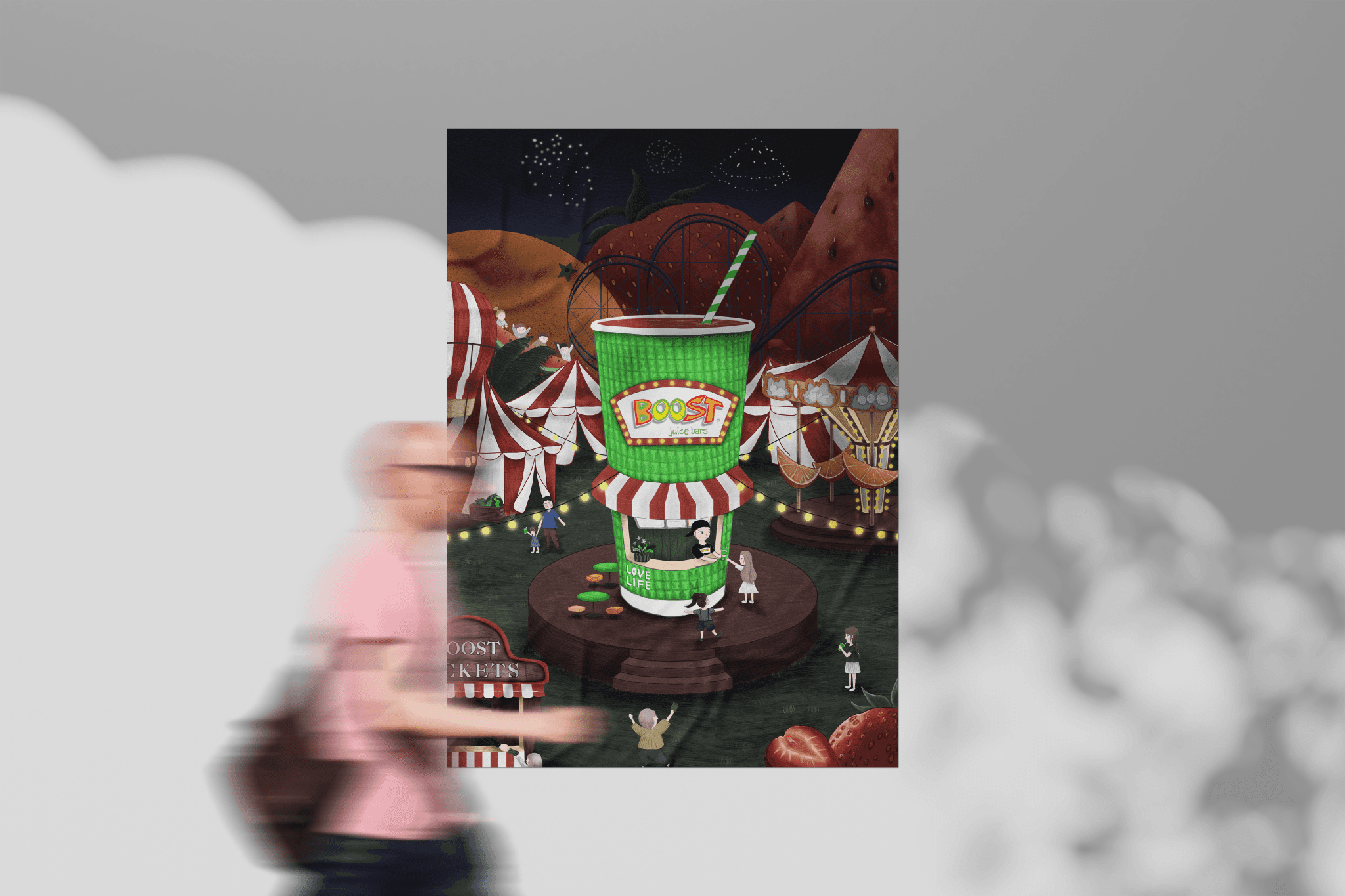
An advertorial illustration that showcases their brand's identity, unique style, and products.
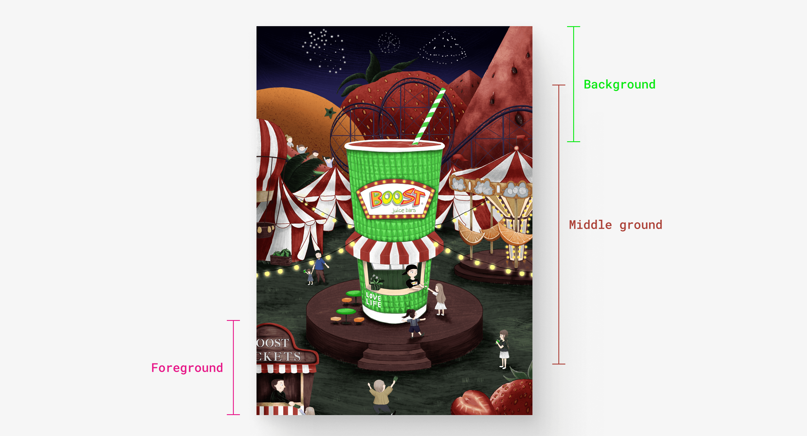
0.1
Use of foreground, middle ground & background.
IMAGE
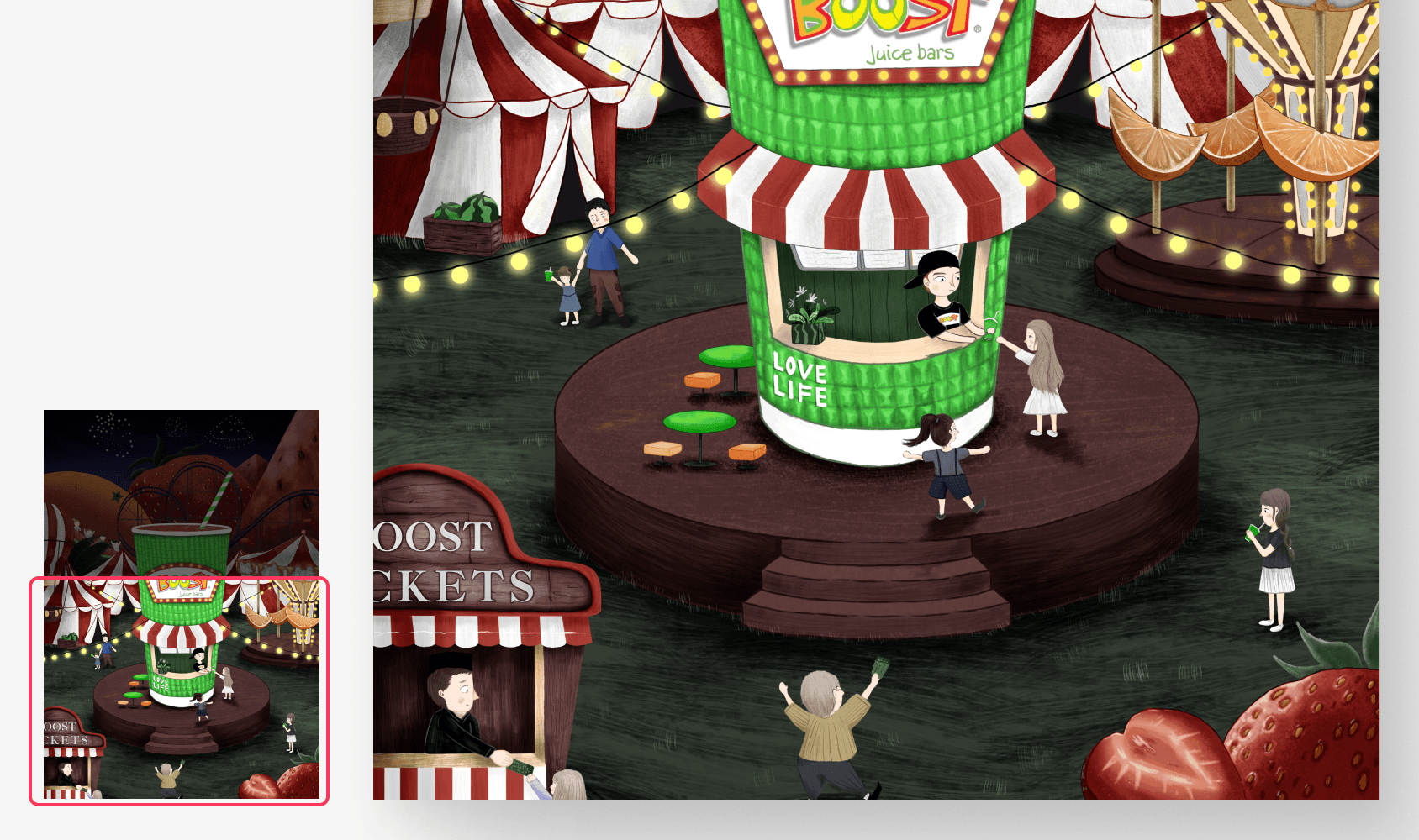
0.2
Illustration with using texture techniques.
IMAGE
Obstacles encountered.
Creating outstanding artwork
Limited brush selection. Due to the lack of a variety of brushes, I was unable to create textural effects in my digital artwork.
Tight timeline. Although I have three weeks to complete the assignment, I also need to conduct research and work on assignments for other courses, which may affect my ability to fully focus on this project.
Limited digital art skills. Since this is my first time creating a digital drawing, my attention to detail may not be enough and I need to watch tutorials to improve my skills.
{
The Challenge
}
Creating art and conveying brand identity under time and skill constraints
To make it even better.
Brand selection & idea inspiration
During my research, I explored three brands: Boost Juice, Starbucks, and Farm Fresh and I also brainstormed various artistic ideas for these brands.
Last, I chose Boost Juice for two reasons.
Unique challenge. It represents a style I have never tried before, and its success will enrich my portfolio.
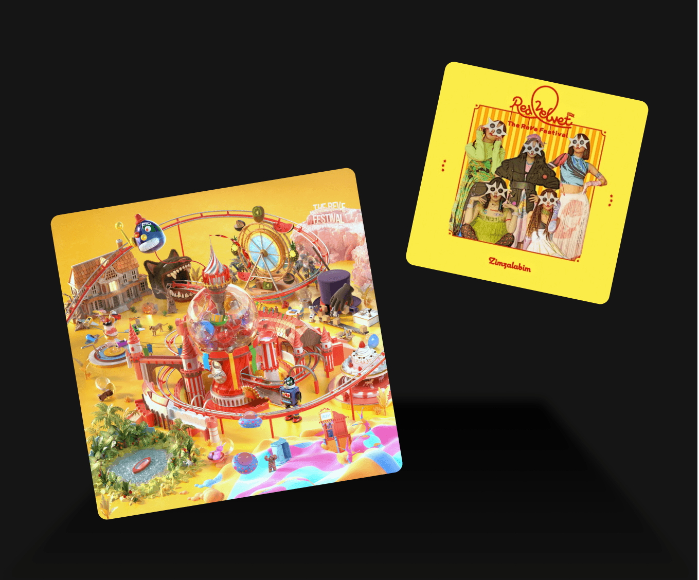
Summery vibes influence. At that time, I was heavily influenced by the summery vibes of K-pop songs and music videos, particularly Red Velvet's "Zimzalabim," which greatly inspired my creative process.
1.1
Inspiration from music.
IMAGE
1.2
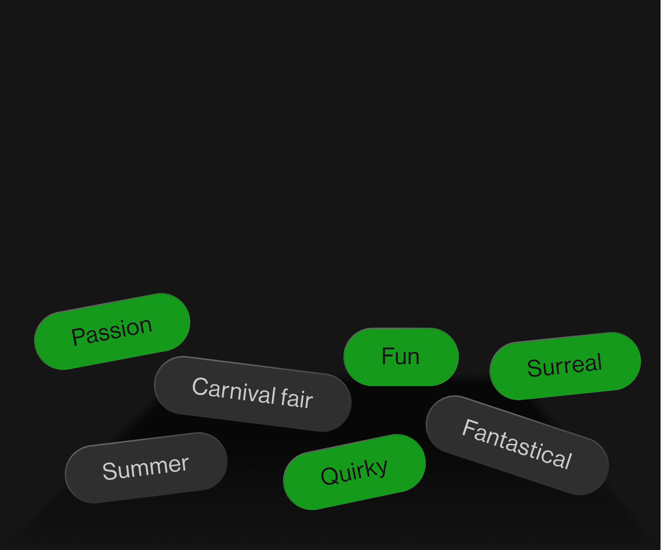
The style that applied to this work.
IMAGE
Crafting fun.
Color palette & visual elements
After identifying the feeling and message I wanted to convey with this illustration, I immediately searched for relevant elements and color palettes.
2.1
Visual references.
IMAGE
Gathering visual elements. I collected visual elements related to carnival, roller coaster, merry-go-round, summer, and fruit once I had a clear vision of the style I wanted to achieve.
2.2
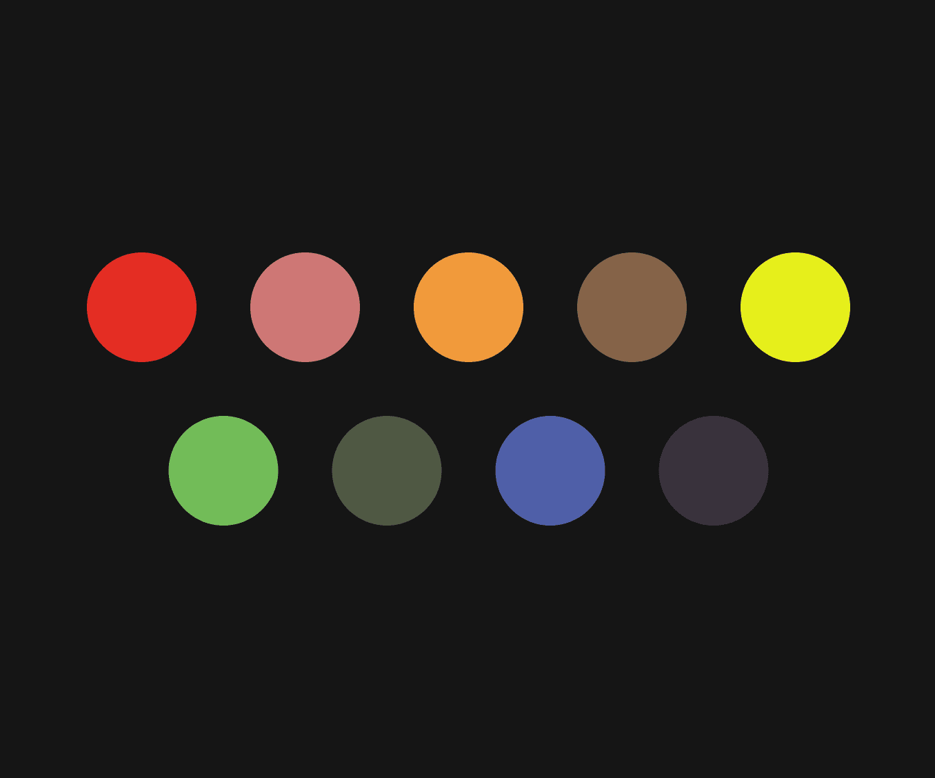
Colour scheme.
IMAGE
Night carnival color palette. This color palette was chosen as it creates a cohesive look that suits the fantastical and enchanting atmosphere of a nighttime carnival.
Illustration style
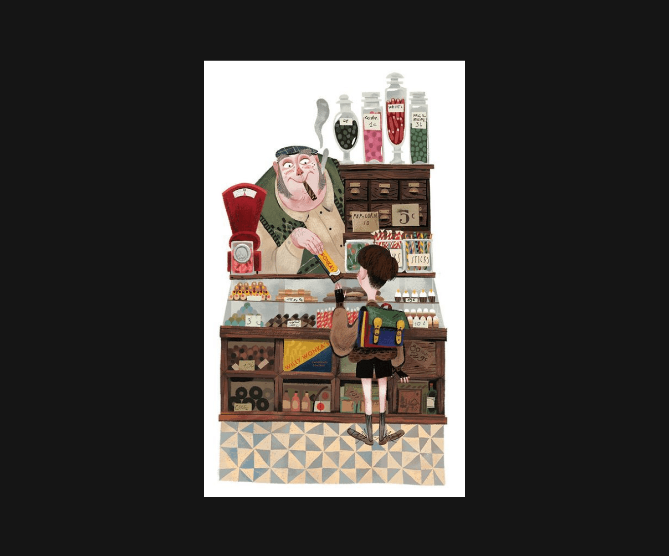
After careful consideration, I finally opted for an illustration using the texture technique (Figure 2.4), which appeared more refined and more match with the brand identity, although it required more time.
Then I search the brush that can create this kinds of texture.
2.3
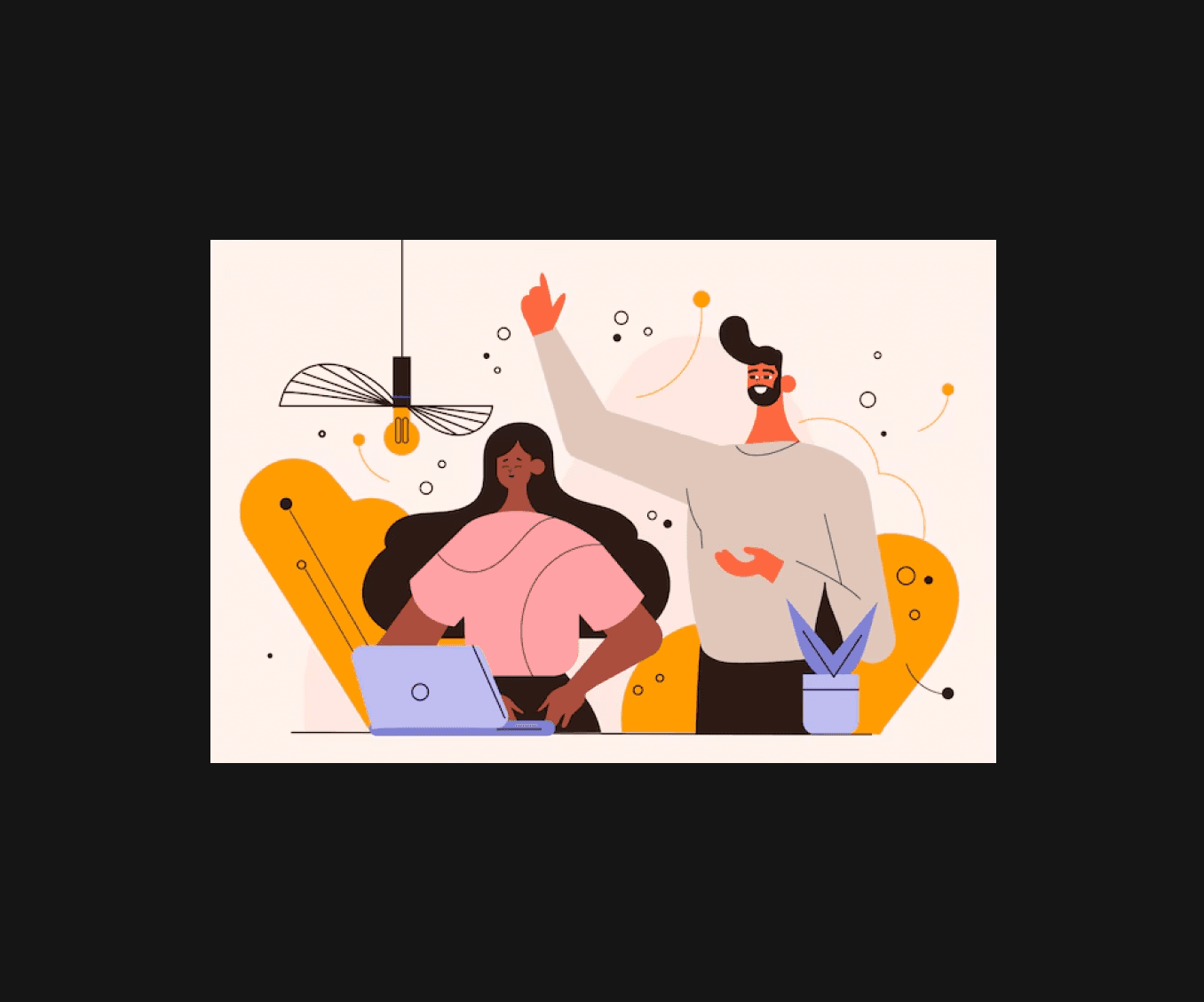
Flat illustration style.
IMAGE
Clarity and simplicity. Flat illustration quick to produce and straightforward in visual communication and it are well-suited for modern or minimalist aesthetics.
Lack of depth and visual interest. Flat illustrations may lack depth and tactile quality compared to textured illustrations as they might not convey a sense of realism or materiality.
Mismatch with brand identity. This brand uses 3D posters extensively and flat illustrations might not convey the desired depth or visual impact consistent with the brand's dynamic and 3D style.
2.4
Textured illustration style.
IMAGE
Visual richness and depth. Textured illustrations helps to make the artwork more visual appeal compared to flat illustration.
Time and skill intensive. Creating textured illustrations typically requires more time and skill than flat illustrations.
The evolution of the artwork.
Sketches
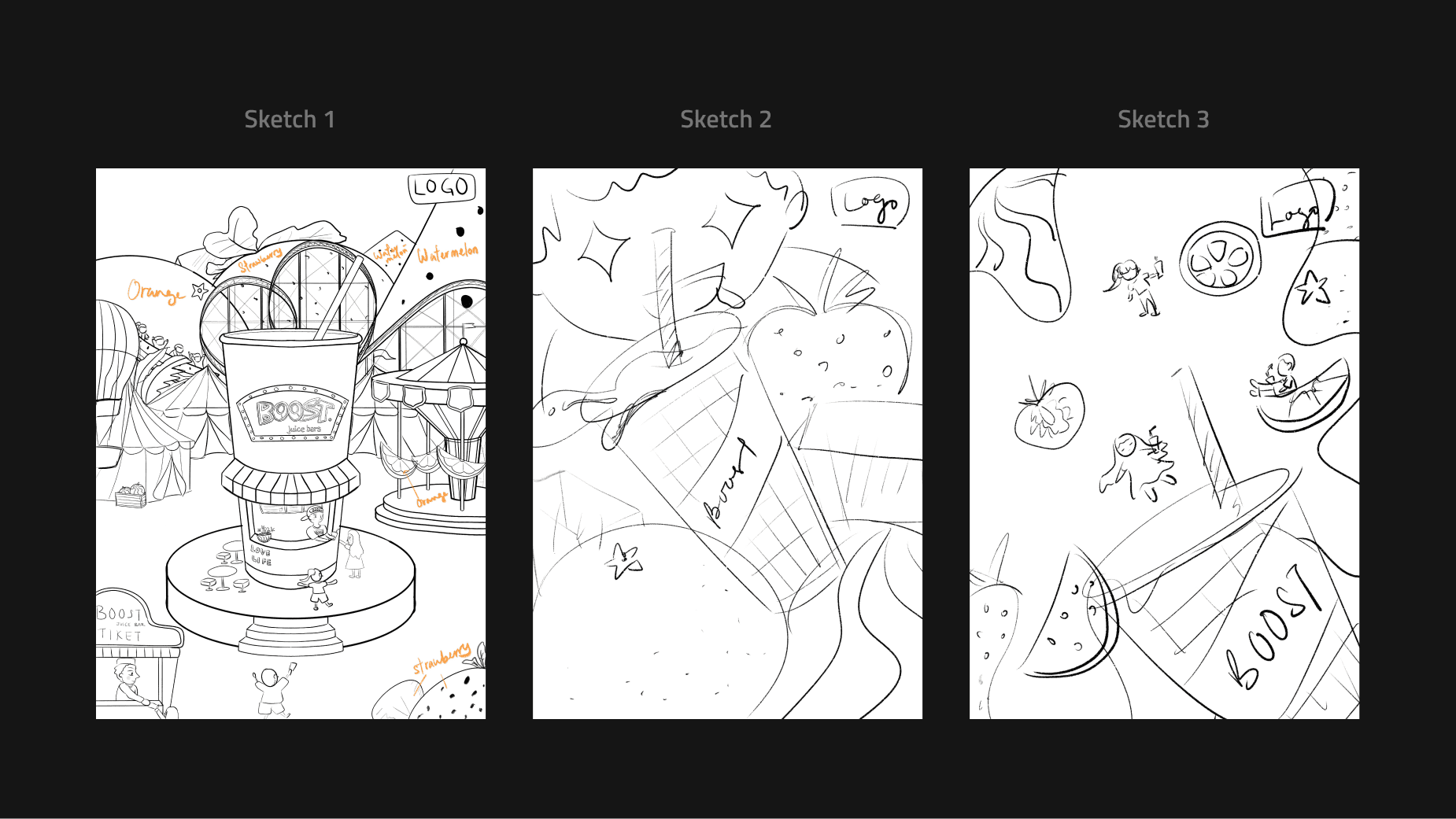
After finding references, exploring various compositions and designs, I created 3 sketches.
In the end, based on my lecturer's suggestion, sketch 1 was chosen as it best captured the concept I wanted to convey (Figure 3.1, left).
3.1
Sketches.
IMAGE
Drawing process
3.2
Drawing process showcase.
VIDEO
The grand finale.
Skills mastered and brand identity delivered
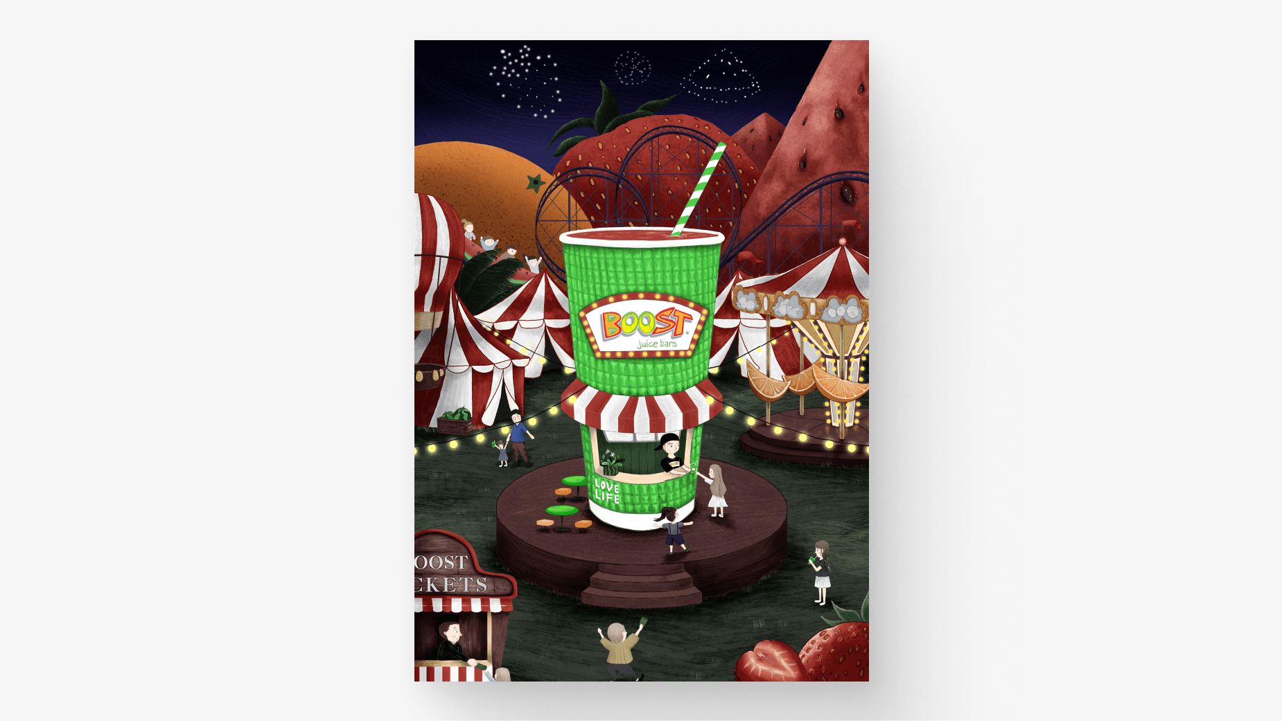
This illustration taught me a lot from experimenting with new styles to mastering various drawing techniques.
The process was an invaluable learning experience that greatly enhanced my skills and added depth to my creative portfolio.
4.1
Final outcome.
IMAGE
A pleasant surprise.
{
Achievement
}
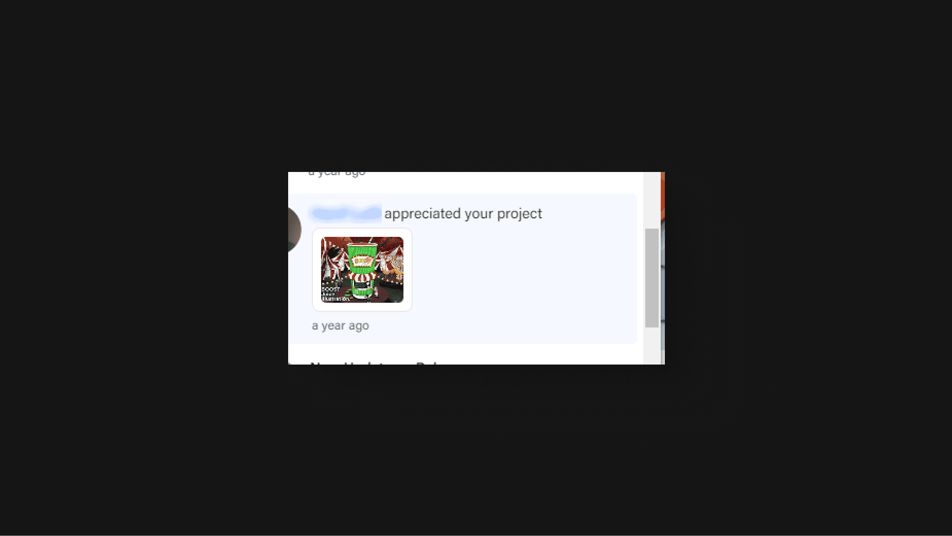
This illustration was well-received, earning the second highest marks and receiving a like from the lead designer on Behance.
5.1
Appreciated from Boost Juice designer.
IMAGE
Lessons learned
Digital illustration is fascinating
Unlike traditional painting, digital illustration allows me to work in layers, making it easy to modify any part of the artwork at any time.
Experiment with styles
Trying new styles and successfully overcoming the final challenge added variety to my portfolio and expanded the boundaries of my abilities.
Seek inspiration everywhere
Inspiration can come from unexpected sources, such as music, movies, or everyday experiences.
Time management is important
Constructive feedback from clients is invaluable for refining and enhancing the design process and final output.
