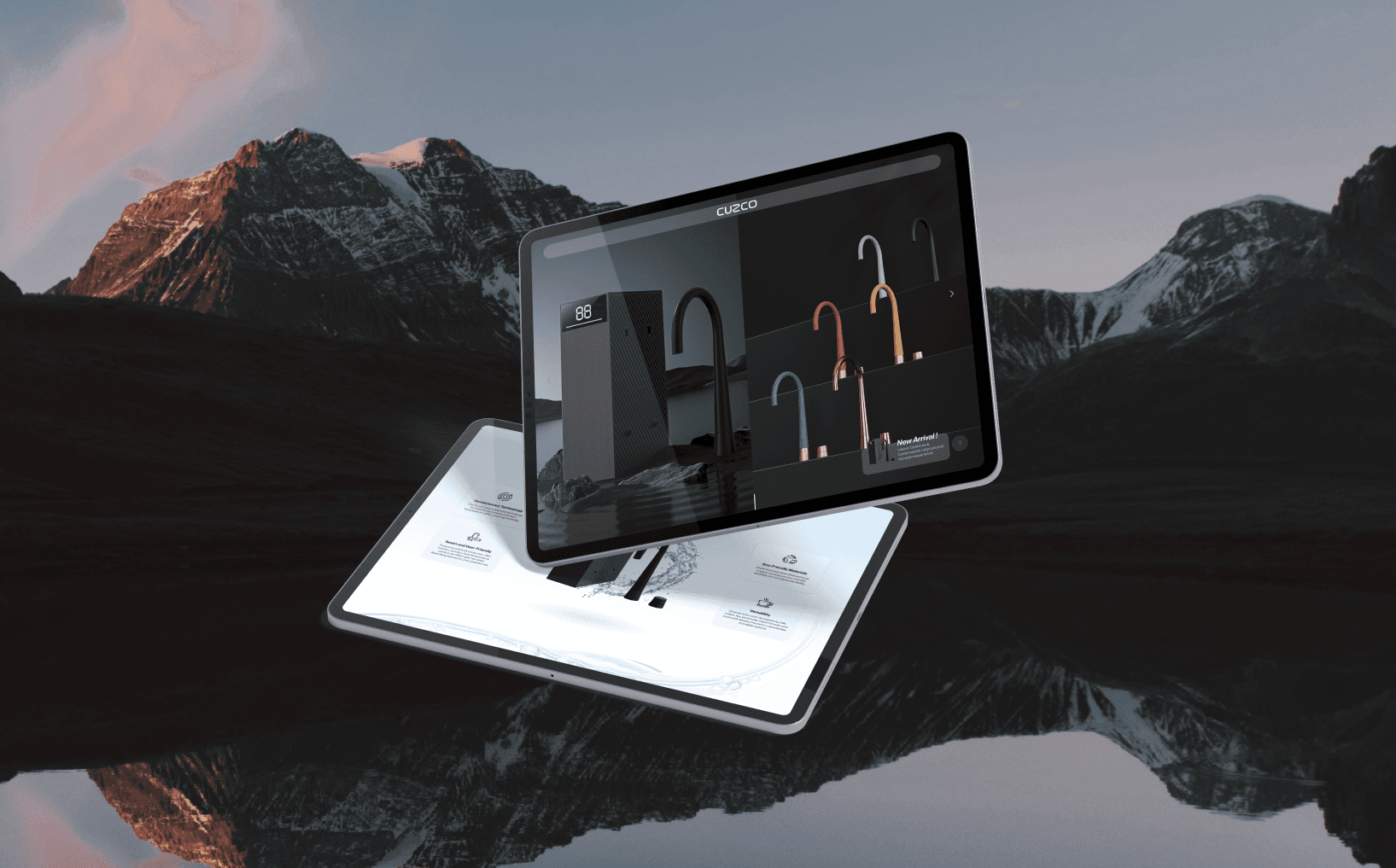
Cuzco
Web Design, Landing Page, Real-World Project - August 2023
Timeline
2023.11 (1 weeks)
Industry
Home appliance, Smart home technology
Role
UI/UX designer (end to end)
Tools
Figma, Adobe Photoshop, Adobe Illustration, LottieFiles
Responsibilities
Content, Prototyping, UI design, UX design, Usability testing
Overview
Cuzco is a company dedicated to revolutionizing home convenience through innovative faucet technology. Their products epitomizes their commitment to quality and functionality, offering instant, continuous, and customizable hot water solutions.
This landing page has been created to promote their advanced faucet and inform clients about its unique features and numerous benefits.
{
Highlights
}
A landing page that help to introduce their products.
Creating with limited resources.
But still need to overcome it
Directly create high-fidelity prototyping. This meant I had to take a lot of time in design and content, because I need to get it right the first time.
Tight timeline. Within three days, I need to research (find references) and design the home page to establish the website's design style.
Translate and streamlining excessive information. The client provided an excessive amount of information in Chinese without simplifying it, so I had to streamline it myself.
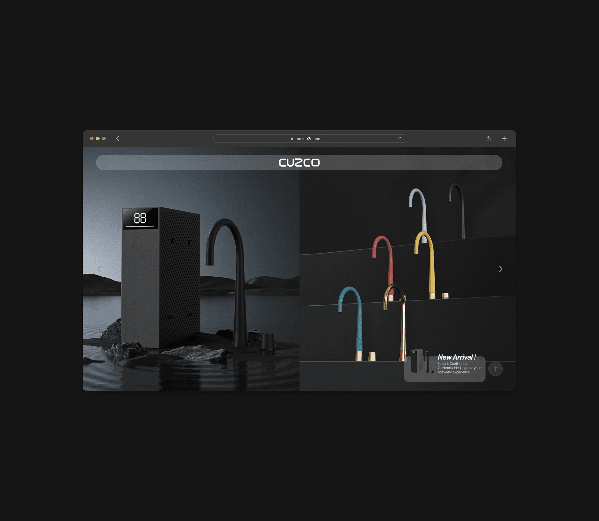
Vertical photos provided only. The vertical photos can't be enlarged horizontally and the photos will be cropped, hiding parts of the product at 1920 resolution.
No references available. There is a lack of available references for content and style of webpages in this industry.
{
The Challenge
}
Design a landing page that effectively showcases the unique features of their faucet despite limited references.
Some records of this project.
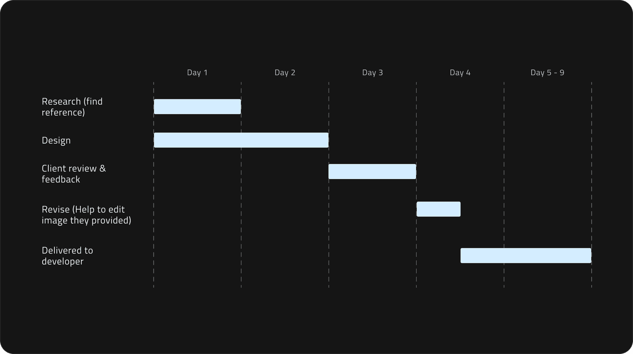
Design timeline
The landing page was originally scheduled to be completed within 3 days.
However, due to staffing shortages, I had to design it within 2 days (Figure 1.1).
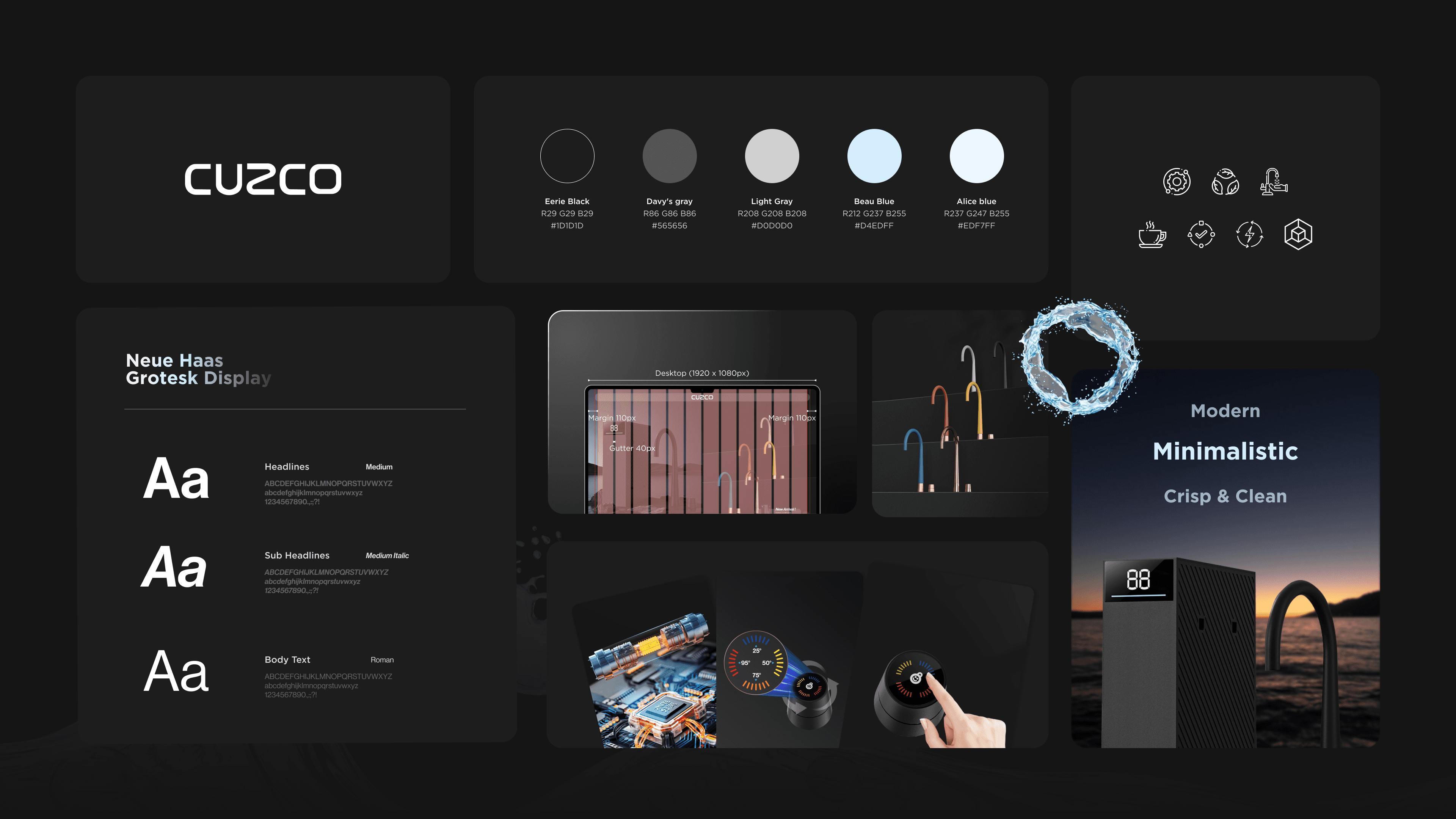
Crafting a consistent visual style.
Visual elements
I defined the website's color scheme based on the client's provided logo and target audiences, aiming for a clean, modern, minimalist, luxurious, and elegant style (Figure 2.1).
Iterate and Innovate.
1. Addressing image limitations
Since the client provided vertical images, there were design limitations, such as not being able to enlarge the photos without users losing the complete product view (Figure 3.1).
To address this, I combined 2 vertical images into one hero image (Figure 3.2) and implemented a slider to allow for more images to be displayed.
Vertical photos can't be enlarged horizontally. This results in blurry and incomplete product images, impacting users from seeing the full product image and user experience.
Combine 2 vertical images. Combining two vertical images into one hero image allows users to see the complete product image and enhance user experience.
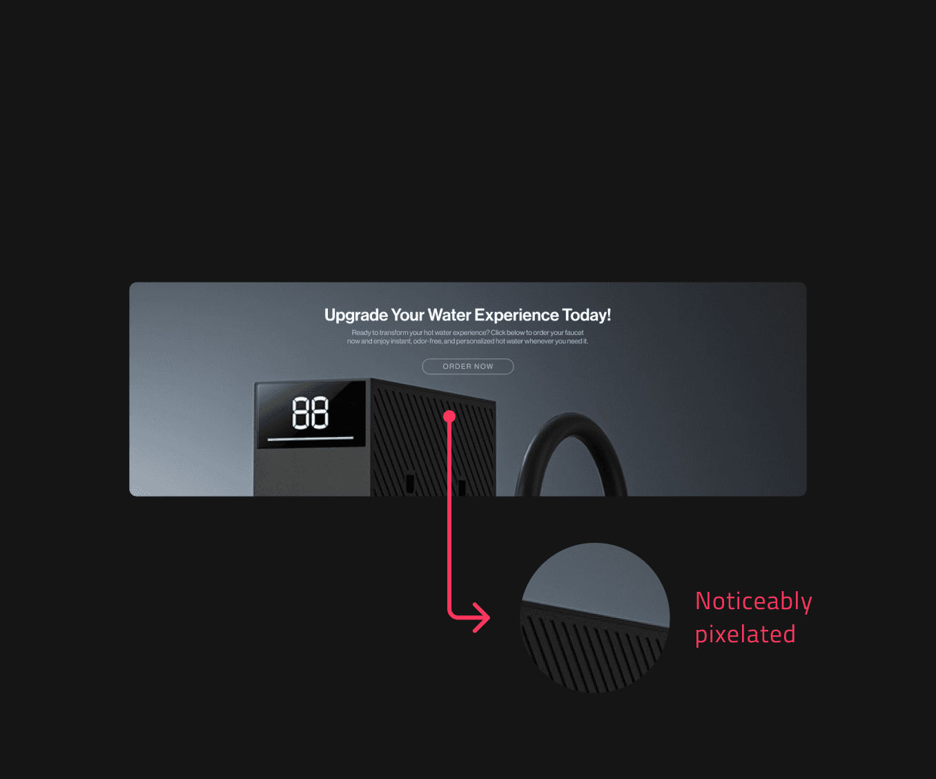
Similar to the previous image, only vertical mid-resolution images were provided, unsuitable for enlargement (Figure 3.3).
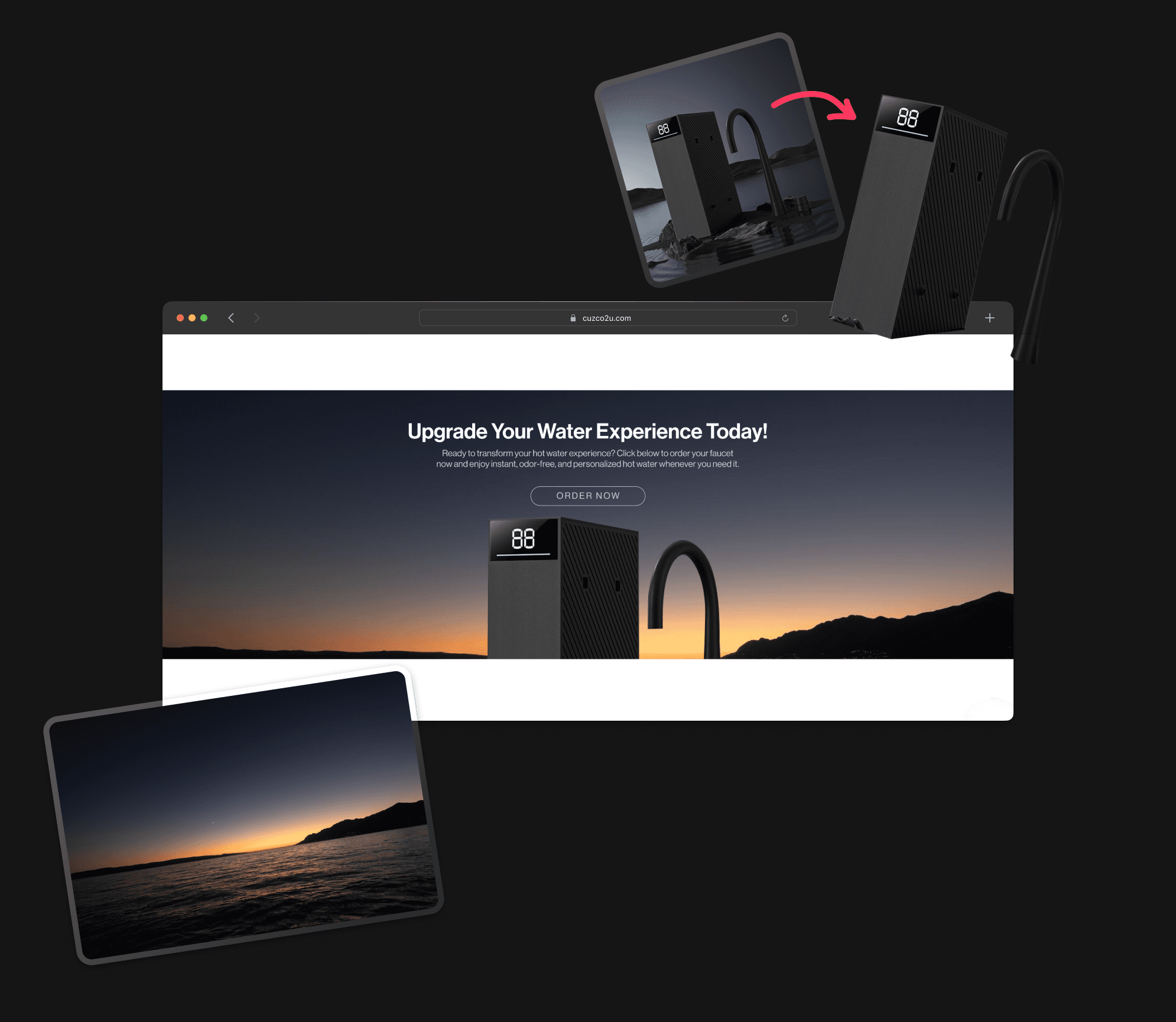
Therefore, my final solution was to extract the main object (Figure 3.4).
Noticeable pixelation when enlarged. As display resolution increases, this effect worsens, severely impacting overall visual quality.
Foreground extraction and background replacement. Extract the main object from the image and replace the original background with a commercially usable one, allowing the product to be partially displayed.
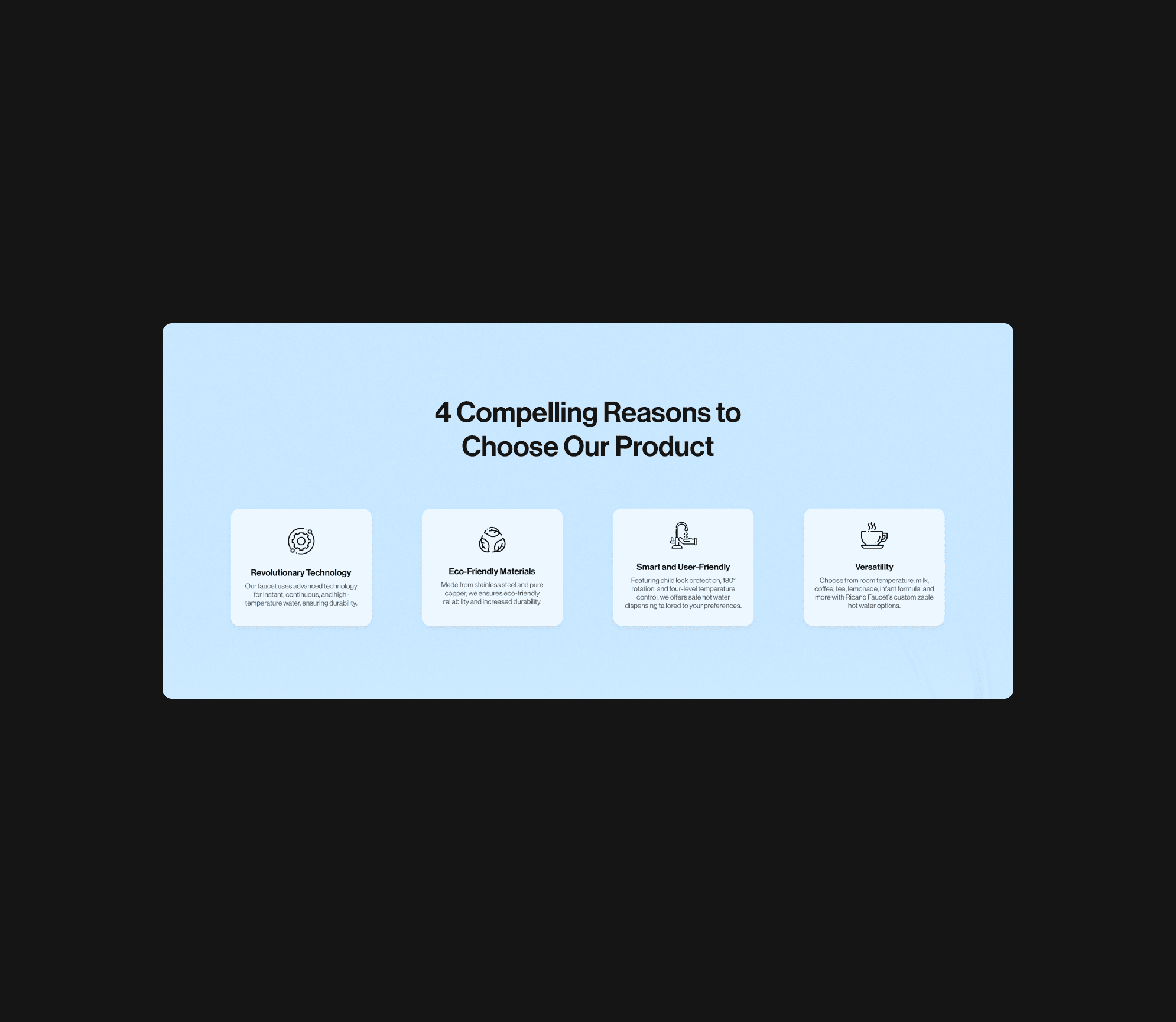
2. Optimized news & updates section layout (homepage)
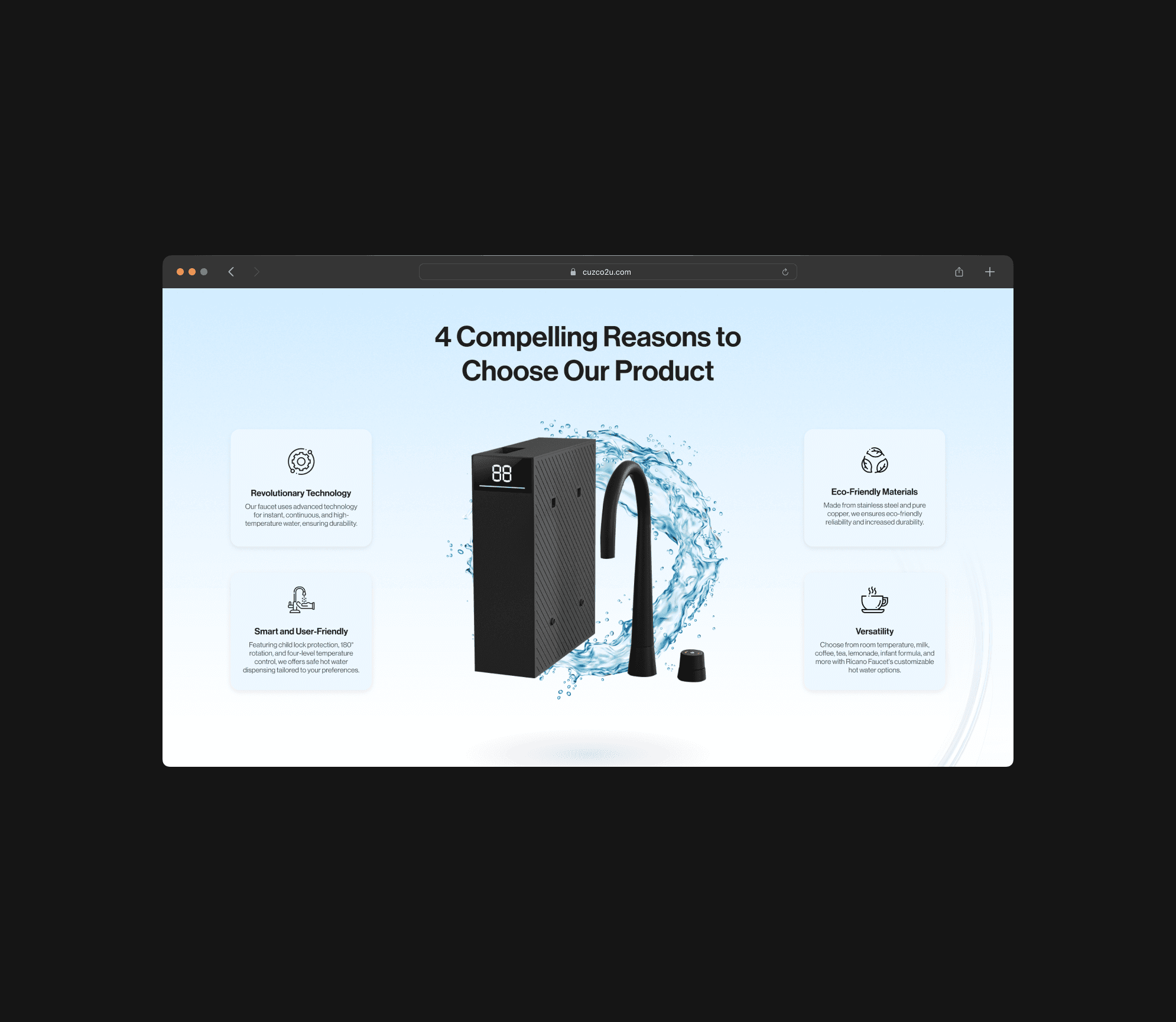
At first, I envisioned a design where the content would be centered, accompanied by titles (Figure 3.5).
However, I later crafted another layout, design 2 (Figure 3.6), as the layout of design 1 closely resembled the previous section. After comparing the 2, I opted for the second design.
Lack of visual appeal. This could lead to a monotonous and dull visual experience, causing users to quickly forget the content after a brief glance.
Use a 3-column layout. Product features on both sides and the product in the middle (a circular water ripple effect rotates automatically at its behind, attracting attention and enhancing visual appeal).
Apply gradient color & texture on background. By using gradient color background(blue to white), it can helps to enhance the visual appeal of the webpage, attract user attention, and reinforce brand identity.
3. Framing for visual harmony
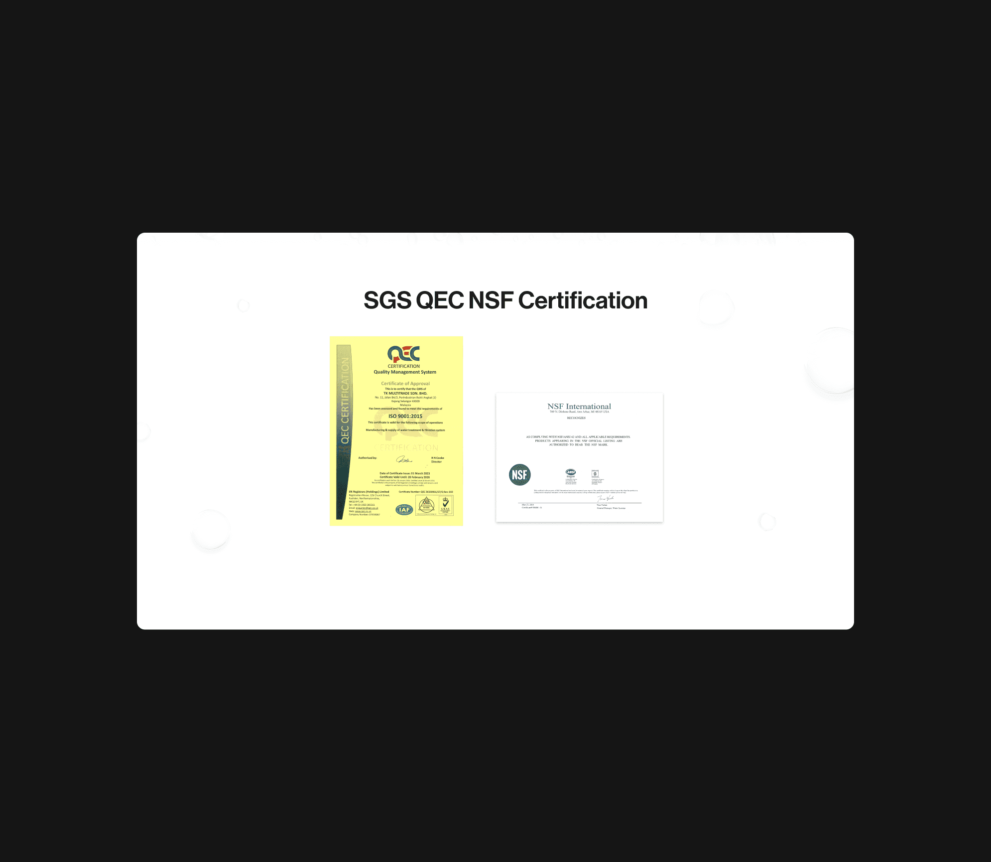
The client directly provided two certificates, 1 yellow and 1 white (Figure 3.7).
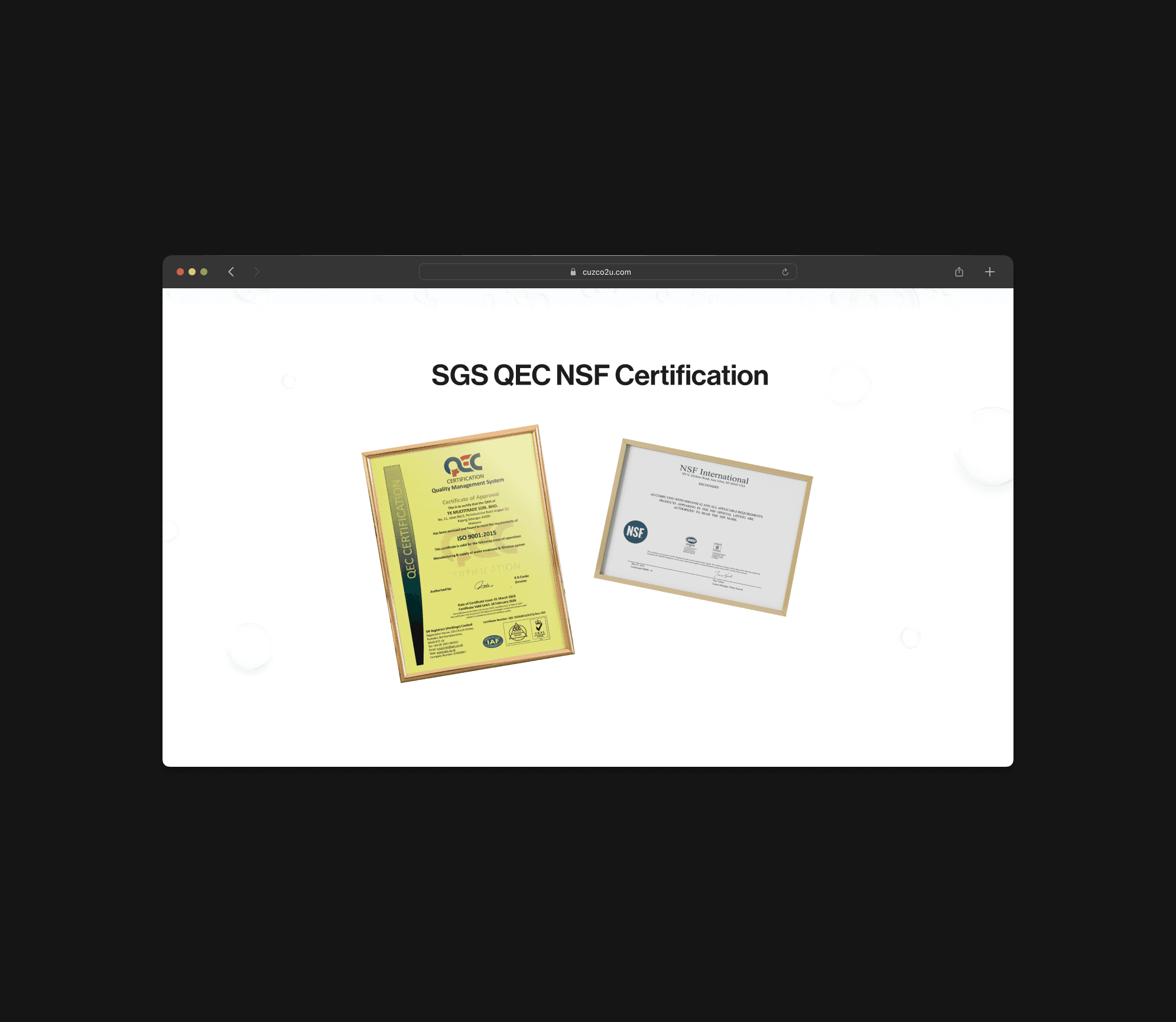
Since the background was white, I utilized a frame mockup from the Freepik platform (Figure 3.8). Additionally, I purposely rotated the objects in different directions for visual appealing.
Visual harmony problem. The white certificate blends into the background, and when placed alongside the yellow certificate, the composition looks unbalanced and dull.
Framing certificates for better display. Use a frame mockup for both certificates ensures the section looks harmonious and prevents the white certificate from blending into the background.
Almost one shot.
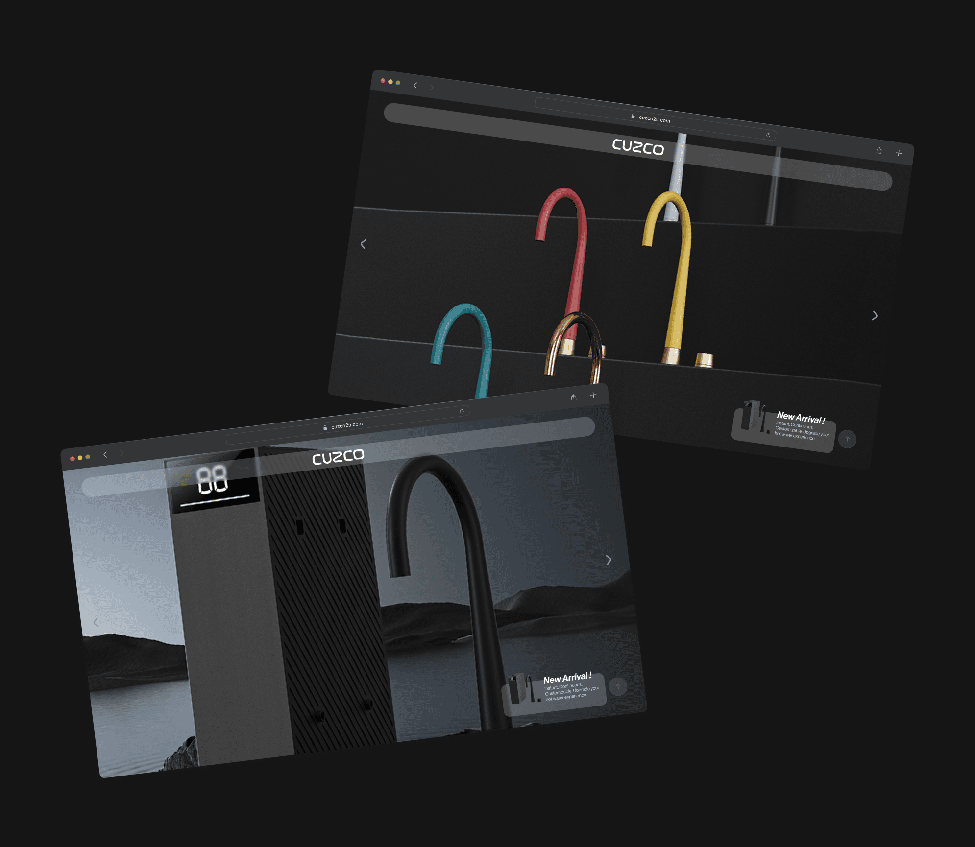
Clearly convey the information
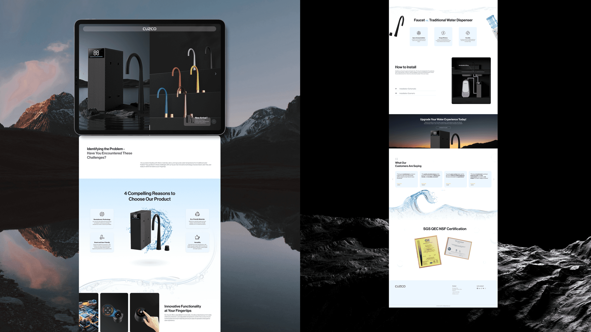
Figure 4.1 illustrates the final design of this project.
This project successfully enhanced my web design skills and improved my approach to problem-solving.
{
Retrospective
}
A successful resolution.
{
Achievement
}
Delivered successfully, with stakeholders expressing their satisfaction.
Lessons learned
Simplifying and highlighting key information is important
Simplifying and retaining important information ensures that viewers quickly understand product features and achieve website goals.
Engaging visual presentation and layout
By using dynamic and appealing design elements, users are less likely to become bored and are more likely to stay engaged with the content and continue exploring further.
Photo resolution and quantity issues can be addressed
Explore various methods to enhance visual impact, such as cropping key elements to improve photo quality and using mockups to enrich the overall design.
