App UI/UX (B2C), Real-World Project - Oct 2023
Timeline
2023.10 - 2023.11 (1 month)
Industry
Web3 & cryptocurrency
Role
UI/UX designer
Tools
Figma, Adobe Illustration
Responsibilities
Competitive analysis, Wireframe & prototyping, Logo design, UI design, UX design, Usability testing
Team
1 Product manager
2 UI/UX designers
2 Developers
Overview
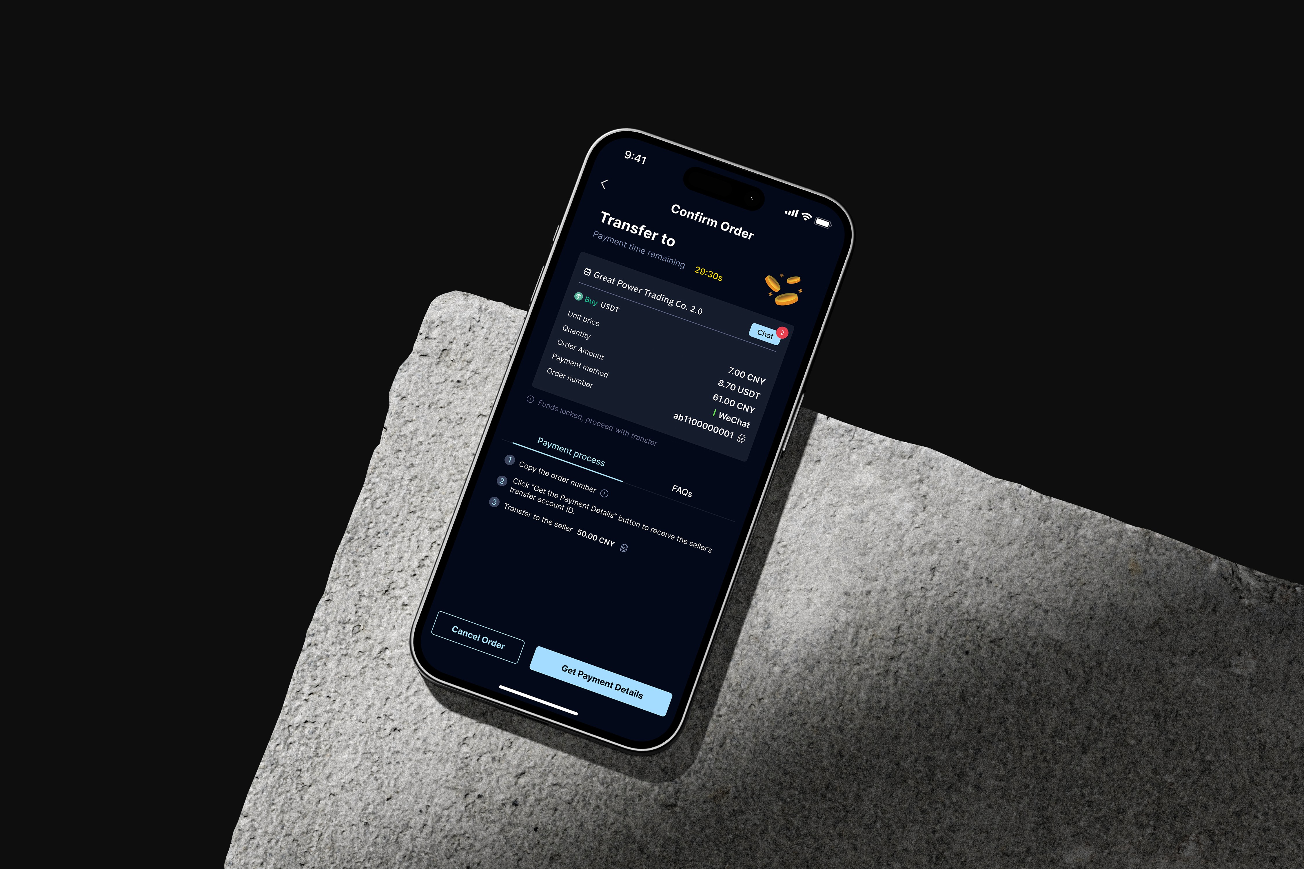
This project is about a cryptocurrency trading app in China, offering users the ability to effortlessly purchase and receive cryptocurrency using widely-used payment methods.
When I joined the team, the P2P feature had already been outlined by the PM. However, the detailed flow and design had not yet been finalized.
In this project, I was responsible for designing the logo, creating the overall UI, and developing the buyer and seller payment flows for the P2P feature.
Notice:
This project was designed with a Chinese-first focus. To help viewers understand, the content has been displayed in English.
{
Highlights
}
A P2P cryptocurrency trading app designed to let users execute trades quickly, efficiently and safely.
First try at crypto design.
Turning complexity into clarity
Logo redesign. Stakeholders requested a logo redesign, and my manager assigned the task to me and it was my first time designing a logo.
Complexity of information. There was a significant amount of complex information that needed simplification and thoughtful selection of components.
Balancing aesthetics and functionality in design. Need to ensure that the visual design is appealing while still functional and user-friendly.
Alternative payment method. For P2P, users buy virtual currency from sellers and then get the transfer account for making payments.
{
The Challenge
}
Ensuring that users can execute trades quickly and efficiently.
Laying the foundation.
1. Audit the payment flow options
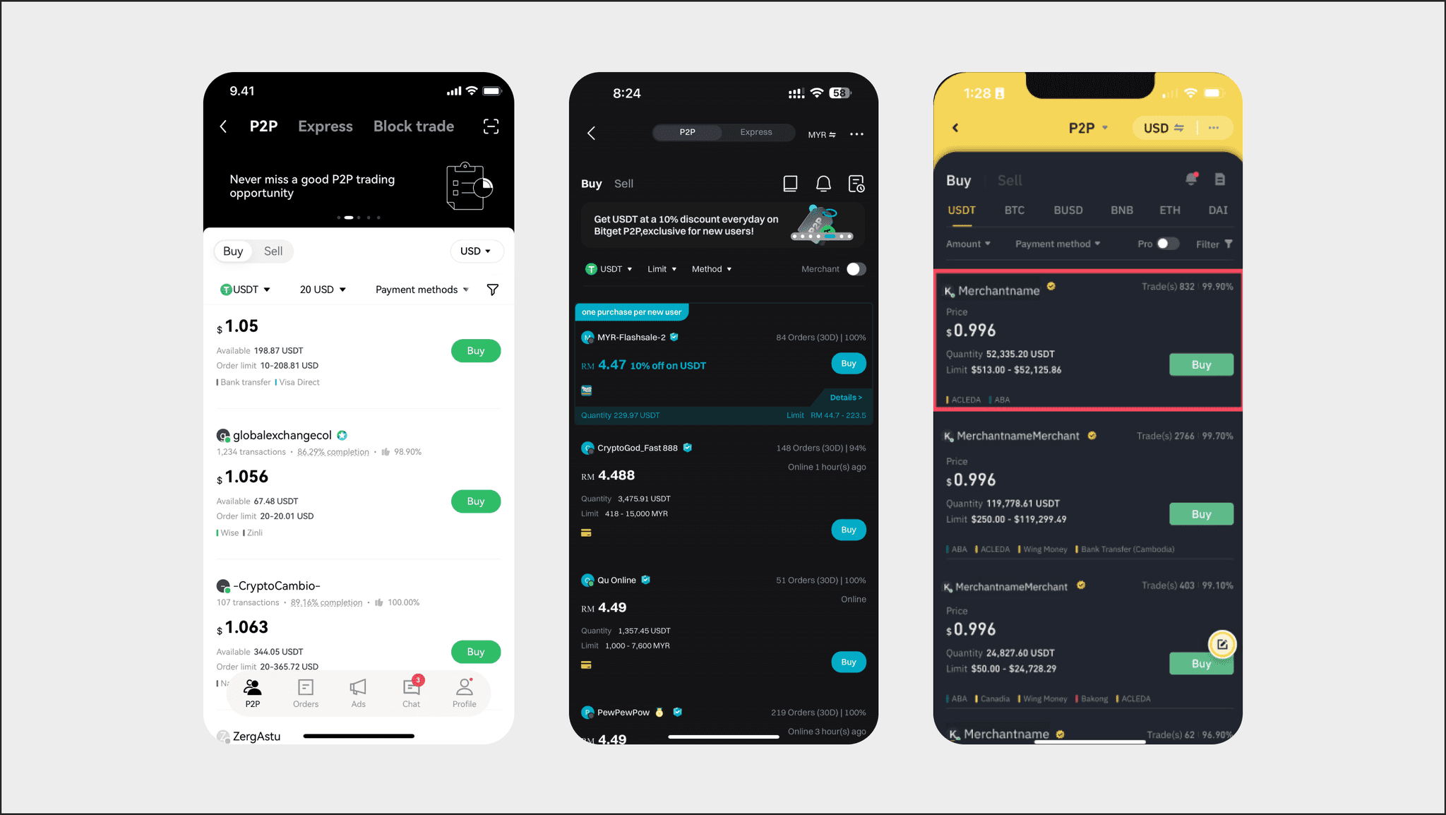
To begin, I researched other cryptocurrency apps to see how they handled similar features (Figure 1.1).
I also reviewed their official websites, which provided guidance videos detailing everything from the order screen to the completion of the transaction, including how users manage payments, upload proof, and interact with sellers or customer service.
Designing for user engagement.
Logo redesign and visual elements
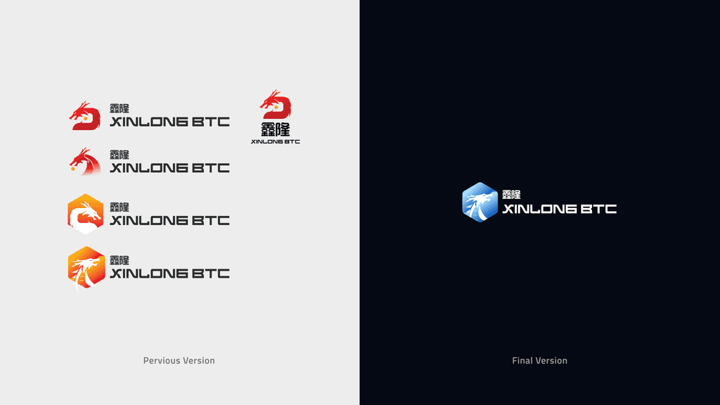
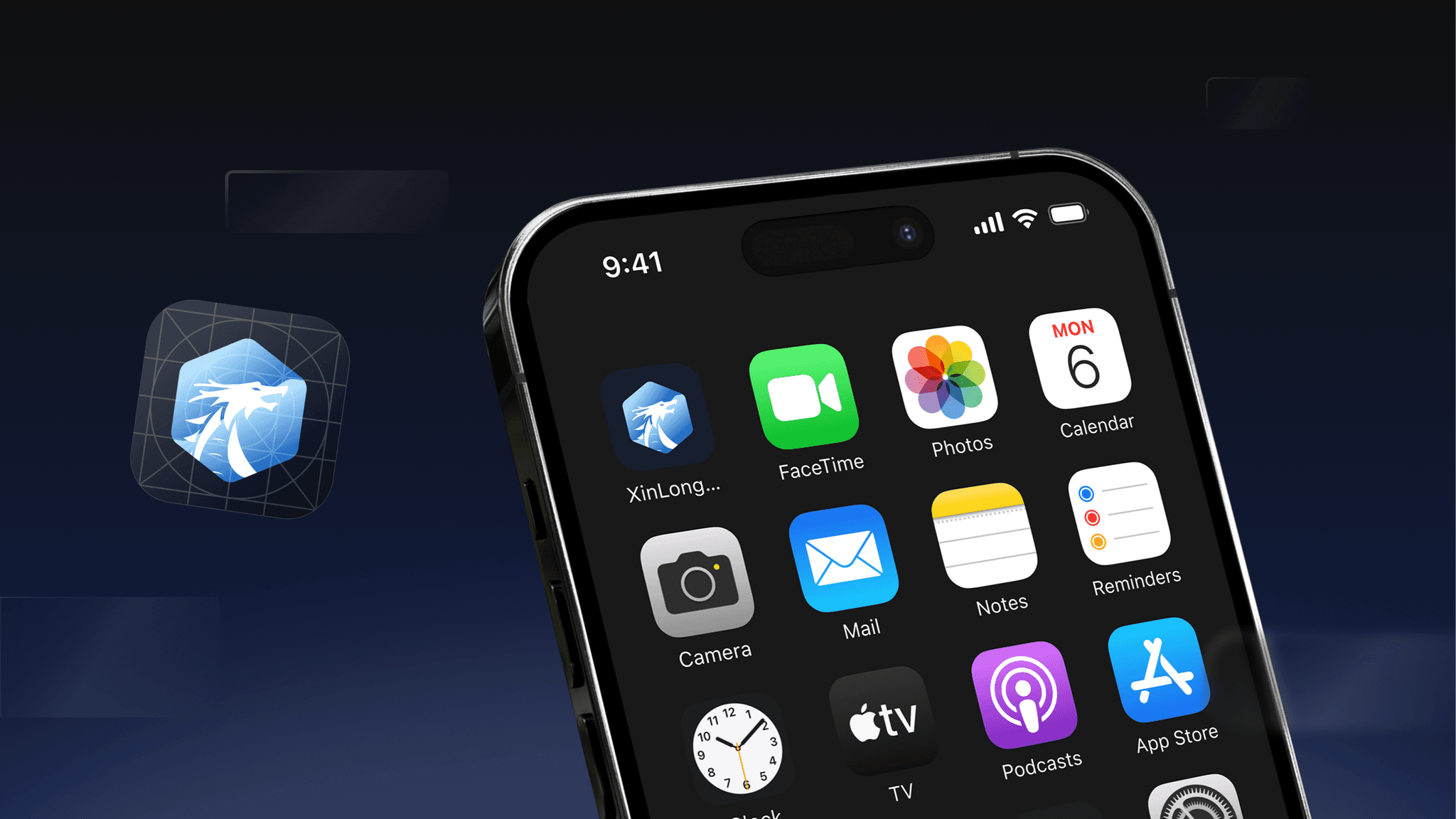
First, I was tasked with redesigning the logo, I created five versions for the stakeholders (Figure 2.1, left). After their review, they requested a color change to blue. The final version of the logo was then transformed into a gradient blue design (Figure 2.1, right).
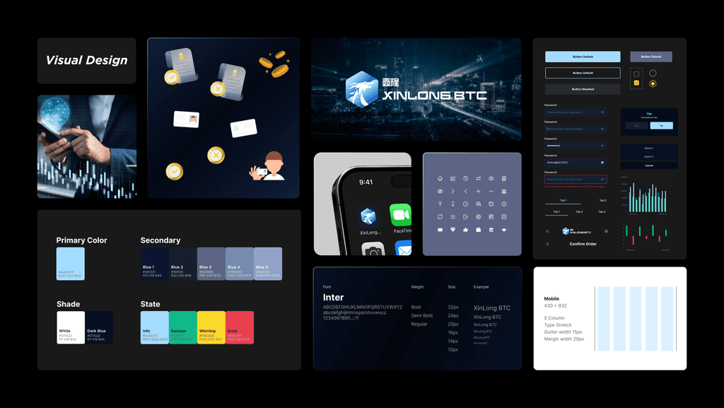
Figure 2.2 shows that the visual elements that used on this app.
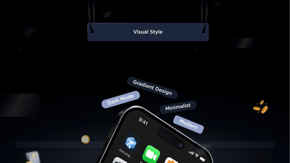
The app's color scheme has been defined based on the new logo, aiming for a modern, minimalist style, gradient design, and dark mode color (Figure 2.3).
Exploring possibilities.
Payment flow options for buyer
After researching, I noticed that many platforms allowed buyers to interact directly with sellers, but my team proposed handling interactions through customer service instead.
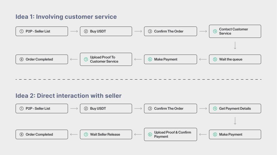
After user testing, I discovered some pain points and this led me to create two design options for the payment flow (Figure 3.1).
Develop the ideas
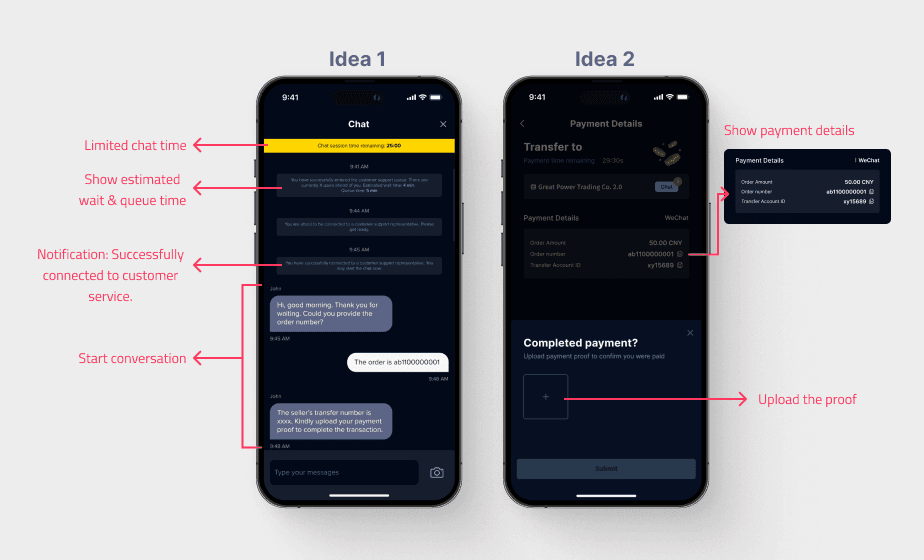
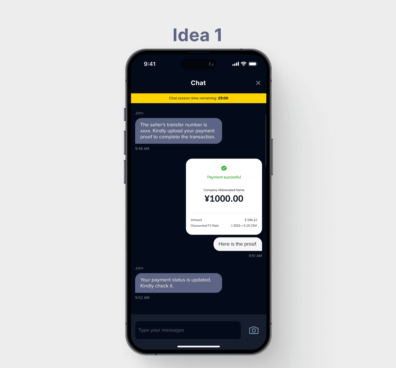
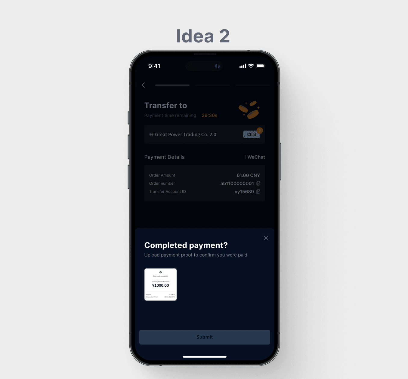
The different ideas (Figure 3.2, 3.3 & 3.4) to determine which payment flow would work best.
Idea 1: Involving customer service
Users contacting customer service to get the transfer account ID and uploading proof of payment for verification. Chatting has a time limit.
Idea 2: Direct interaction with seller
Users getting the seller's transfer account ID (WeChat/QQ) directly after ordering, then uploading proof of payment, with the seller confirming the transaction.
Idea 1 or Idea 2?
After consideration and discussion with teams and stakeholders, we choose idea 2 (Figure 3.6).
As idea 2 is the better choice because it speeds up transactions and gives users more control over the process. Idea 1 was more technically complex and would have delayed the process by involving customer service for verification.
In other words:
Idea 1: Like a relay race, with more steps and waiting on others, slowing down the process.
Idea 2: Like running a short race with the finish line in sight—direct and user-controlled.
Increased security. Customer service acts as a mediator, ensuring that the transaction is handled securely and reducing trust concerns.
Slower process and time constraints. Going through customer service slows the process, while time constraints can pressure users into making mistakes.
May cause higher cancellation rate. As users may become impatient with the added step of contacting customer service, which can feel inconvenient.
More efficiency. Users can directly obtain the seller’s payment details without needing a third party and speed up the payment and confirmation process.
Reducing the customer service burden. It allows customer service agents to focus on complex help center issues rather than routine tasks.
Trust issues. Users may worry about dishonest sellers, but the platform can ease these concerns by allowing them to report suspicious activity for further investigation.
Seller's flow after receiving an order
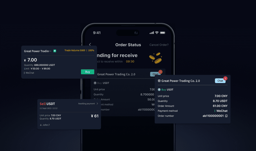
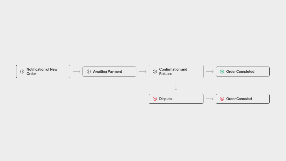
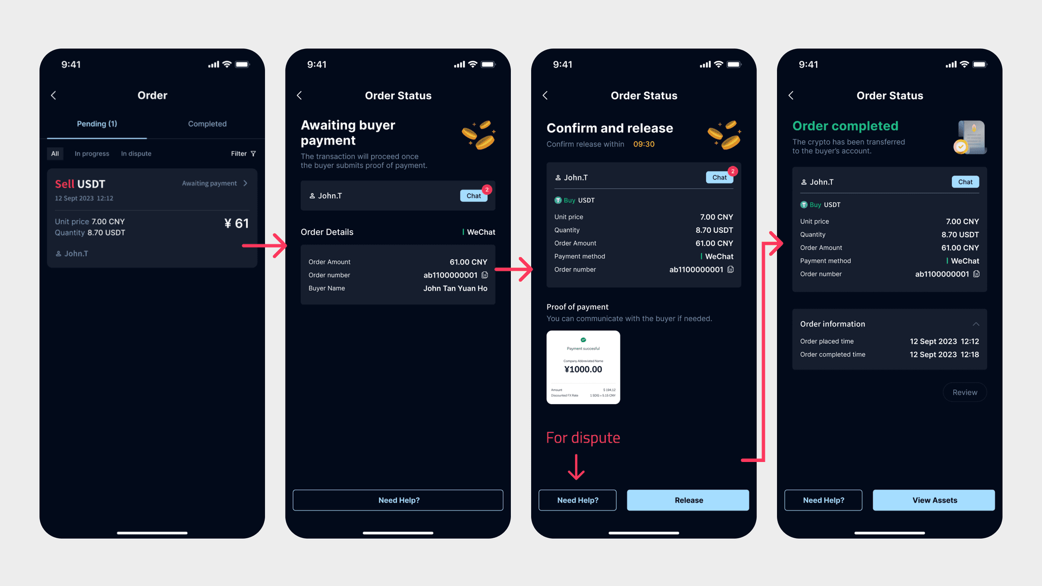
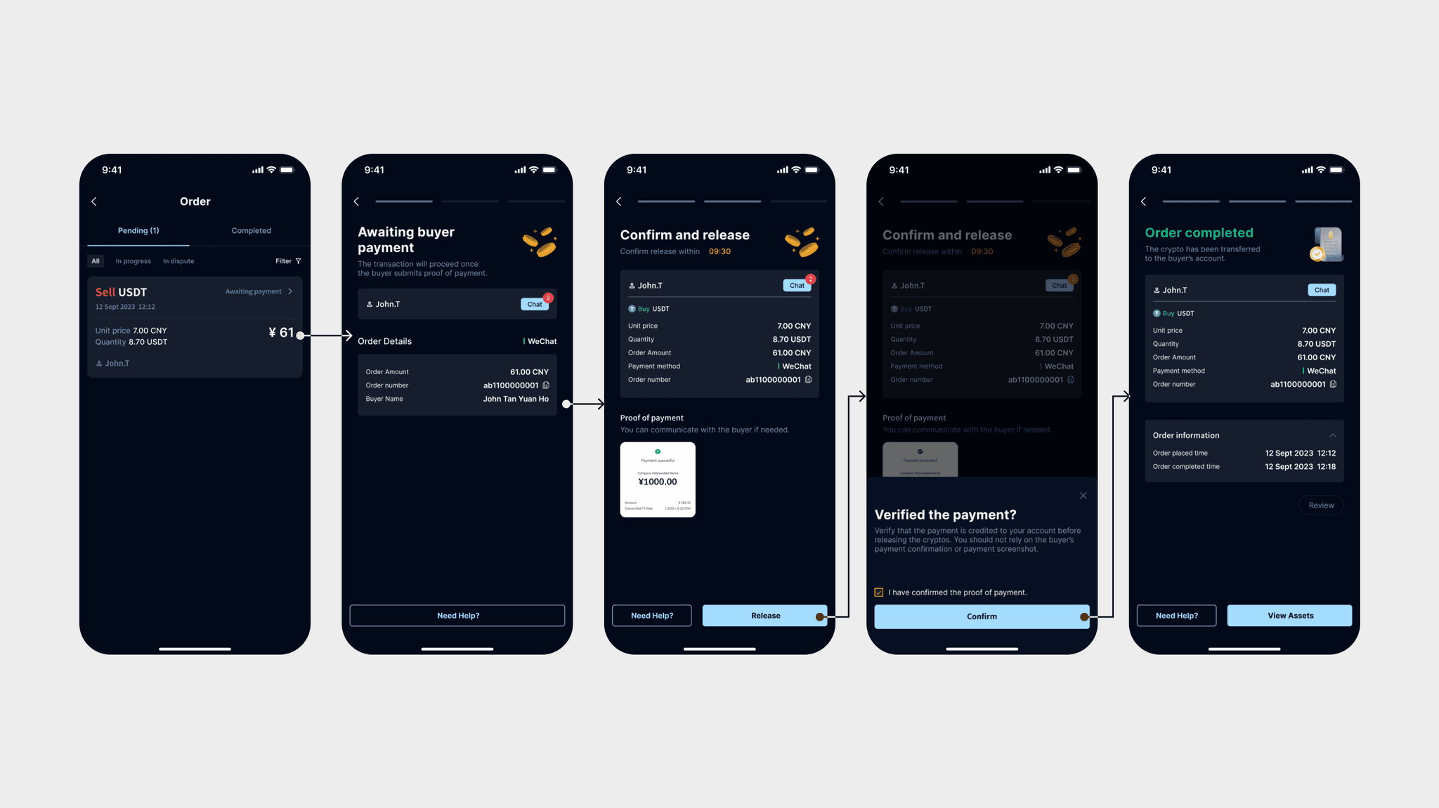
After finalizing Idea 2, I then focused on designing the seller's screen for when they receive an order (Figure 3.7).
Seller's screens
After confirm the flow, I design a similar 3-step process for the seller to helps create consistency across the platform and keep the flow simple and easy to follow for both parties (Figure 3.8).
Design for 'order canceled' screen
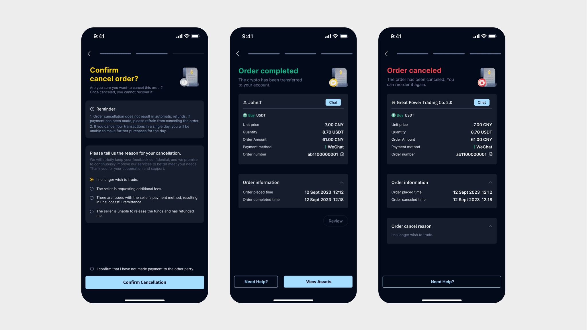
To clearly indicate the current status of the order, I used different colors.
Both the buyer's and seller's screens display the reason for cancellation, allowing them to review the details. (Figure 3.9).
Layout exploration
To determine which layout provides a better user experience in terms of information clarity, usability, and visual appeal, I explored 2 different layout designs for this cryptocurrency app, which are classic line-separated design (Figure 3.10) and card design (Figure 3.11).
More simplicity and familiarity. Clean and straightforward design avoids visual clutter and users are generally familiar with this type of layout.
Poor navigation experience. Compare to card design, users may find it more difficult to quickly locate specific pieces of information due to the less distinct visual separation.
More visual appeal. The use of cards creates a visually engaging and modern interface, making the platform appear more dynamic.
More readability and comprehension. Cards help break down complex information into manageable chunks, improving readability and comprehension.
CTA button helps increase engagement. It helps guide and prompt users on what to do next, encouraging them to explore further and make purchases.
Is there room for improvement?
To improve user clarity
During our initial testing phase, users expressed uncertainty about their current position in the transaction process.
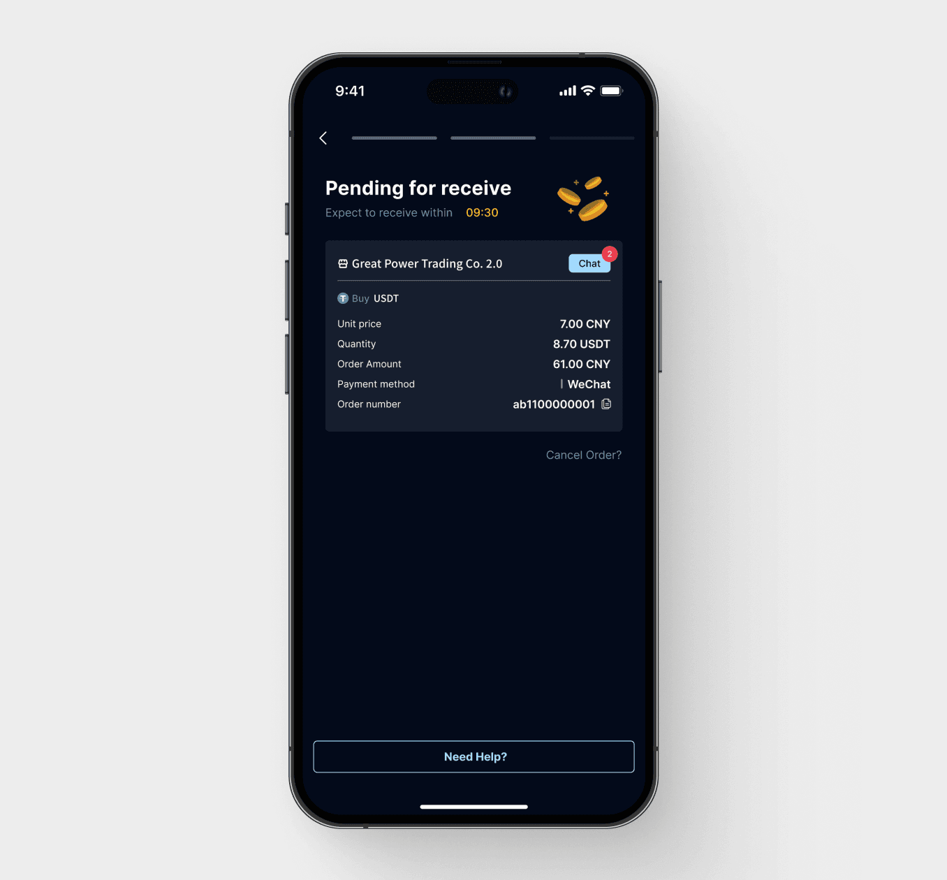
Hence, I added a progress indicator (Figure 4.2) to help users stay informed about where they are in the process.
Before
User feedback that they felt anxious about their payment status and unsure of how many steps were needed to complete the transaction.
After
Progress indicators help to enhance the user experience, providing clarity and minimizing confusion during transactions.
Effortless trading.
A smooth and intuitive user experience
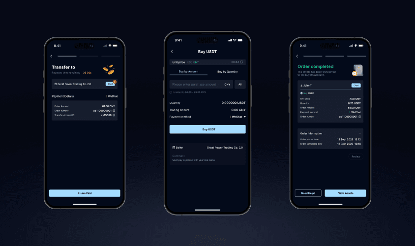
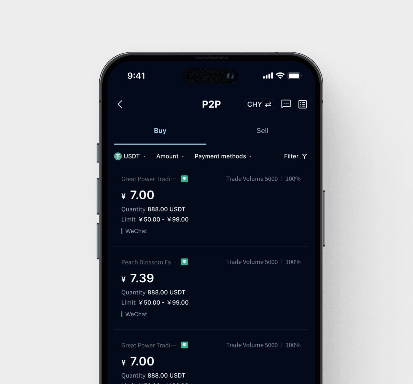
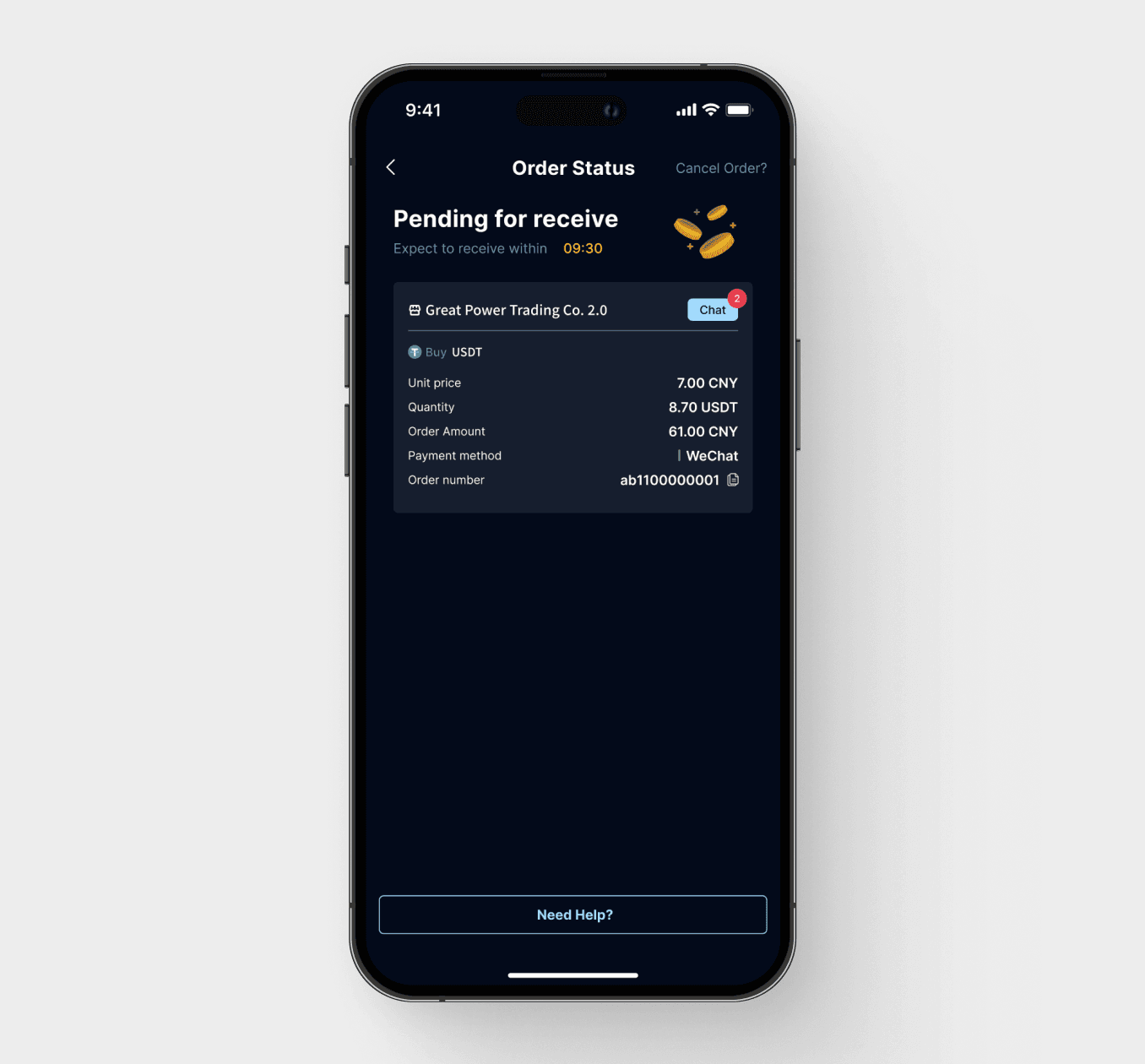
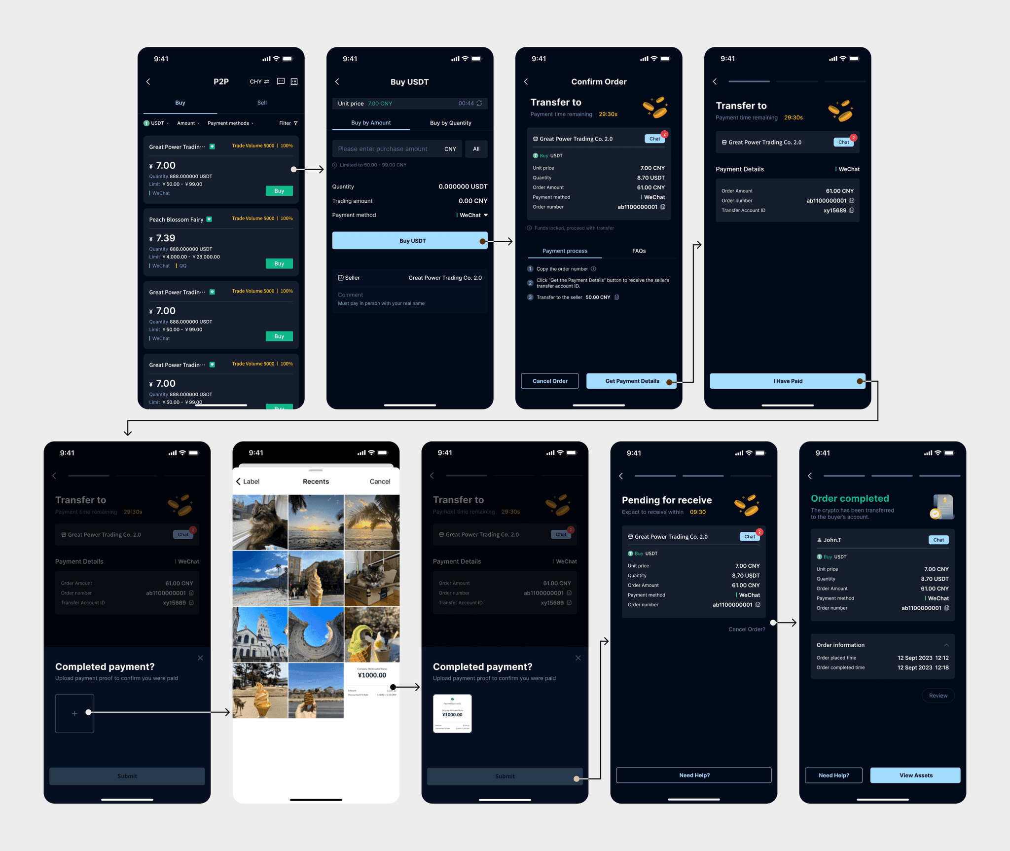
Figure 5.1, 5.2 & 5.3 showcase the final design of the P2P payment flow. Users can enjoy a seamless P2P trading experience.
Growth through challenges.
{
Achievement
}
The feature was successful deliveried.
Lessons learned
Research and user flow help a lot
Research (competitor analysis) and creating user flows helped me quickly understand cryptocurrency apps and some specific terminology.
Communication and collaboration are key
Working closely with the team and stakeholders helped align design decisions and avoid misunderstandings, ensuring a smoother design process.
Exploring all possibilities
I learned the importance of exploring every option, which led to finding more efficient and user-friendly solutions.
