Web Design, Corporate Website, Real-World Project - August 2023
Timeline
2023.08 - 2023.09 (5 weeks)
Industry
Real estate, Start-up
Role
UI/UX designer (0 - 1)
Tools
Figma, Adobe Illustration, LottieFiles
Responsibilities
Competitive analysis, Content, High-fidelity wireframe, Prototyping, UI design, UX design, Usability testing
Overview
TEO Overseas Property is a start-up real estate agency based in Hong Kong. They empower clients locally and internationally through personalized consultation, one-stop property management, mortgage advice, legal & tax guidance and so on.
They handle property listings from the UK, Australia, and Malaysia. Basically their primary clients are from China.
This project was entirely handled by me from 0 - 1 and it was also the first website I've designed with the most number of pages during my internship.
Notice:
After the project is delivered, the client will have full control to independently revamp the content and design, and I will no longer be involved.
{
Highlights
}
A corporate website that help to introduce their services.
A journey from Zero to One.
But encountered some issues
Directly create high-fidelity prototyping. This meant I had to take a lot of time in design and content, because I need to get it right the first time.
Tight timeline. Within 3 days, I need to research (find references) and design the home page to establish the website's design style.
Eye-catching web design. The client requested an attractive web design with interactives and animations to capture attention.
Client's content blank canvas. The client provided only the project photos of the properties and lacked specific ideas for web content.
Pages provided, content to be determined. Manager only informed me about the pages needed, but didn't list the content required for each page.
{
The Challenge
}
Within a limited timeframe, creating content and designing a website that reflects their company's identity.
Some records of this project.
Design timeline & workflow
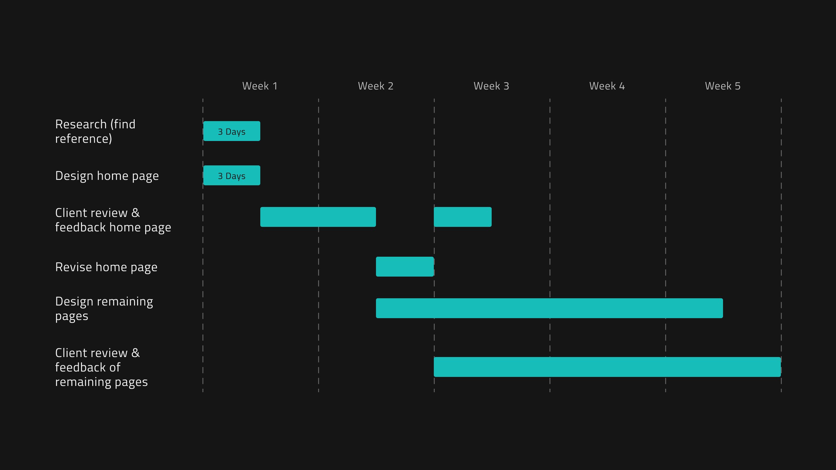
Before delivering the webpage design to client for review, user testing will be conducted to identify any potential areas of confusion for users. The home page, being the first webpage, will take three days to complete (Figure 1.1).
During these 3 days, I will gather references and research competitors' websites to analyze and identify standout features.
Sitemap & feedback sheet
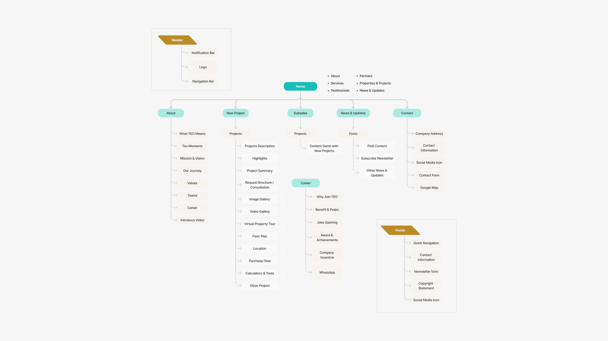
To better understand the typical content of real estate websites, I gathered references and researched competitors' sites. As a result, I created a sitemap to visualize the structure and content (Figure 1.3).
During this project, a Google Sheet was prepared for client feedback. Weekly meetings were held to ensure continuous improvement and alignment with client expectations.
Shaping the identity.
Visual elements
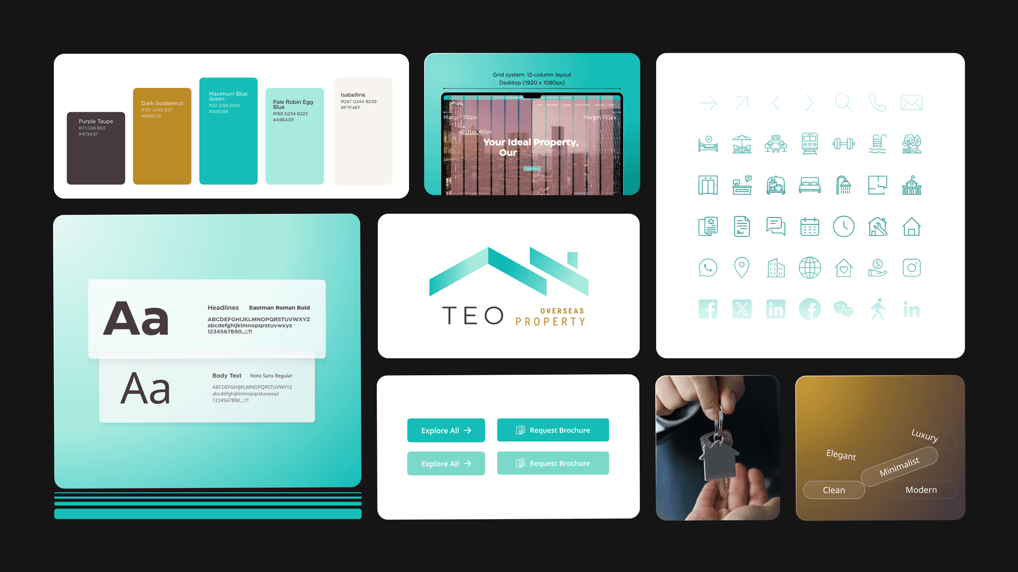
I defined the website's color scheme based on the client's provided logo and their target audiences, aiming for a clean, modern, minimalist, luxurious, and elegant style (Figure 2.1).
Crafting memorable experience for lasting impressions.
Design & content audit
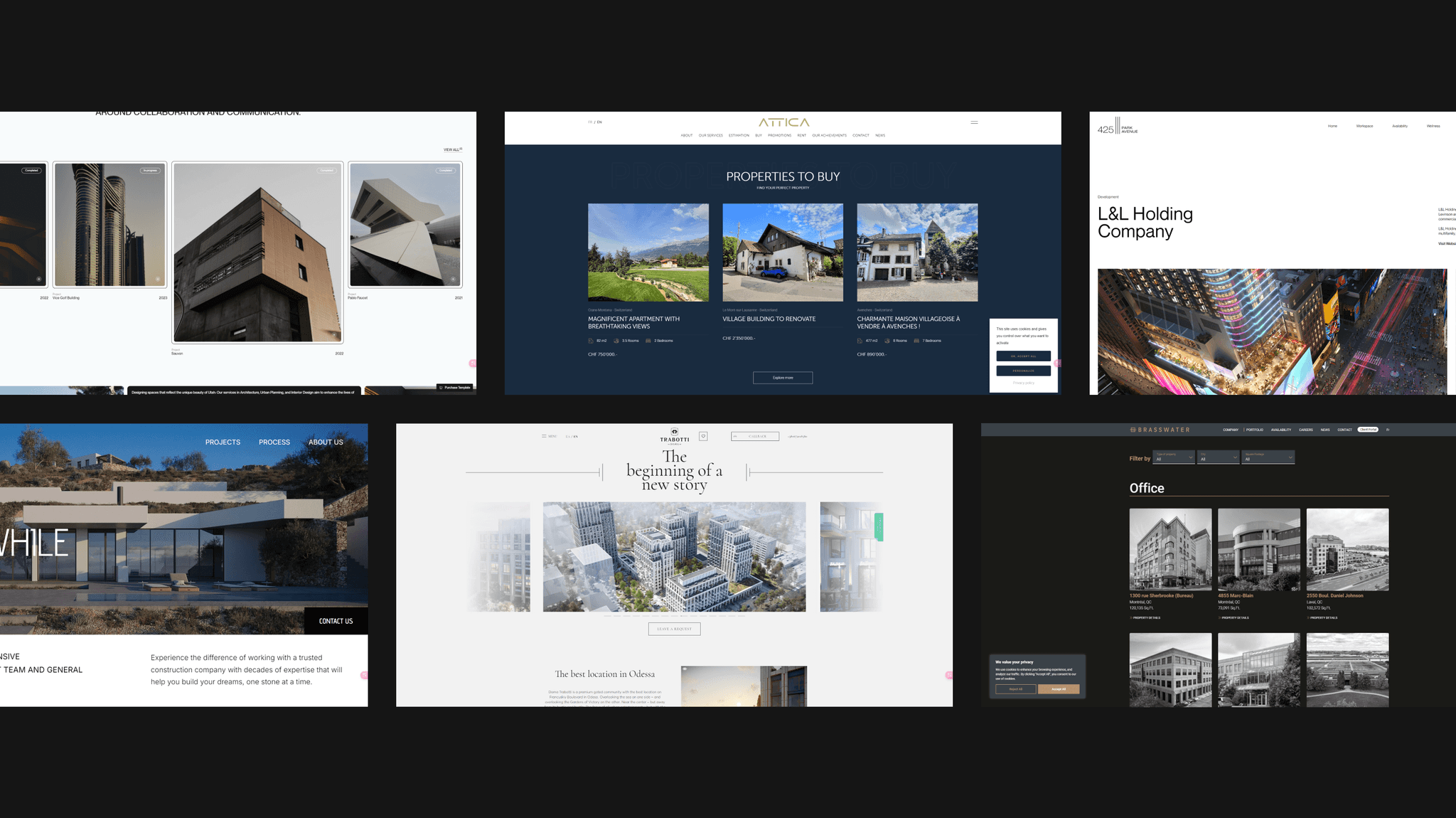
I conducted an audit of over 20 website designs and content, included other industries, and analyzing key pages such as the homepage, about page, contact page, and more (Figure 3.1).
An effective design ensures users remain engaged, easily finding the information they need.
Journey timeline
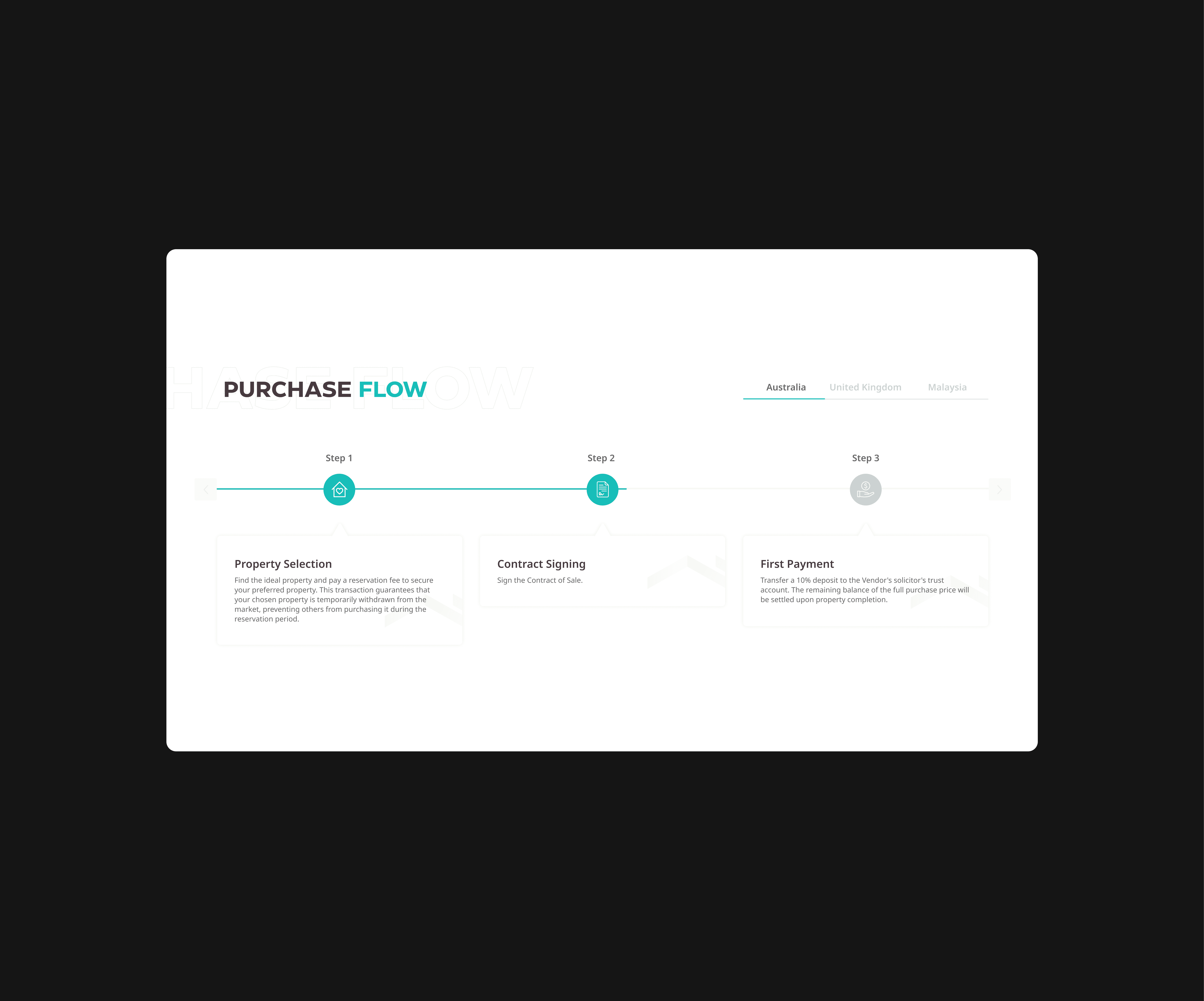
Although it's a startup company, I designed a journey timeline support their growth and long-term development. Initially, I considered using a horizontal timeline (Figure 3.2) similar to a purchase flow.
However, since this component is better suited for illustrating a career webpage's purchase flow, I opted for Design 2 (Figure 3.3), a draggable horizontal slider.
Monotony. The left design is more monotonous and less dynamic, which might not capture users' attention as effectively as the more visually engaging right design.
Limited information display. Purchase flows need straightforward designs, but icons and text lack the flexibility to highlight significant milestones effectively for displaying a complex journey timeline.
More visual appealing. Combine large images and text makes the content more attractive while enhance the storytelling aspect, make the information more memorable and impactful.
Interactive journey timeline. This draggable horizontal slider allow users to view different time points by sliding to enhances user engagement and experience.
Clear information hierarchy. Each time point used and accompanied by images and brief descriptions, making it easy for users to understand and remember key events.
Optimized news & updates section layout (homepage)
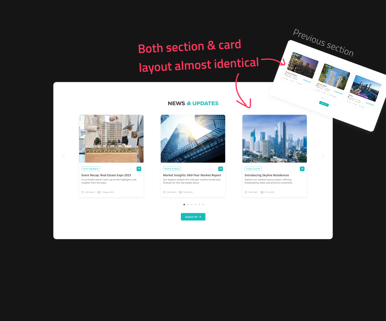
At first, I envisioned a design where the content would be centered with a titles (Figure 3.4).
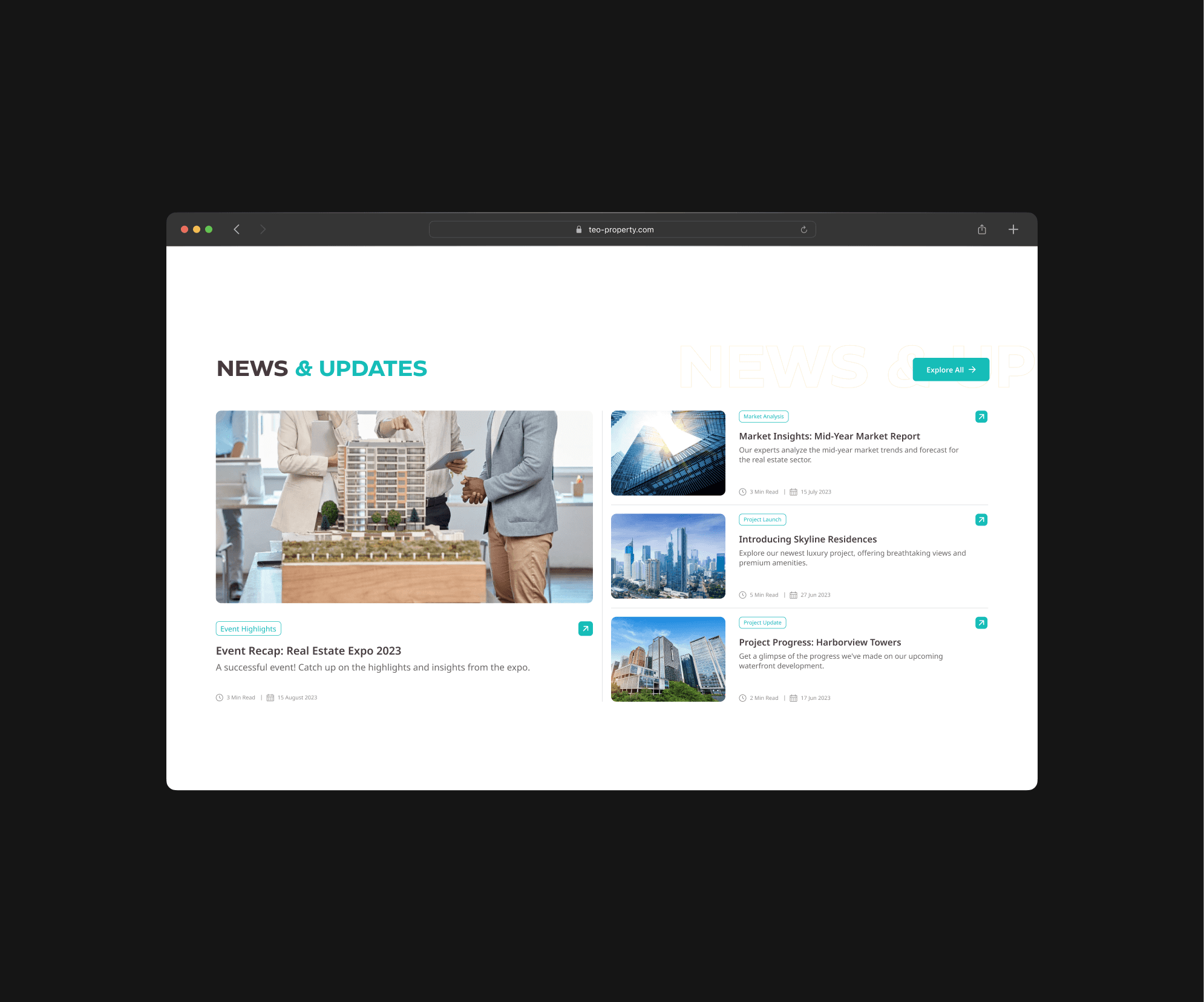
However, I later crafted another layout, design 2 (Figure 3.5), as the layout of design 1 closely resembled the previous section. After comparing the two, I opted for the second design.
Visual fatigue & monotony. Having similar card layouts and sliders in multiple sections make the page feel repetitive and monotonous, reducing user engagement.
Confusion. The multiple sections look similar, so the distinct importance or relevance of each section may be diminished, may lead users confuse and hard to focus on key information.
Visual diversity. This variety in layout and size used to prevent visual fatigue by offering users different focal points and visual experiences as they navigate the page.
Clarity and differentiation. This clear differentiation can help users understand the organization of the content and navigate the page more efficiently, reducing user confusion.
Some concepts and justifications.
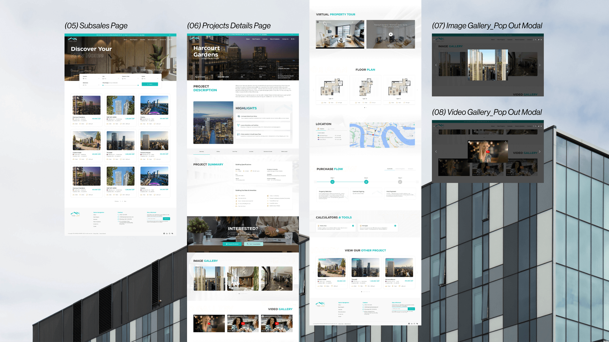
Content for single project details page
While worked on the 'Content for Single Project Details Page,' I considered a question from the user's perspective.
{
Question
}
When users visit a real estate website to view projects, what information are they looking for?
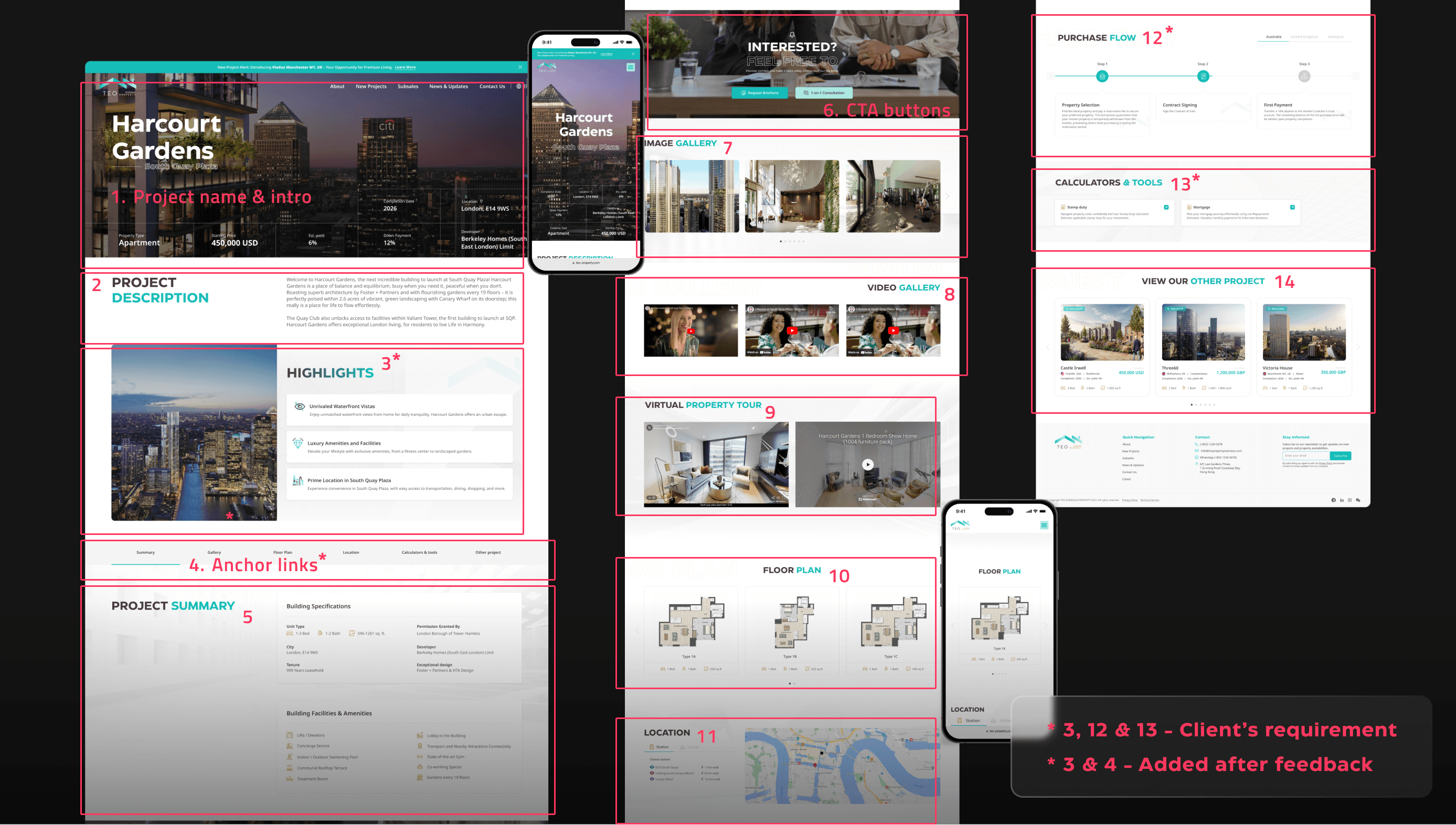
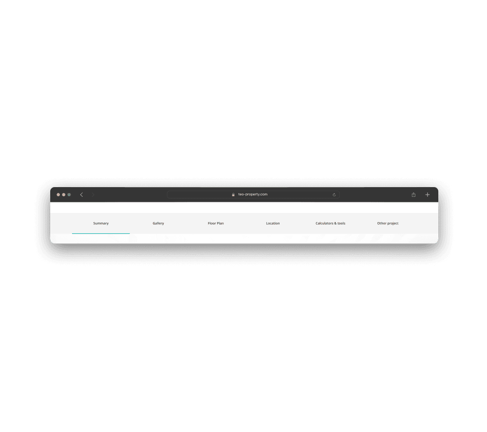
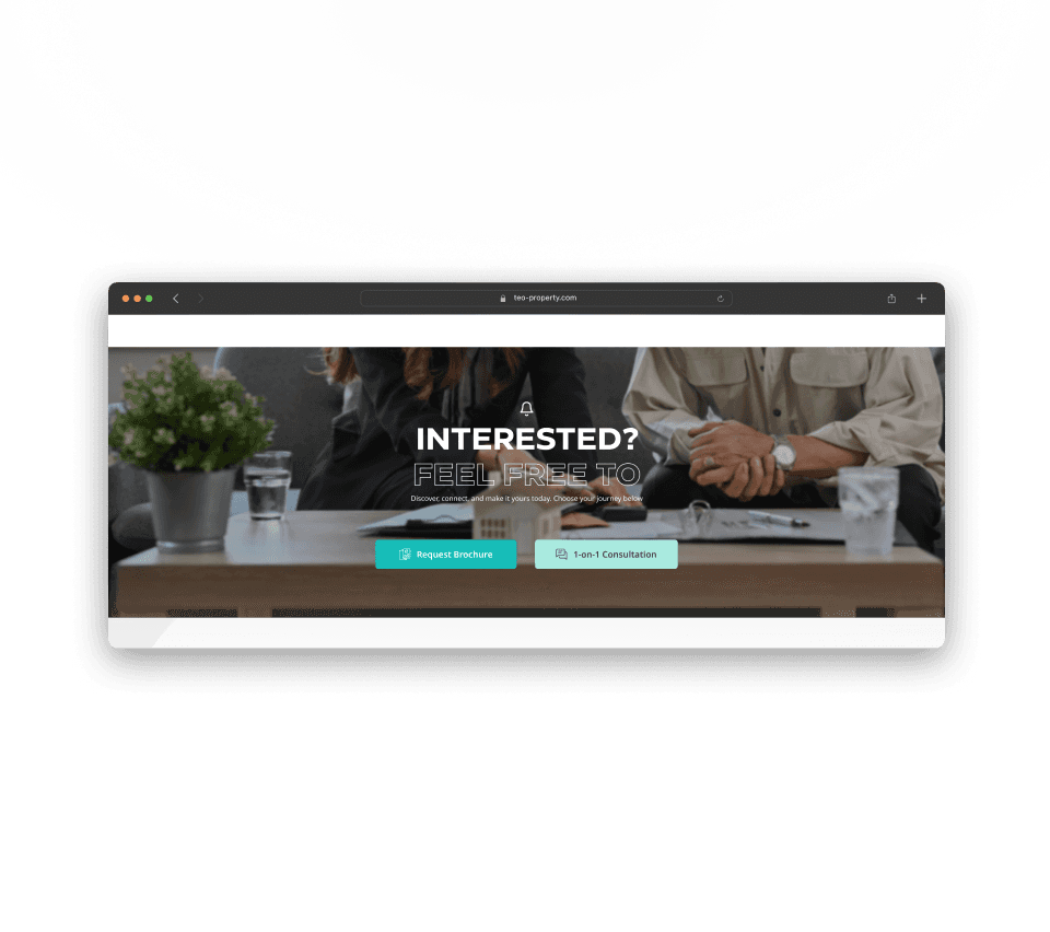
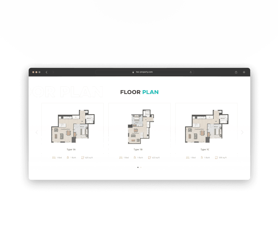
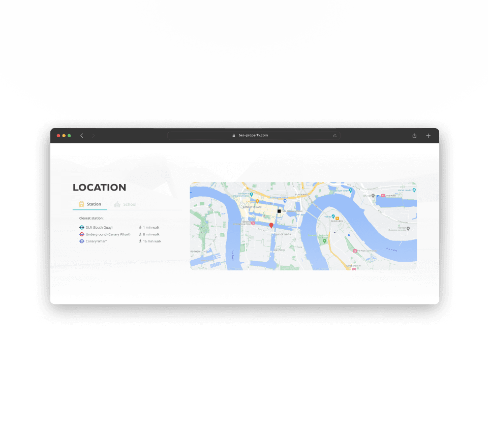
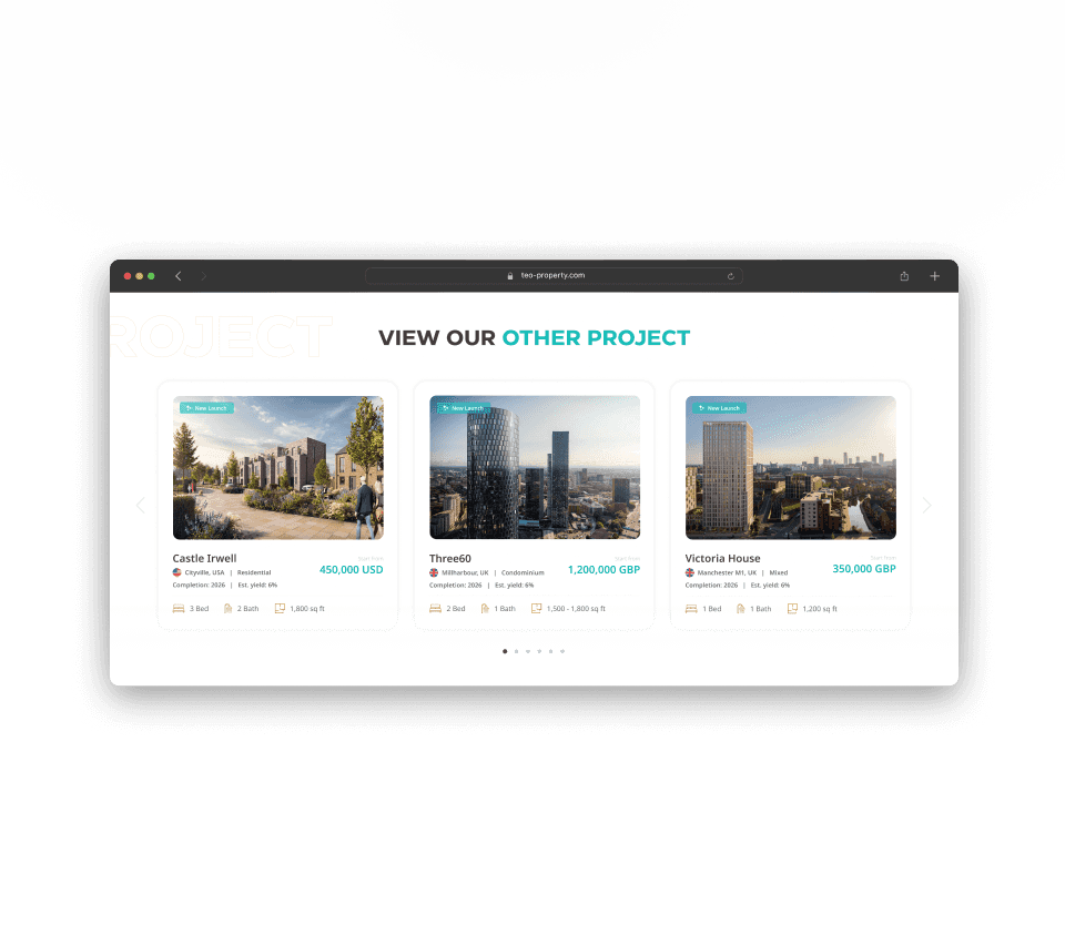
After conducting research and iterations, the final design was developed (Figure 4.1). Figure 4.2 shows the content flow I devised, combining client feedback and requirements.
In addition, Figure in 4.3 illustrates the design concepts I kept in mind throughout the design process.
Other design rationale
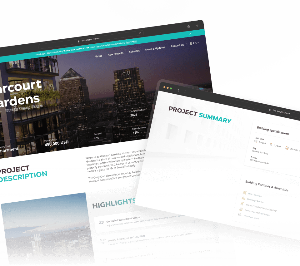
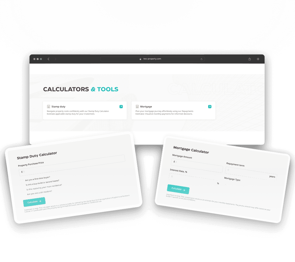
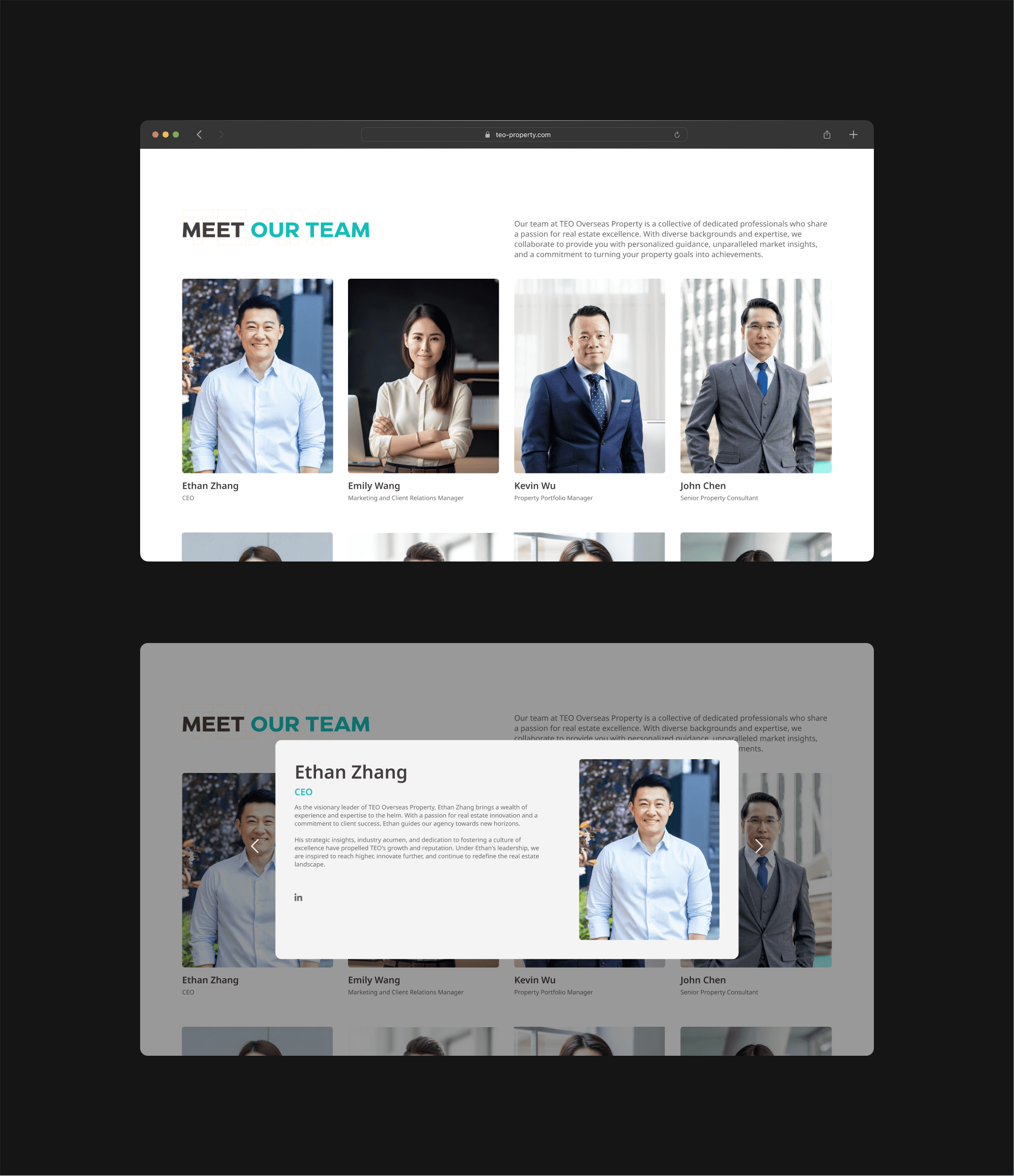
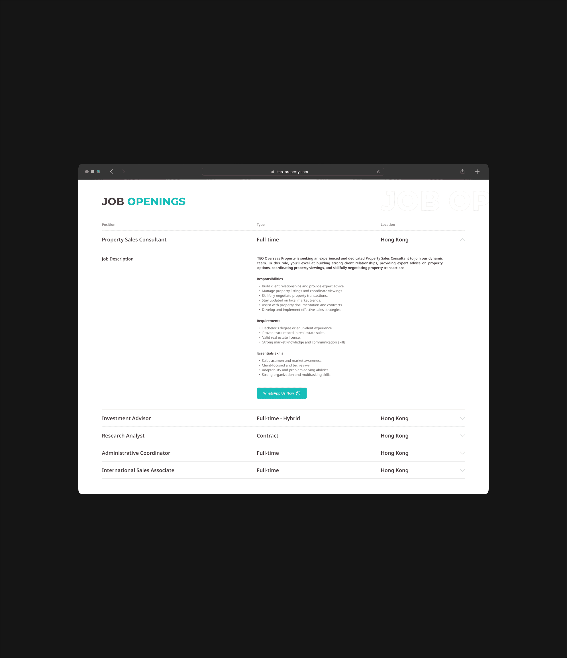
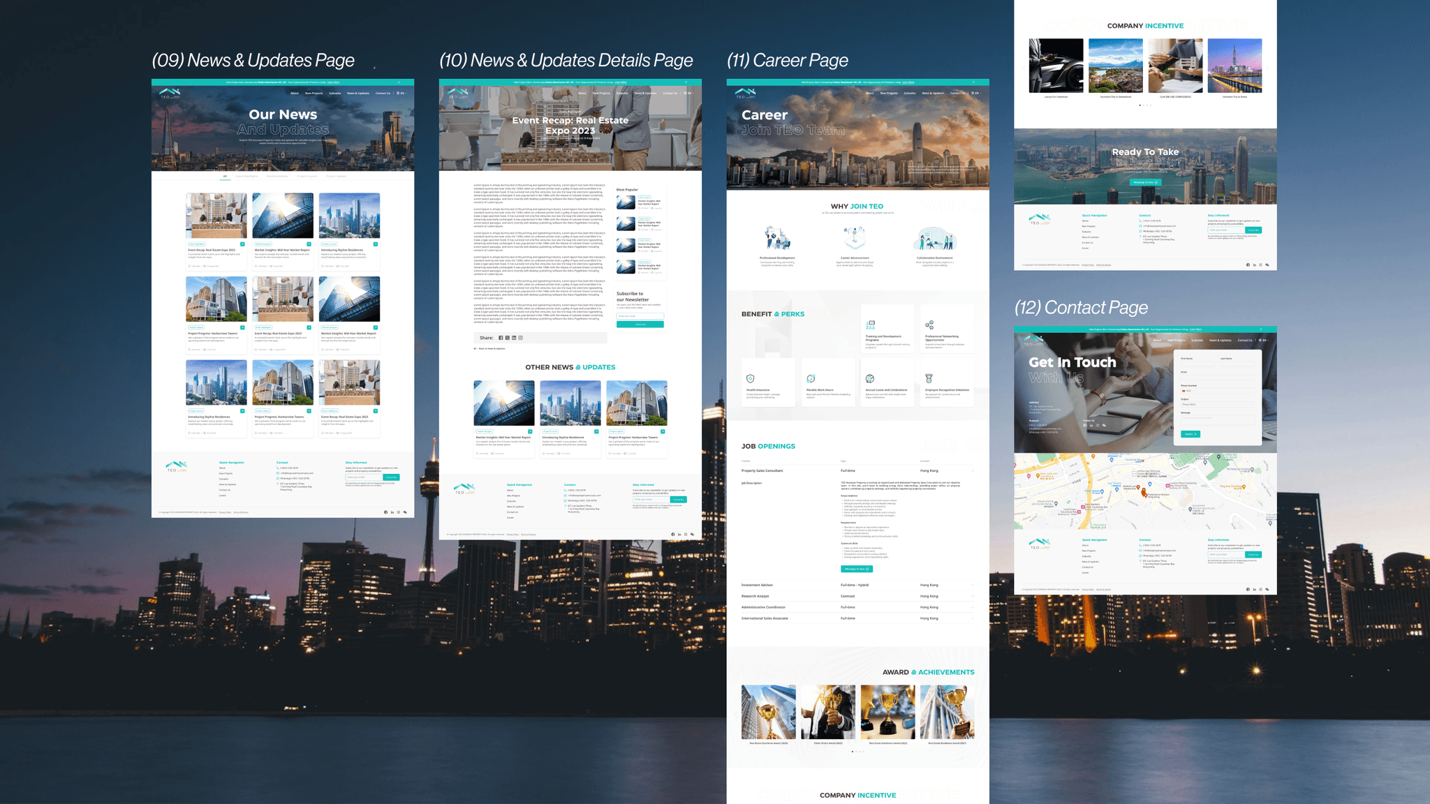
Additionally, I put considerable thought into the design of the following 2 sections (Figure 4.4 & 4.5).
Meet Our Team section
Introducing their team with authentic photos, names, and positions via a dedicated 'Meet Our Team' page. Pop-out modals provide background details to boost trust with potential clients.
Job Openings section
I utilized collapsible components to showcase job openings as card components wouldn't provide ample space for their team to elaborate on job type, responsibilities, requirements, and essential skills.
At the end of each position, there's a 'WhatsApp Us Now' button for immediate job applications.
Iterate and Innovate.
Work with us section
I initially designed the first version, and the client suggested changing the 'Contact Now' button to 'WhatsApp Us Now' (Figure 5.1). I then created a new design, and after discussion, we unanimously agreed on using Design 3 (Figure 5.2).
Before
The 'Contact Now' and 'WhatsApp Us Now' buttons directly lead users to their WhatsApp contact number but do not indicate the positions TEO is hiring for.
After
After the second iteration, the final design displays the positions TEO is hiring for.
The 'WhatsApp Us Now' button was replaced with 'Discover More,' leading users to the 'Career' page to view job openings. Each position detail includes a 'WhatsApp Us Now' button for direct contact.
Means of TEO section
I initially designed the first version, and the client suggested changing the 'Contact Now' button to 'WhatsApp Us Now' (Figure 5.3). I then created a new design, and after discussion, we unanimously agreed on using Design 3 (Figure 5.5).
Before
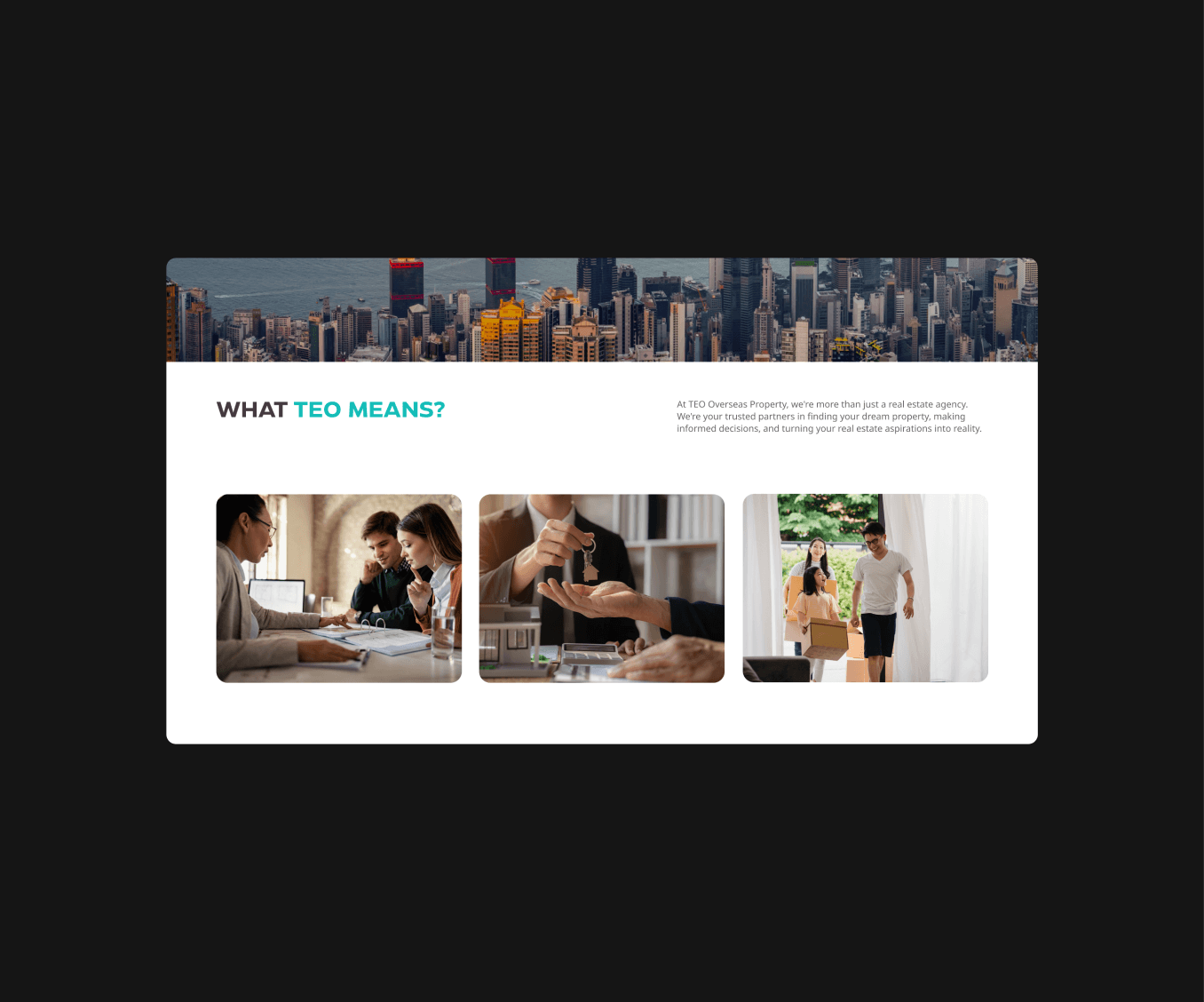
Since the client did not provide detailed information, I put some images to hint at TEO's business and leave a stronger impression on users.
After
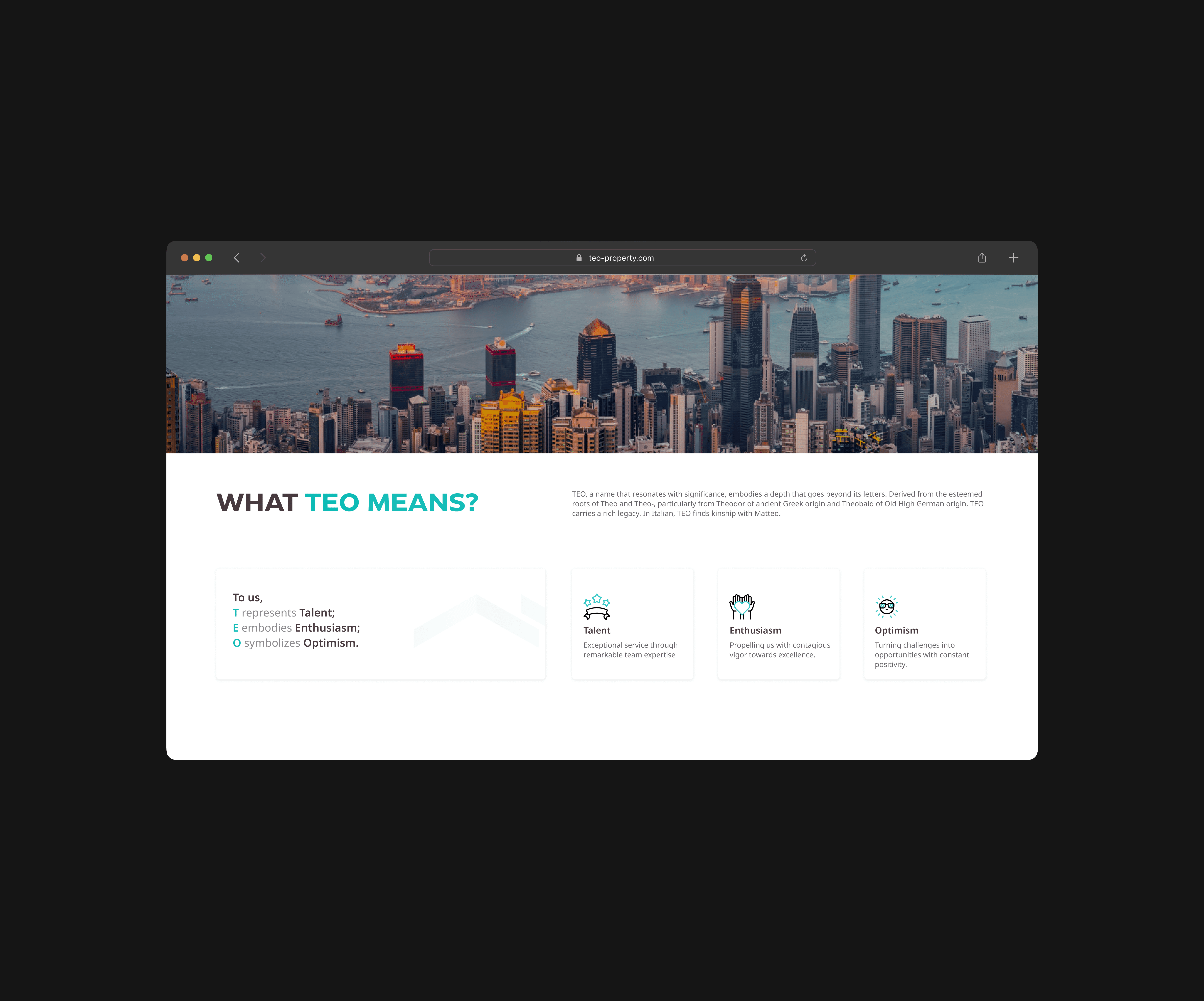
After receiving the client's feedback and requirements, this part of the design was revised accordingly. Animated icons were also used to capture users' attention.
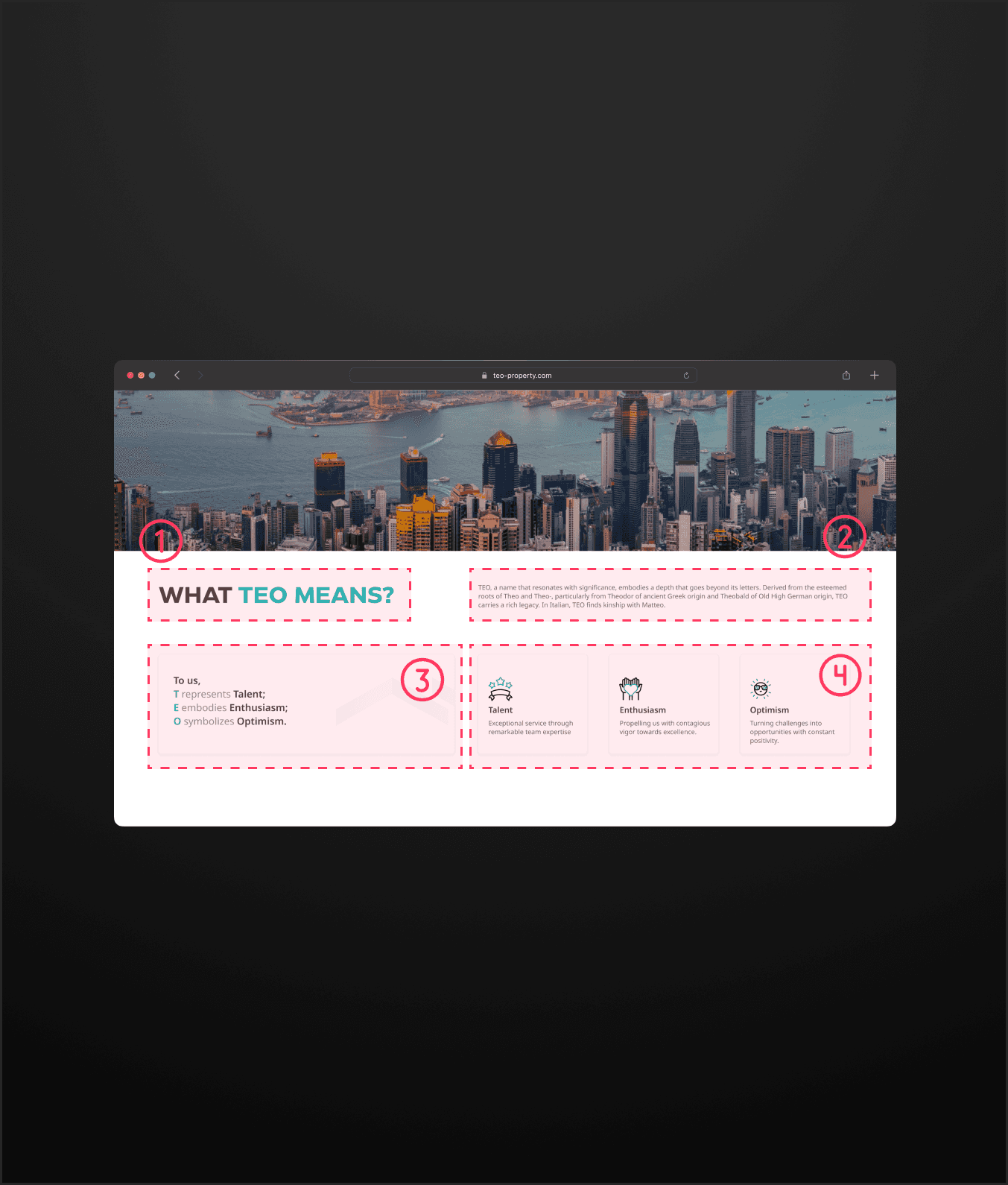
Design rationale for this section
Title section: "What TEO Means?". To introduce the acronym "TEO" and set the stage for the detailed explanation of its meaning.
Text explanation section. To provide a narrative explanation of the significance and origin of "TEO."
Acronym breakdown section. To break down the acronym "TEO" into its constituent meanings: Talent, Enthusiasm, and Optimism.
Detailed explanation section. To provide further details on what each word (Talent, Enthusiasm, Optimism) means in the context of the organization or concept.
Reflect their identity.
Build trust and engage through design
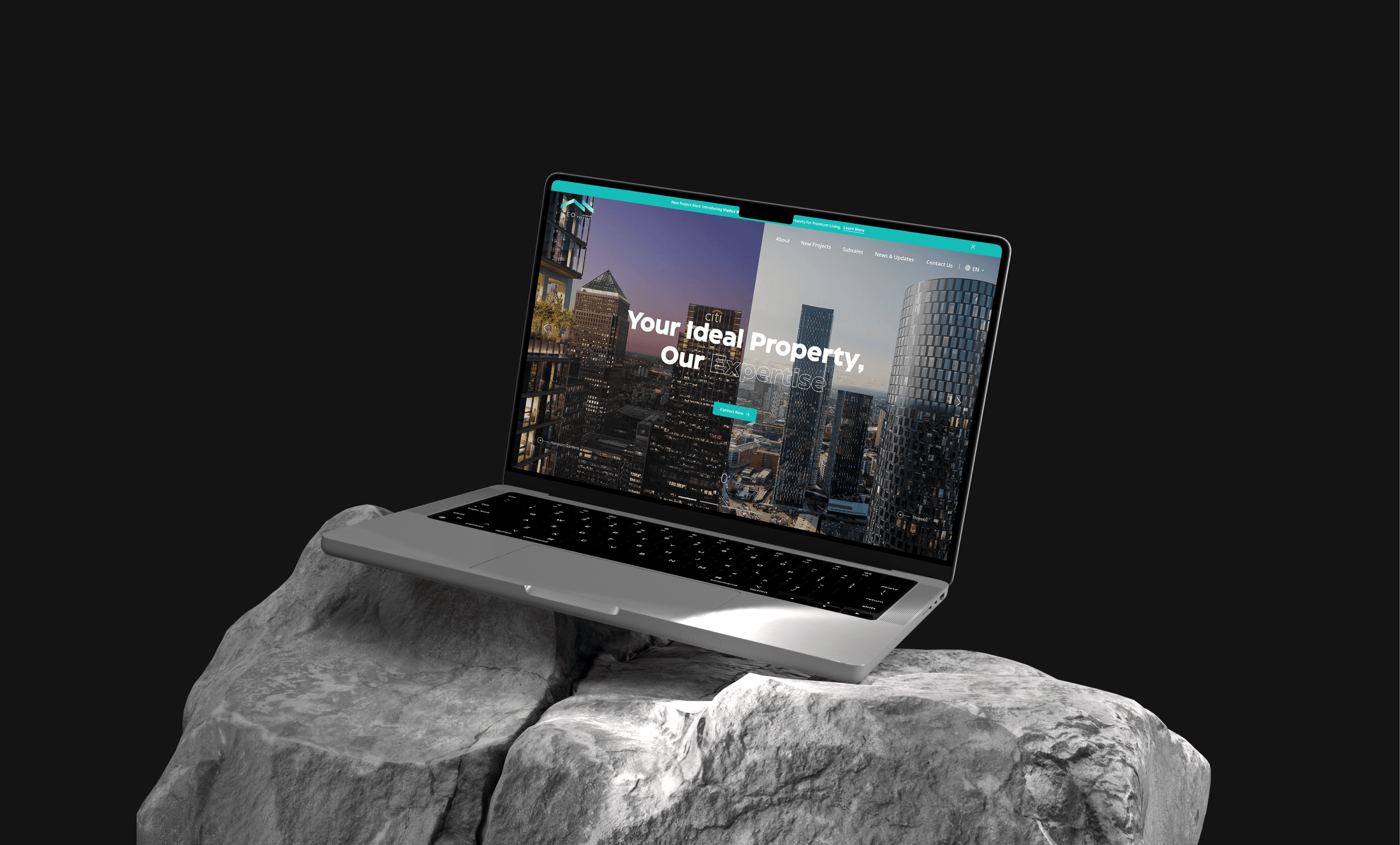
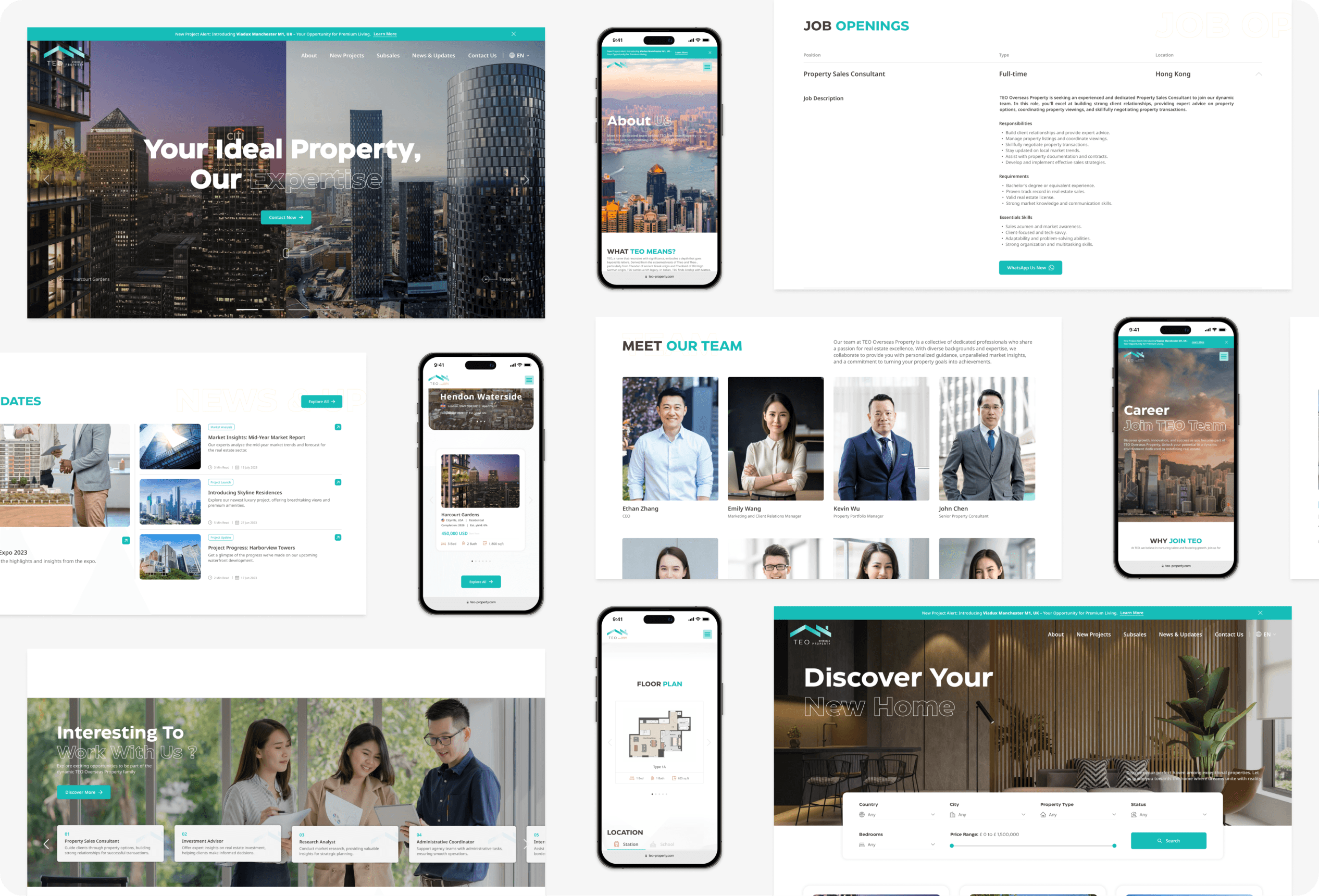
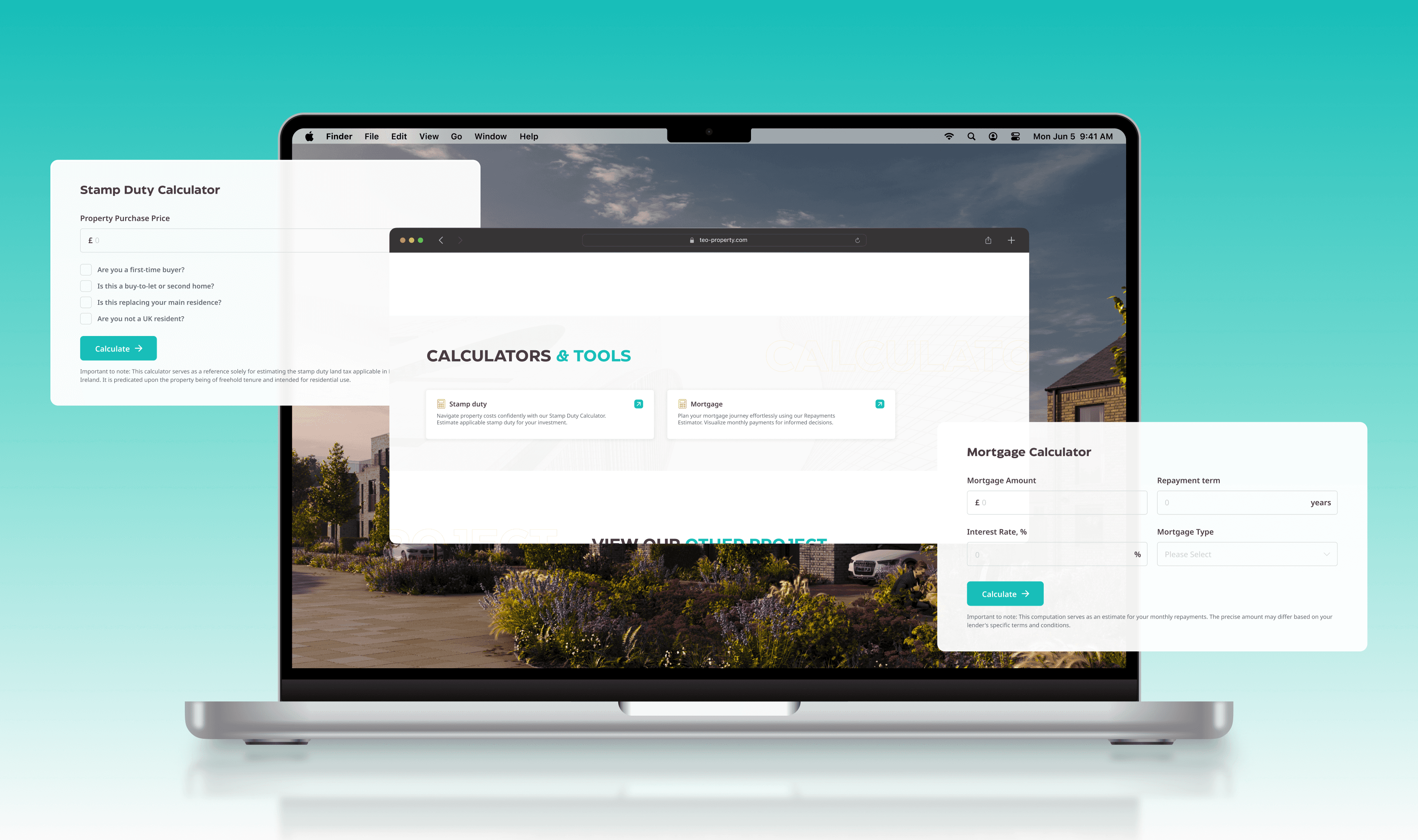
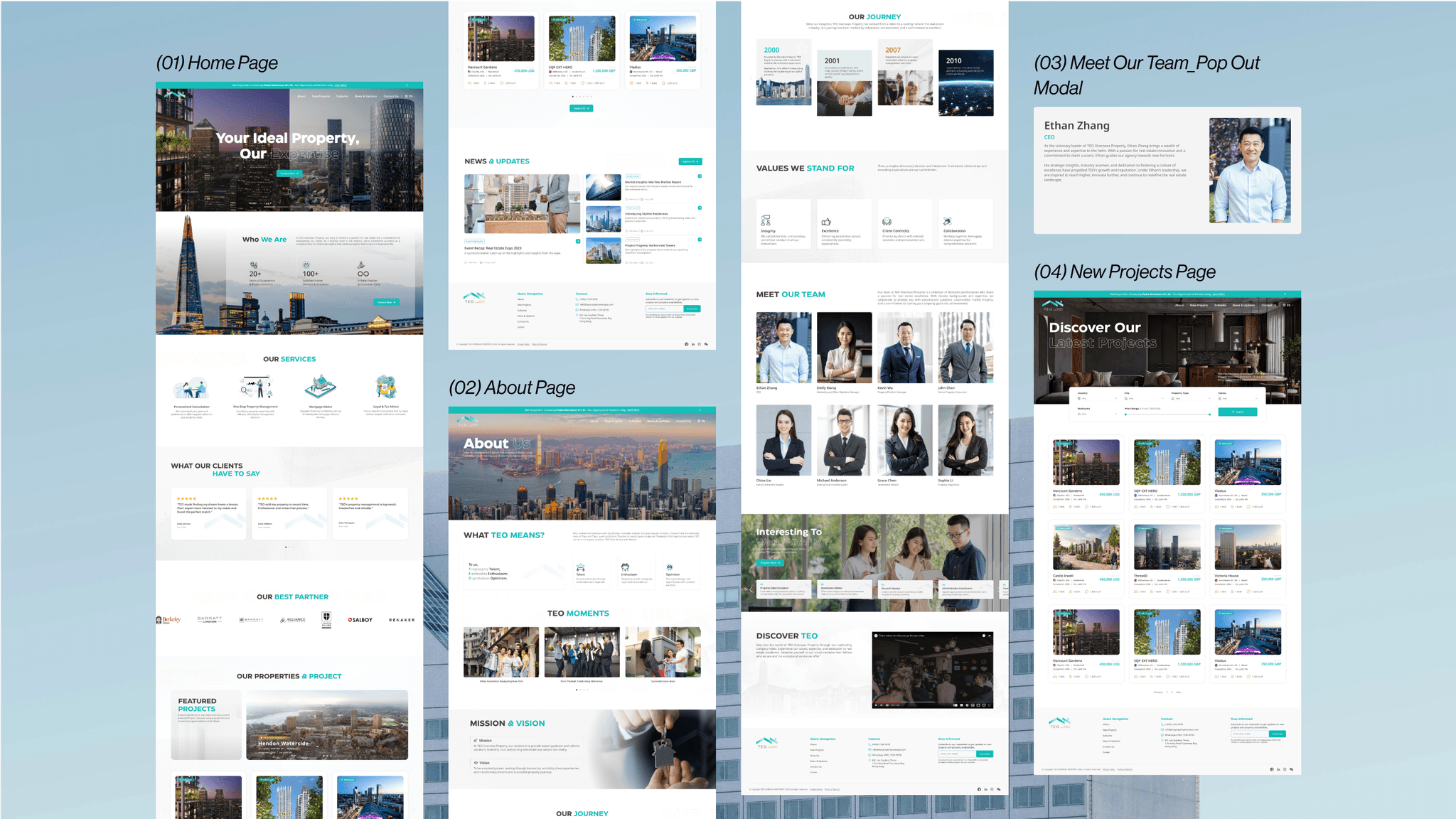
Last but not least, the final design has finally been completed (Figures 6.1, 6.2, and 6.3). I am very grateful to the client for allowing me to implement my ideas and for taking the time to meet and collaborate to make this website the best it can be.
Delighted to design the startup's website.
{
Achievement
}
Stakeholders are highly satisfied, and successful delivery was achieved.
Lessons learned
Content for real estate websites
Through extensive research and referencing numerous real estate websites, I learned what content is typically included in real estate websites.
Effective communication is crucial
To reduced misunderstandings, Google Sheets used to document any design concerns and required changes, and then schedule a meeting with stakeholders to review the web design drafts.
Responsive for desktop & mobile
Responsive design ensure that users can easily navigate and interact with the website, and improves satisfaction and engagement.
Client feedback & continuous iteration are valuable
I can learn more and gain a deeper understanding of the client's needs and it helps uncover what clients in this industry desire and what content is essential for these types of websites.
