MJM E-commerce
UIUX (Web), Real-World Project - Oct 2023
Timeline
2023.10 (2 weeks)
Industry
Healthcare & wellness
Role
UI/UX designer
Tools
Figma, Adobe Illustration
Responsibilities
High-fidelity wireframes, Visual design, Mockup, Prototyping, UI design, UX design, Usability testing
Overview
Utilizing a template provided by my manager, I was tasked with revamping it to suit the needs of MJM Global, a company with over 15 years of experience in health management and solutions.
The project involved creating an e-commerce platform for their team members to purchase items for promotion, with 3 purchase options: 'points only', 'money + points', and 'money'.
Even my responsibilities are just revamp some things but I still gain a lot from this projects.
Spoiler Alert!
This project may not be a success story, but it records some of my thoughts and ideas when I was working on and revamping this e-commerce website template. Wish you a pleasant reading :D
{
Highlights
}
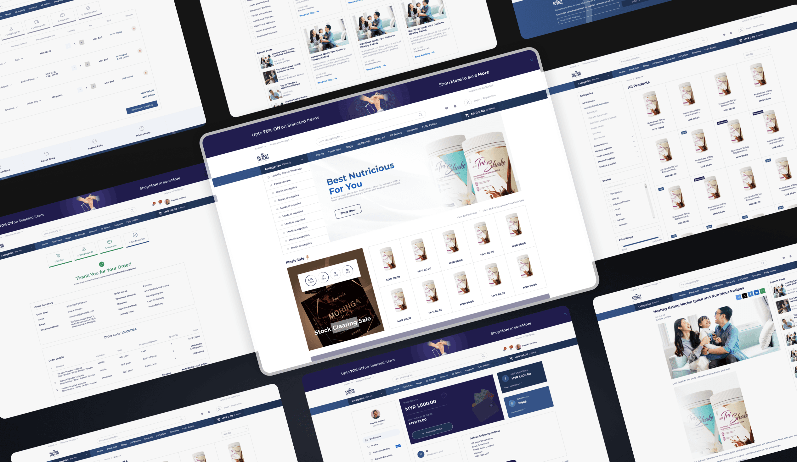
An e-commerce platform for their members to buy at promotional prices.
0.1
UI showcase.
IMAGE
0.2
Payment section after redesign.
IMAGE
Set ambitions and achieve it.
Project Goal
How might we revamp the ecommerce template to enhance user experience and ensure no obstacles to completing orders?
Business Goal
How might we streamline the purchasing process to increase sales of items to MJM Global members?
Templates cannot be used directly.
A platform of constraints
Lack of user-friendliness and user experience. Some features caused cannot navigate website efficiency.
A 2 weeks deadline. Need to address the problems and design visual asset that were consistent with the brand identity.
Stakeholders request changes to the purchase options. The payment process and related components need to be modified.
Unclear redemption options. Users unaware of full points needed to redeem item.
{
The Challenge
}
Transform complex problems into a user-friendly, efficient, and visually consistent website experience.
What might I be able to accomplish?
Navigate the absence of user testing and established design systems.
To identify user pain points and resolve issues users face
Since my previous company did not have a tradition of conducting user research, user testing, or establishing design systems, I took the initiative to use my own time.
User testing. After work, I invited friends, and during lunch breaks, I engaged willing colleagues to assist in user testing. to improve usability after done the high fidelity design.
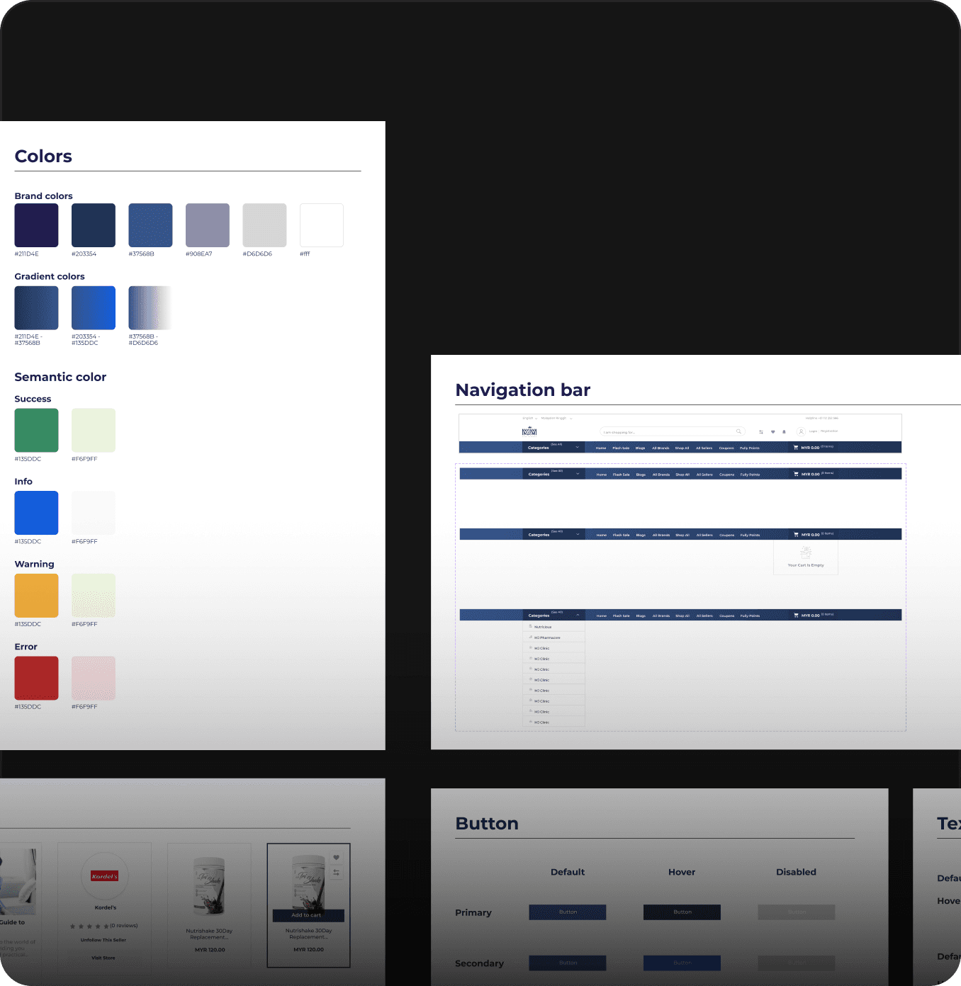
Design system. Due to making minor modifications to a few pages and tight deadlines, I opted not to create a complete design system. So I organized the colors, fonts, icons, and modified components on existing pages for clarity and ease of use by developers.
1.1
Design system
IMAGE
Design system
The list of modify components used for clarity and ease of use by developers.
1.2
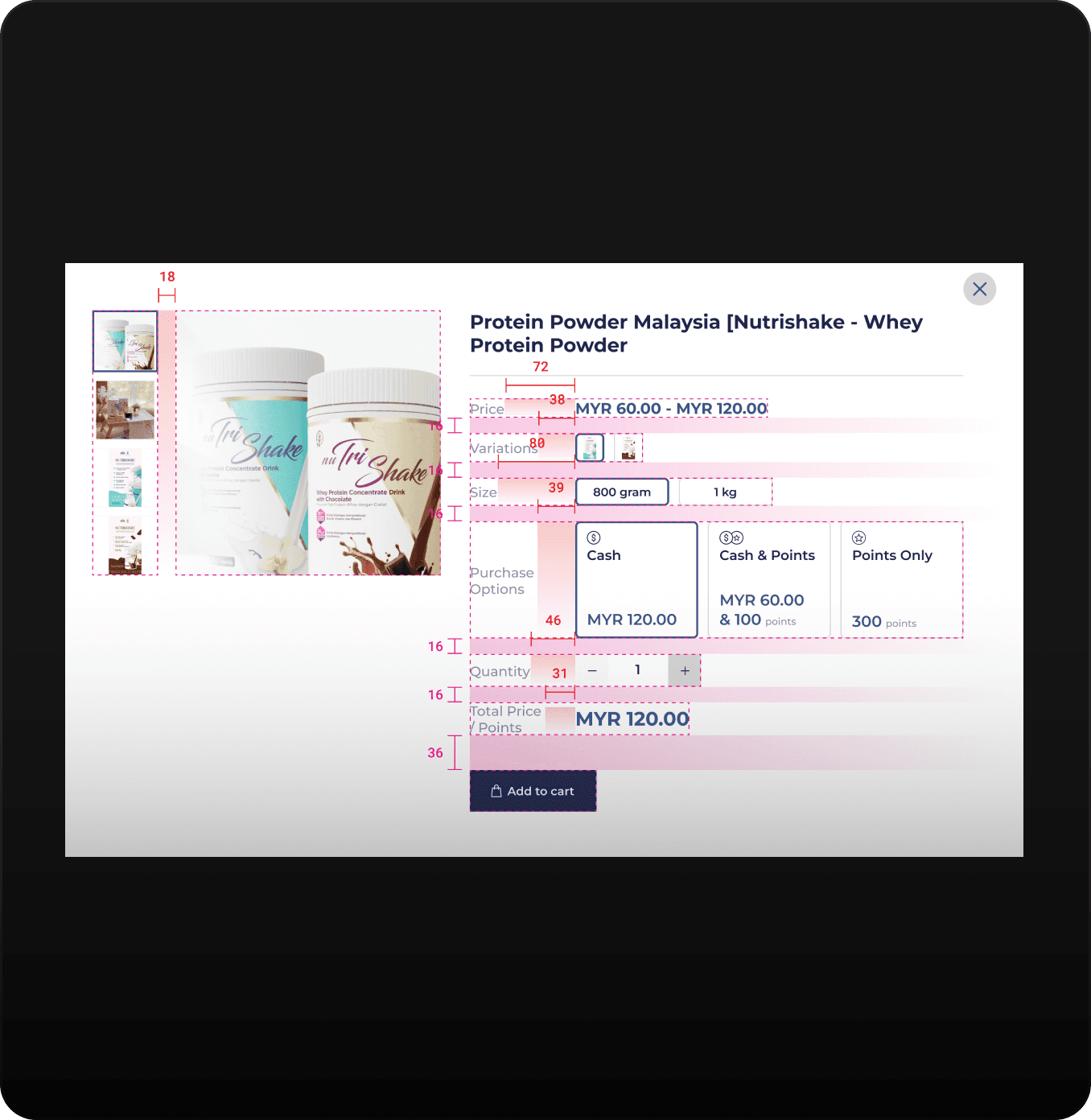
Use the plugin "Redlines" to annotate details of changes to developers.
IMAGE
Use of plugin 'Redlines'
Provide detailed design specs to make it easier for developers to replicate the design and ensure that designs are implemented accurately.
Try and try again.
1. Purchase option design
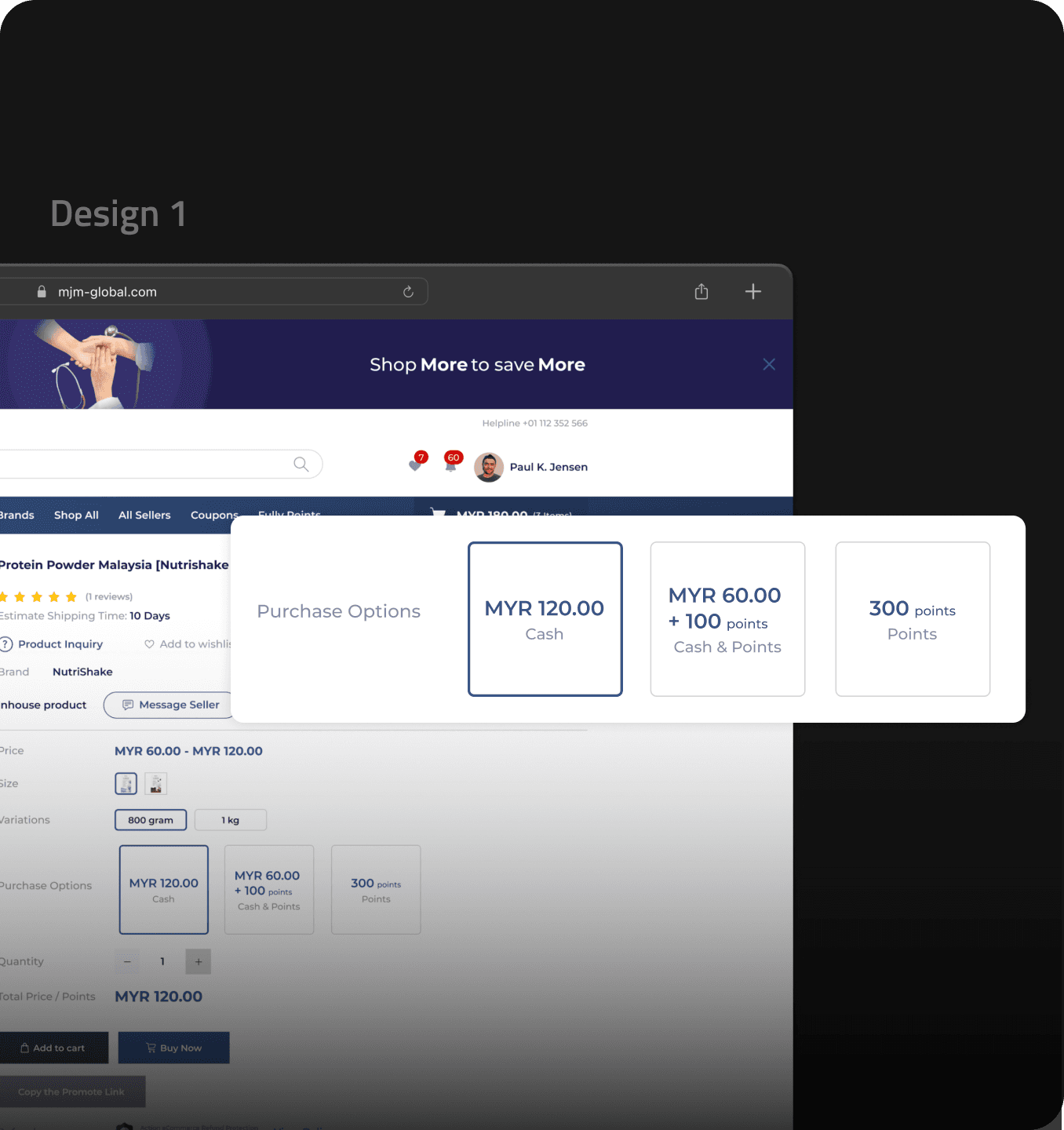
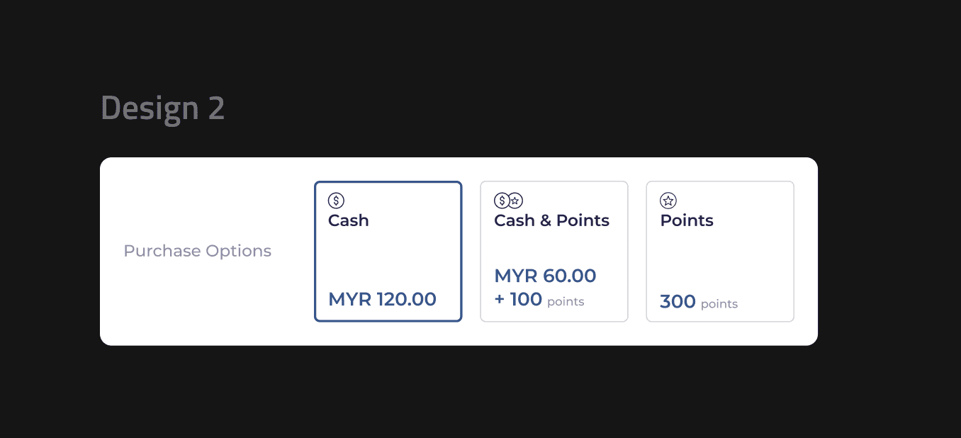
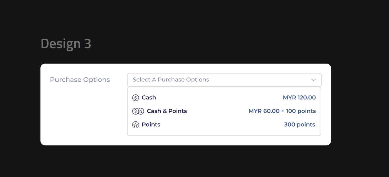
After completing the Design 1 (Figure 2.1), I invited my colleagues to conduct a small usability test, as I wanted to test whether the messages of the different designs I had produced were clearly communicated to the user. Design 2 and 3 (Figure 2.2 & 2.3) are the designs I came up with after conducting the user testing.
After second use testing, design 2 (Figure 2.2) was chosen because it look more intuitive and can conveys information quickly to the users.
2.1
Purchase options design 1 - Before user testing.
IMAGE
2.2
Purchase options design 2 - After user testing.
IMAGE
2.3
Purchase options design 2 - After user testing.
IMAGE

Wait, why design 2?
Perhaps you are curious the details.
Use of icons and text
The powerhouse combination of icons and text allows users' eyes to quickly scan for relevant purchase option information.
Minimize errors & save time
Unlike Design 1 (Figure 2.1), design 2 (Figure 2.2) does not cause users incorrect clicks and spend more time repeatedly checking for incorrect payment method selections.
Streamline option selection
More intuitive compared to design 3 (Figure 2.3), as users don't need to spend time clicking on the component and selecting the option from a drop-down list.
2. Product card + point redeem design
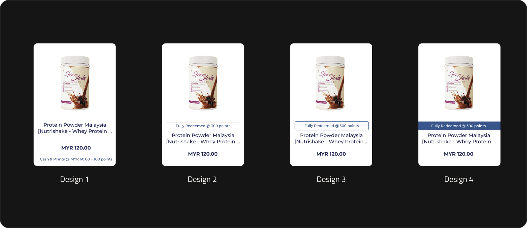
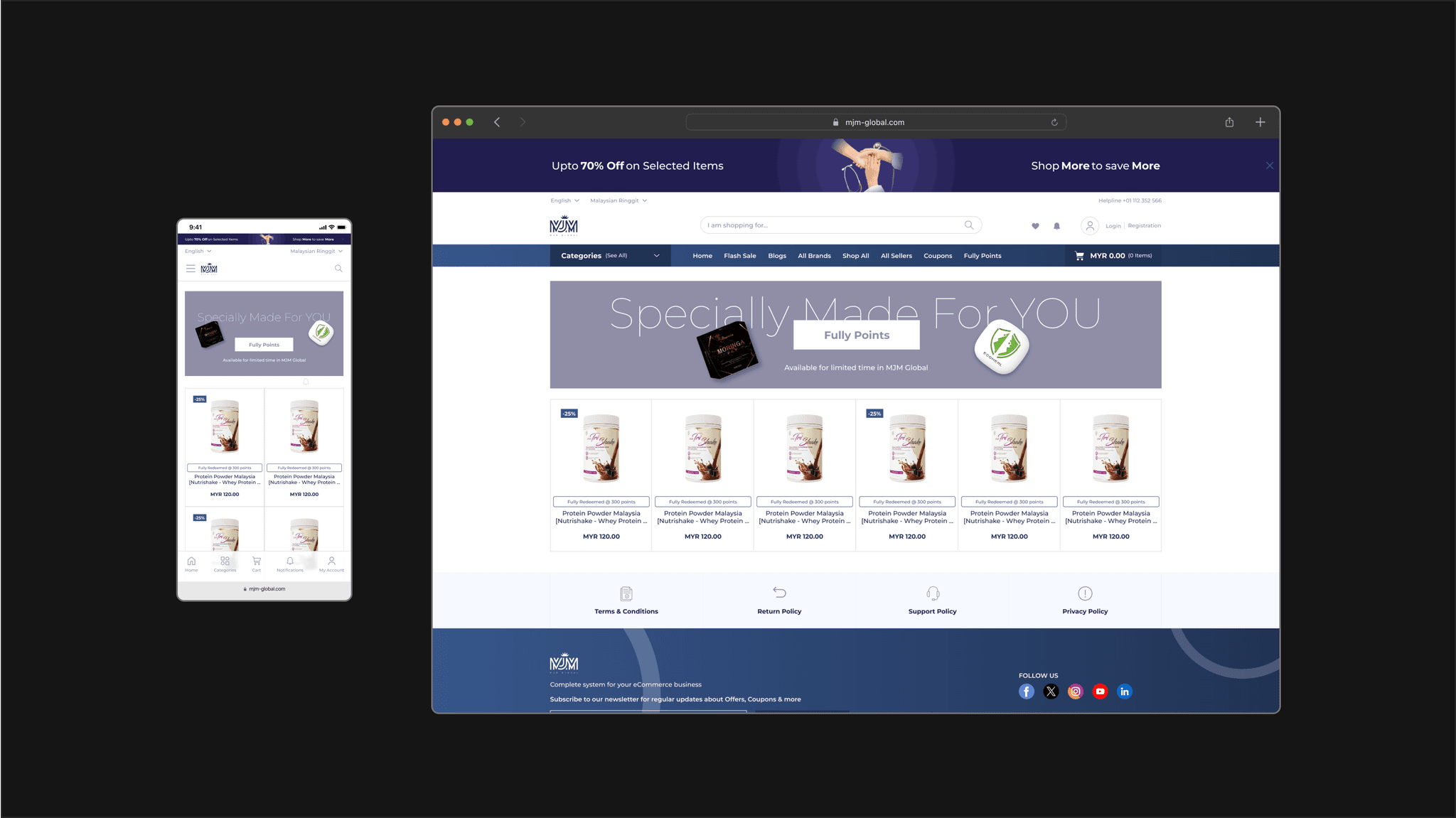
I have created 4 different layouts for this single product card. In the end, design 3 was chosen as the 'fully redeemed @ 300 points' message stands out, easily grabs users' attention at first glance.
Unlike design 4, design 3's use of blue text and line creates a clear boundary, highlighting the redemption message without overshadowing other important information such as the product name and price.
Meanwhile, design 1 and 2 were not chosen because the 'fully redeemed @ 300 points' message did not stand out enough.
2.4
Product Card + Point Redeem Design Exploration.
IMAGE
3. Search bar
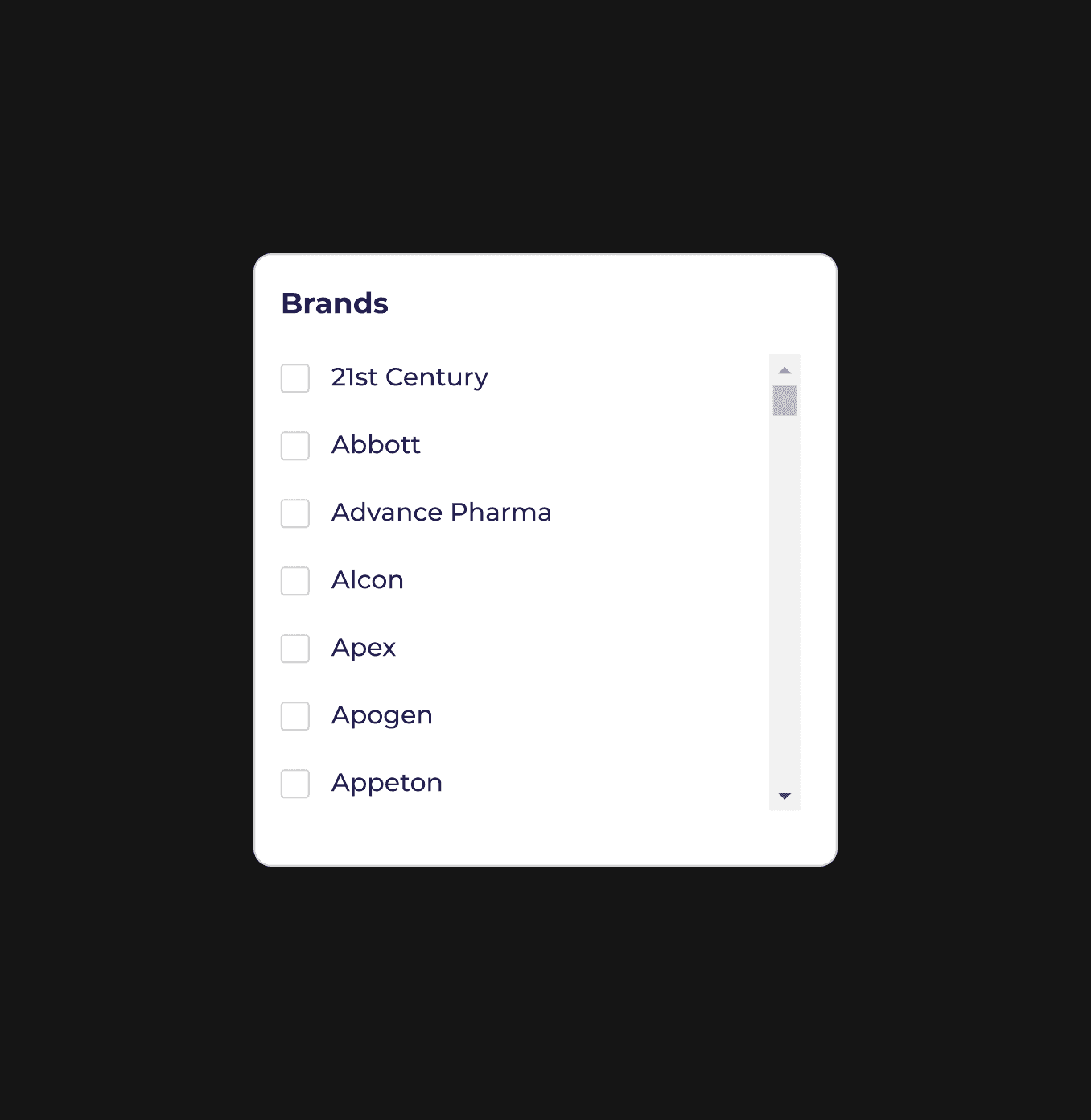
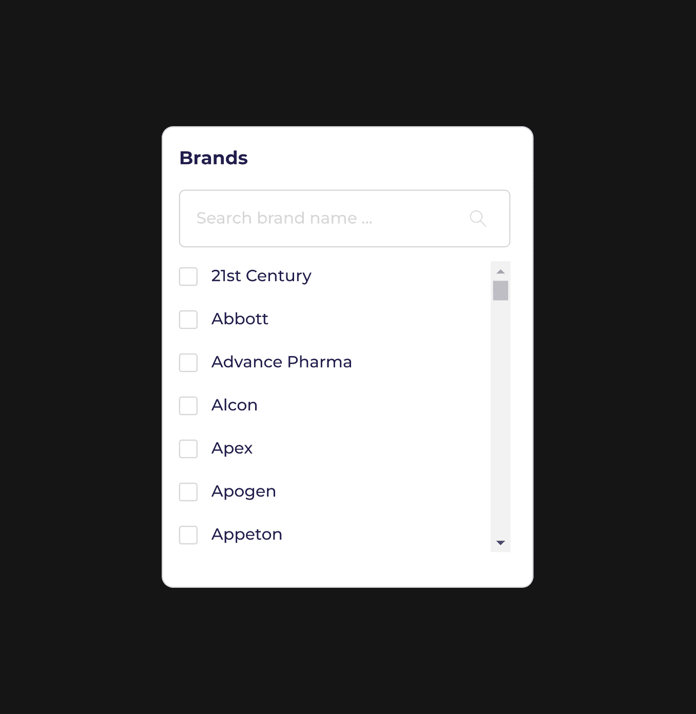
The original website (Figure 2.5) lacked a search bar, so I added one to allow users to quickly find their desired brands without scrolling, as some users already knew what brand they were looking for.
After user testing and discussion with manager and developer team, they agreed to add a search bar component.
2.5
Without search bar.
IMAGE
When users search for the brand they want, they can discover more other brands.
Users need to take some time to find what they need if without search bar.
If users cannot quickly find the products they want, it may lower their purchase intent, thus impacting the conversion rate.
2.6
With search bar.
IMAGE
Users need to take some time to find what they need if without search bar.
It helps to increases likelihood of purchases & conversion rate as users can find the products they want easily.
If the filters are not optimized, they may increase website loading times, affecting user experience.
Unfortunately some ideas didn't make the cut.
{
Reason
}
The ideas for the payment flow couldn’t be implemented due to time constraints, as making these changes would require additional development time.
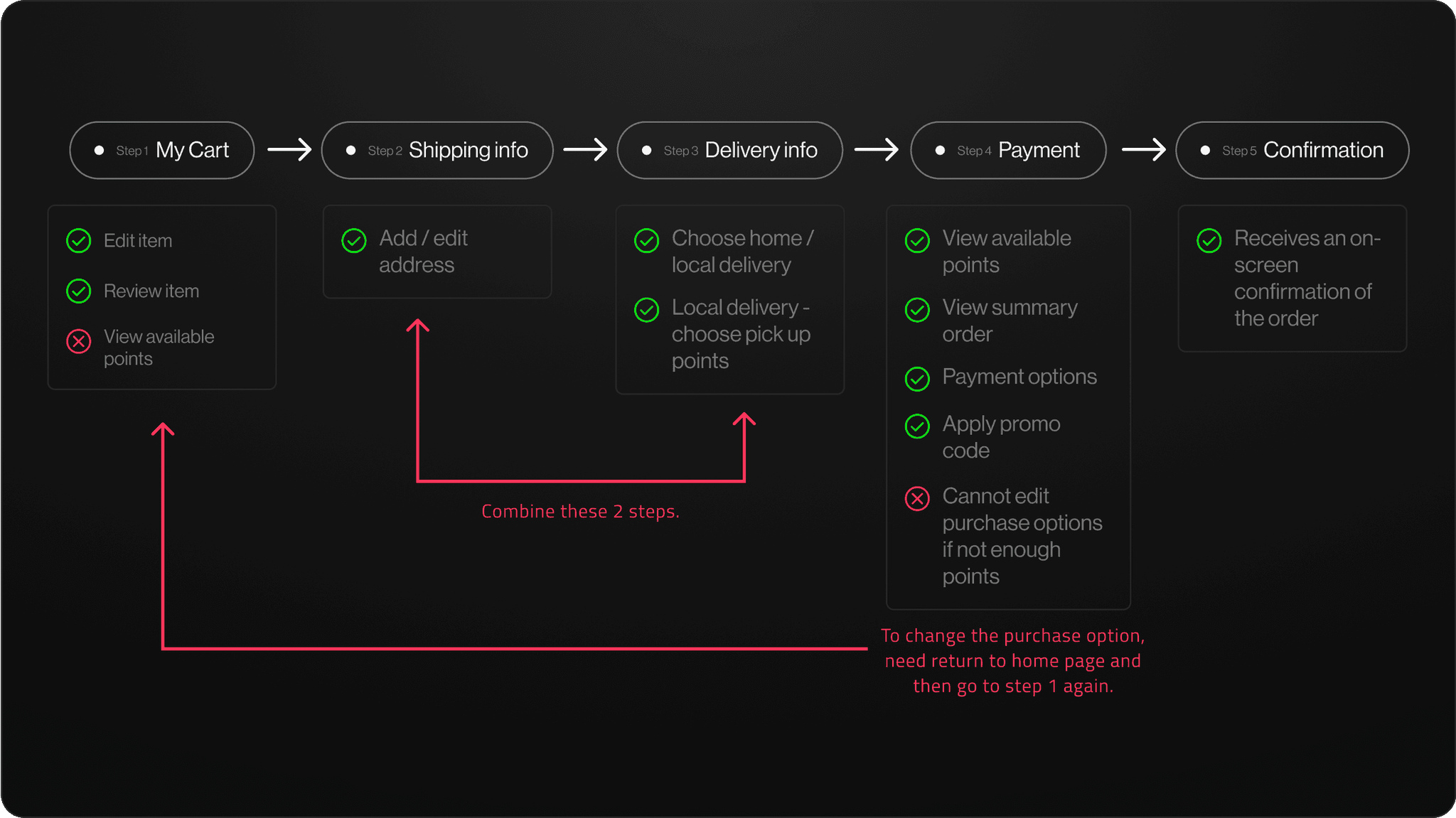
The things I felt the need to change
First, the reasons for proposing this change is that users can't view their points early, leading to frustration when they must return to the homepage to remove items if they don't have enough points.
Figure 3.1 shows the areas I identified for improvement after conducting user testing with my colleagues.
3.1
My idea for the payment flow.
IMAGE
1. Step 1: my cart — before & after
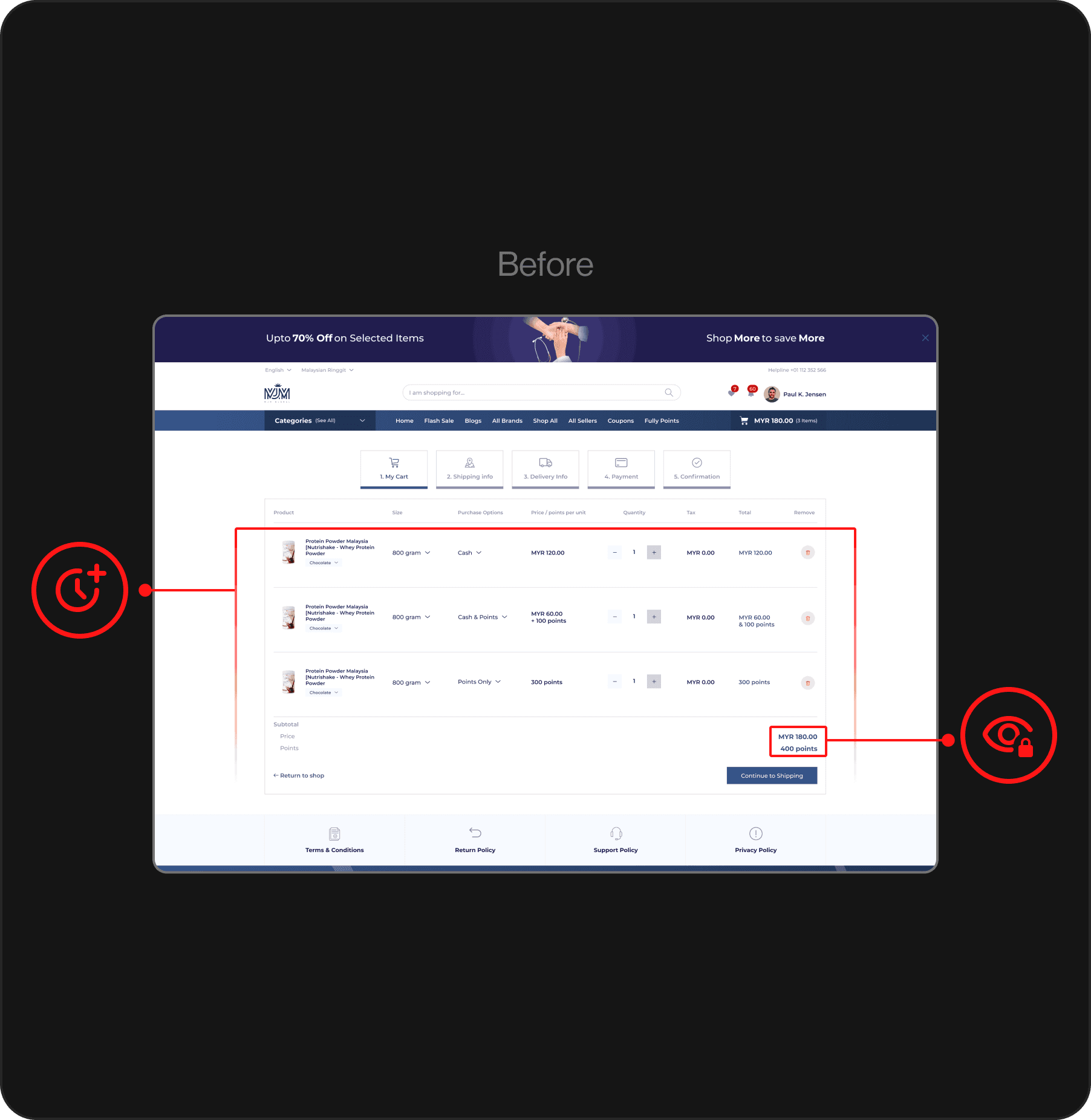
Figure 3.2 is based on the original web template layout with some modifications, such as item size and variations.
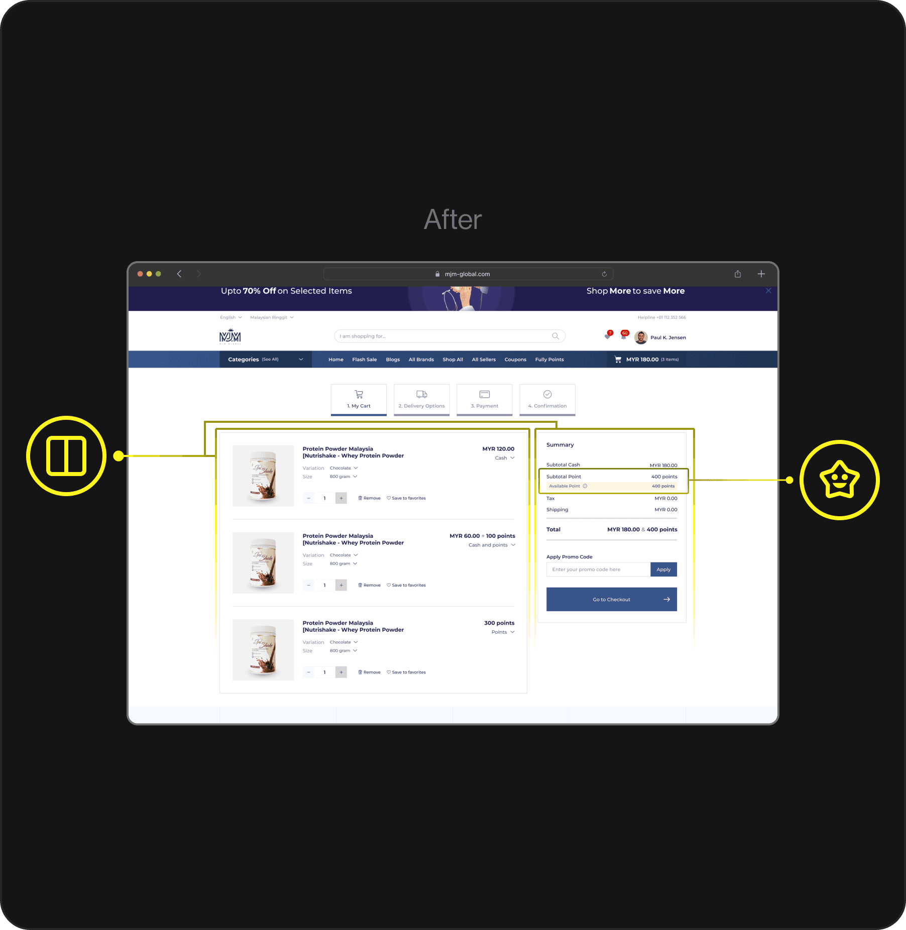
Meanwhile, Figure 3.3 was created after user testing with colleagues.
3.2
Before — Payment flow step 1 following original template.
IMAGE
Visibility pointer issue. Users can't view their available points until step 4, at which point they can't remove items if they don't have enough points.
Long review time for added products. The horizontally arranged product information causes users to spend more time reviewing their added products.
3.3
After — Payment flow step 1 after I redesign.
IMAGE
Display points early. Display the user's available points below the summary (second column layout), and allow them to adjust purchase options immediately if points are insufficient.
Get the information quickly. By using 2-column layout, the first column for item review and adjustments, second column for price summary including tax and shipping fees.
2. Component — Points visibility & promo code application
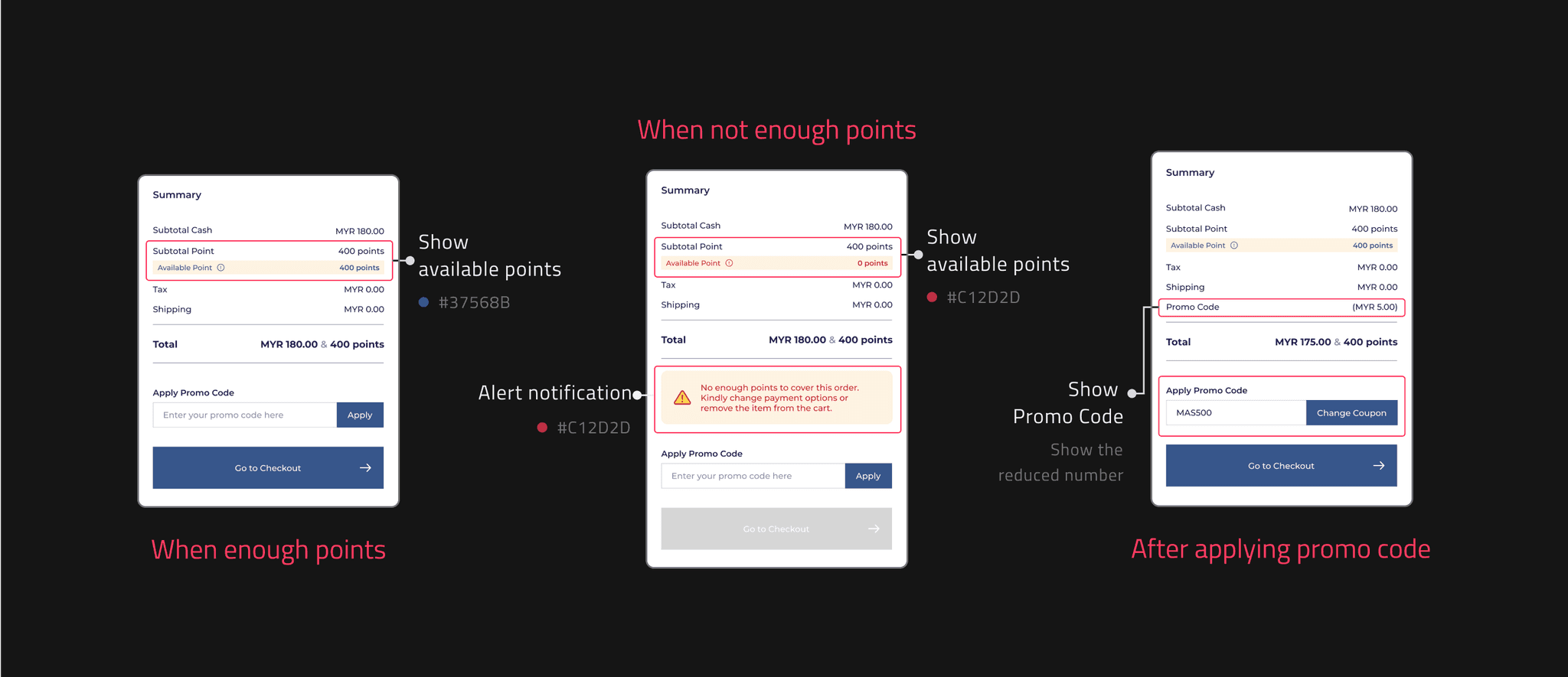
I created 3 different components for users to address various scenarios: 'having enough points', 'not having enough points', and 'after applying a promo code'.
The 'available points' displayed under the subtotal points, allowing users to easily check their points balance. If the user does not have enough points, an alert notification will appear under the summary section, guiding them on the next steps to take.
After applying a promo code, the system will display the deducted amount in the summary.
3.4
Components for summary prices & points of purchase item.
IMAGE
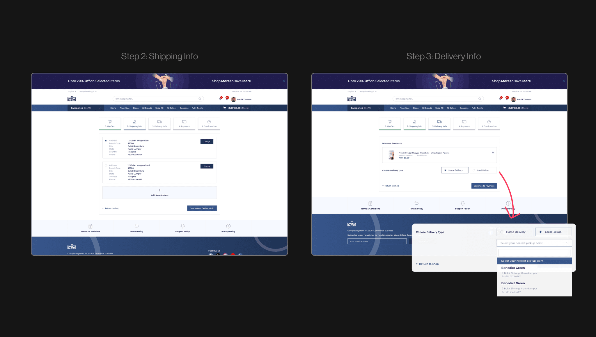
3. Step 2: shipping Info & Step 3: delivery Info — before combine
Steps 2 and 3 were designed according to the original webpage template (Figure 3.5). After conducting user testing with my colleagues, I combined these two steps into one (Figure 3.6).
May confuse users. As step 2 requires the shipping address, while step 3 asks for the delivery type and pickup location and it may feel redundant or disjointed to them.
3.5
Before — Following the original template, Payment flow steps 2 & 3.
IMAGE
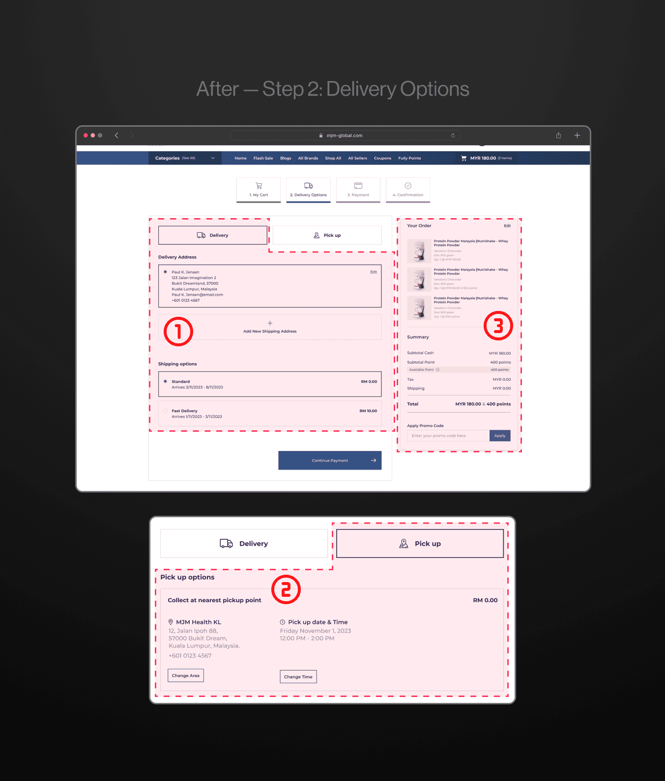
Step 2: delivery options — after combining
After careful consideration, the following solution was implemented to address user confusion (Figure 3.6).
Combine the two steps. Use tabs to toggle between home delivery and pickup to keep the interface clean and organized as well as reduce any potential confusion.
3.6
Step 2 after combining & redesign.
IMAGE
Design rationale for this section
Left column tabs 1- Delivery. Primarily displays the user's delivery options and address selection to allow users complete all delivery-related settings on this side.
Left column tabs 2 - Pick up. Display the pickup options, allowing users to choose their preferred pickup point and time for collecting their items.
Right column - Order summary and promo code application. At this step, users can review a detailed order summary and conveniently revamp order details using the edit option in the top right corner.
Try an another simple solution.
Step 2: delivery options to Step 4: payment option
Because some ideas couldn't be implemented, I sought alternative solutions.
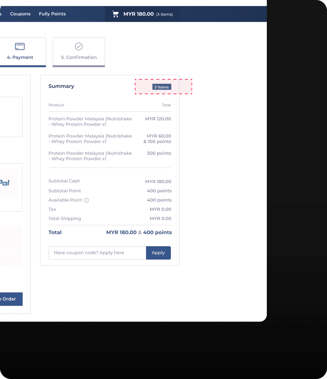
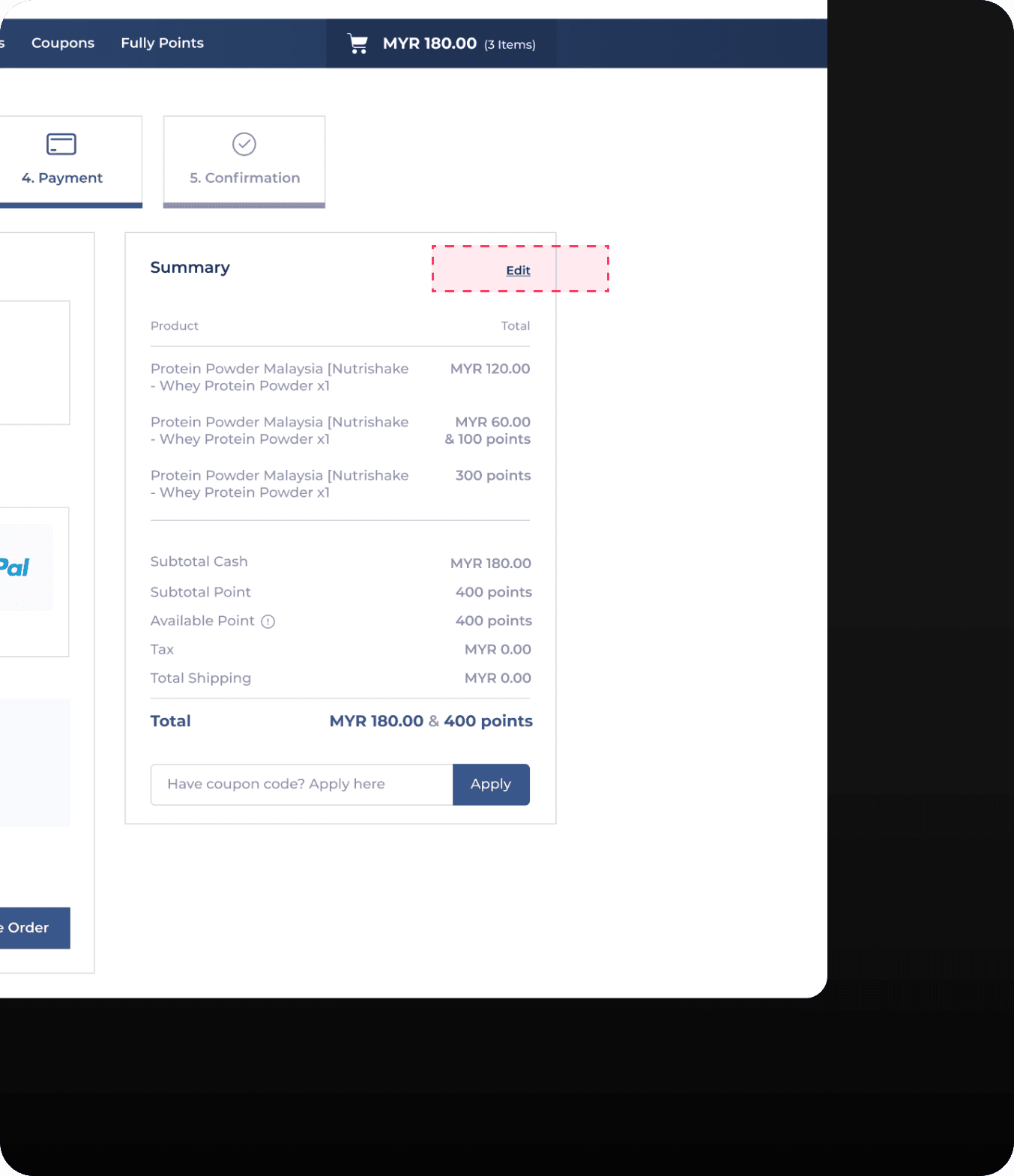
Therefore, the alternative solution I found is to revamp the summary order in step 4, which is located on the right side, and change the '3' item (Figure 4.1) to an edit button (Figure 4.2).
Then users can directly return to step 1 and revamp the purchase option for the item.
4.1
Before — Summary order in Step 4.
IMAGE
4.2
After— Add ‘Edit’ button.
IMAGE
Seamless experience.
Process of shopping without obstacles
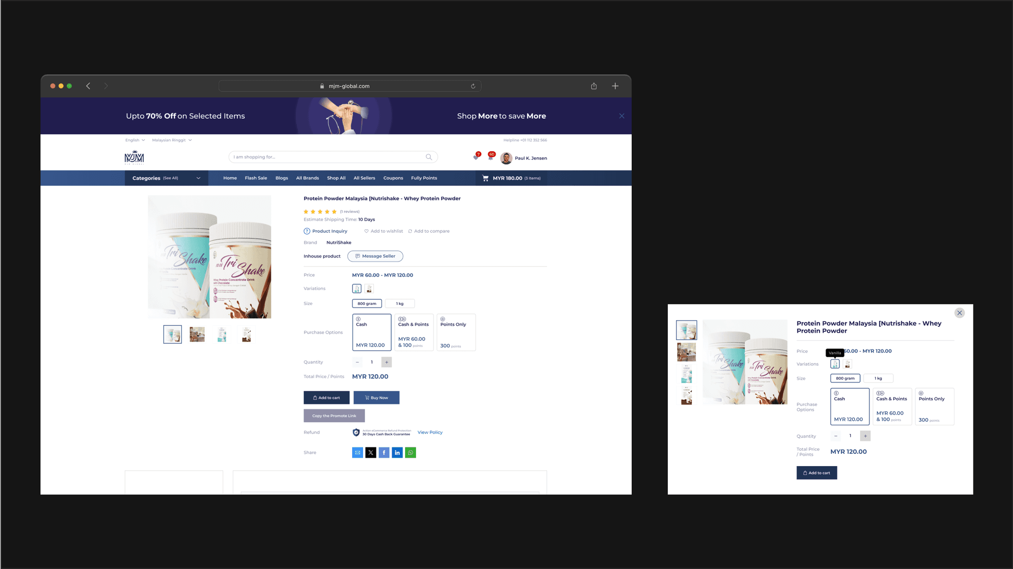
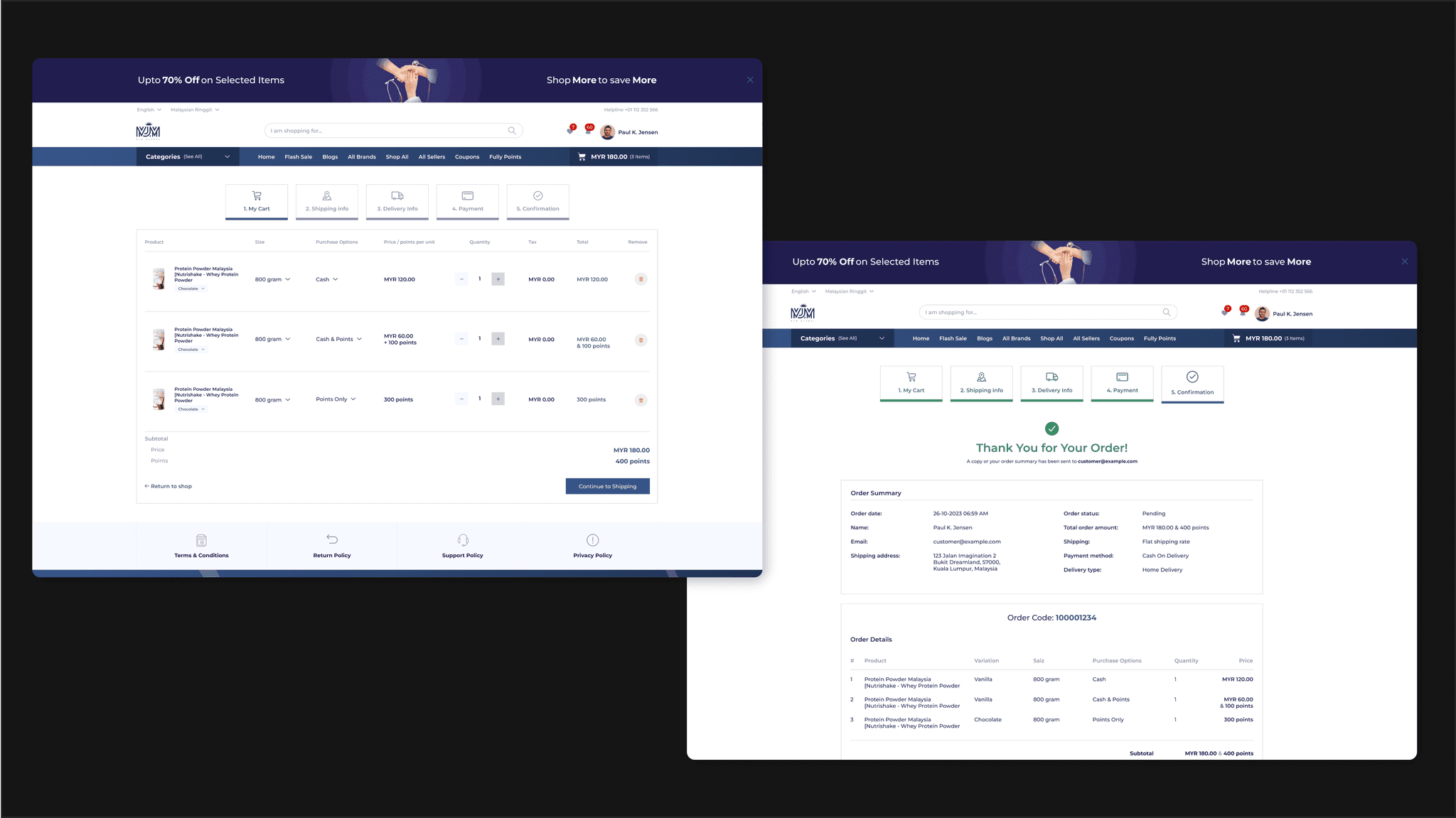
After the modification, users can place orders without any problems.
5.1
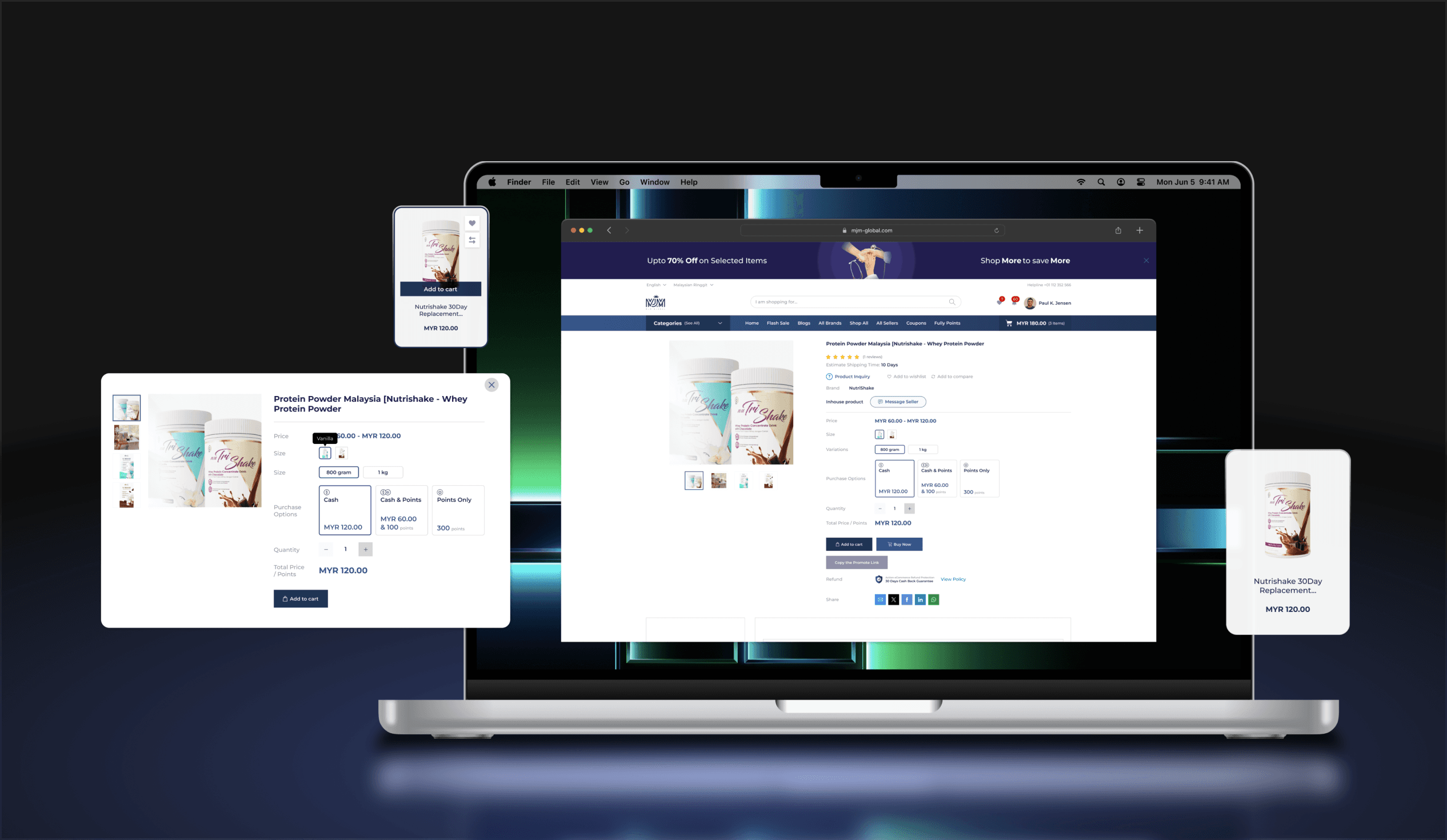
Single product page and pop up modal.
IMAGE
5.2
Product Card + Point Redeem.
IMAGE
5.3
Make payment process.
IMAGE
A happy ending.
{
Achievement
}
Stakeholders are satisfied, and successful delivery was achieved.
Lessons learned
Discover possibilities in limitations
Even under limited constraints, find a ways to make the product better, such as finding colleagues to do user testing to ensure that all user processes are working properly.
Continuous learning and growth
Remaining curious and open to new ideas allowed me to continuously improve my skills and stay at the forefront of UI/UX design trends.
Persist in finding the best solution
Through exploring multiple solutions, I've learned a lot and am happy and accomplished to have arrived at the best design solutions.
Client collaboration is key
Regular collaboration with the client ensures that their vision and requirements are accurately reflected in the final design, leading to higher satisfaction.

