Gel n Go
Web Design, Real-World Project - Nov 2023
Timeline
2023.11 (1 weeks)
Industry
Beauty & personal care
Role
UI/UX designer
Tools
Figma, Adobe Illustration, LottieFiles
Responsibilities
Content, Prototyping, UI design, UX design, Usability testing
Overview
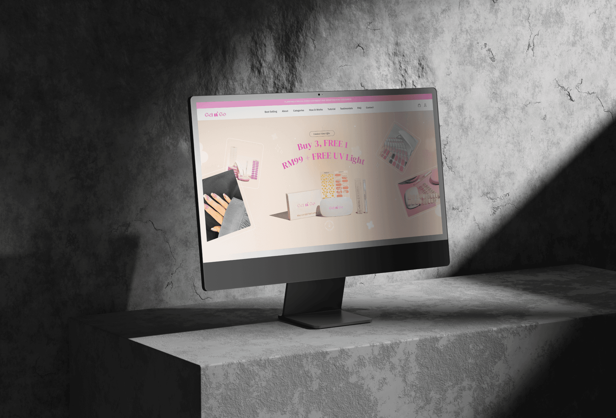
Gel n go’s website is focus on sell the sticker nail and UV lamp. The overall page’s style is cute as attract young female customers to view and purchase.
This project involved designing a comprehensive e-commerce website for a brand specializing in customizable nail stickers. The aim was to create an engaging and user-friendly platform that showcases a variety of nail sticker designs, offers customization options, and provides valuable content for users, including tutorials and FAQs.
Notice:
After the project is delivered, the client will have full control to independently revamp the content and design, and I will no longer be involved.
{
Highlights
}
A website that help to introduce and sell their products.
0.1
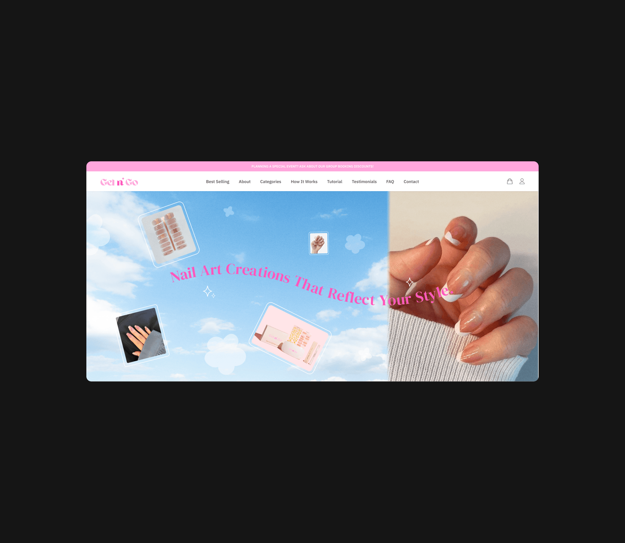
Hero image created by me.
VIDEO LOOP
0.2
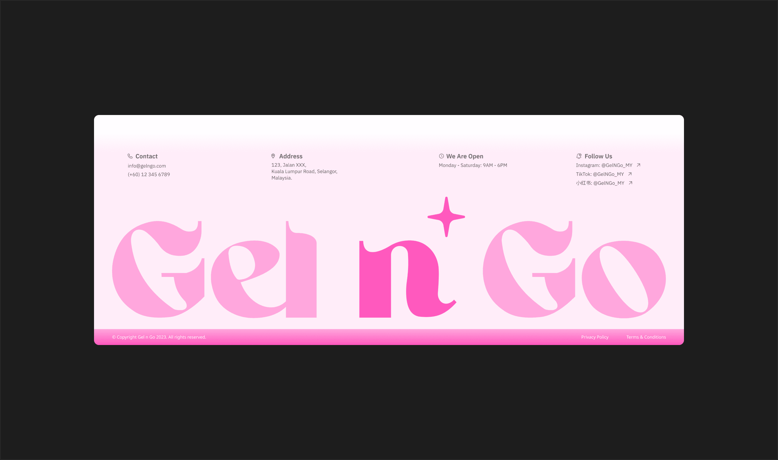
Footer design with using huge logo.
IMAGE
0.3
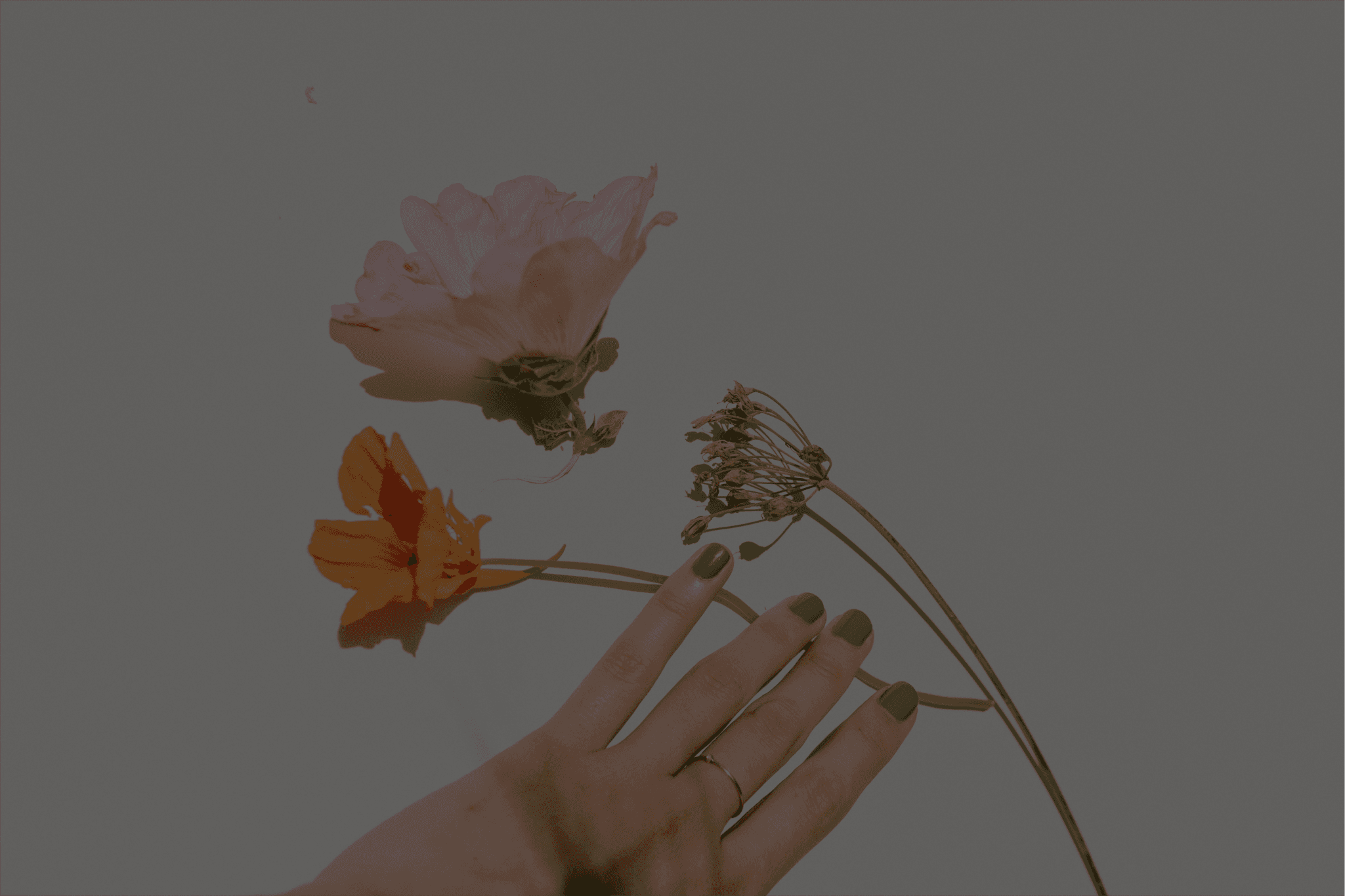
Hover effect on image.
VIDEO LOOP
{
Goal
}
Set objectives, drive outcomes.
Project Goal
How might we help the client create a website that effectively showcases product variety and reflects the brand's identity?
Business Goal
How might we help the business increase overall sales of nail stickers and expand their customer base?
{
Problem
}
Innovating with constraints.
Maximizing potential with limited resources
Directly create high-fidelity prototyping. This meant I had to take a lot of time in design and content, because I need to get it right the first time.
Tight timeline. Within three days, I need to research (find references) and design the home page to establish the website's design style.
Undefined content direction. The client had no clear concept for certain sections, require significant creativity and initiative to develop content that fit well with the overall brand message.
Few & mid-resolution photos provided. The client provided only the product and feedback photos, make it difficult to maintain a high-quality visual standard across the page.
No references available. There is a lack of available references for content and style of webpages in this industry.
{
The Challenge
}
Ensure cohesive design and balance information and aesthetics in the nail sticker landing page.
{
Project Roadmap
}
Project progression record.
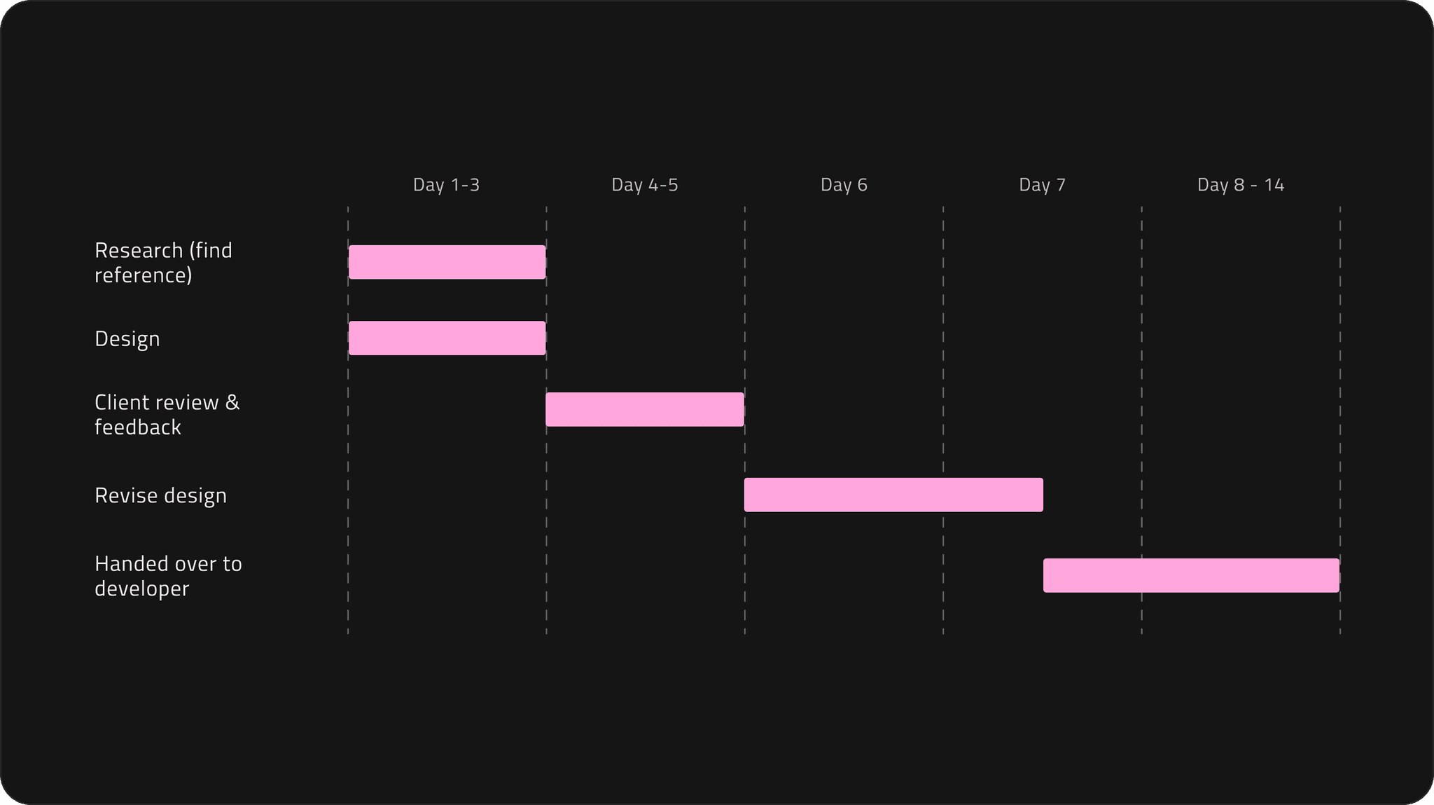
Design timeline
In this project, I was responsible for designing the home page, while the login, registration, and purchase-related pages were assigned to the developer to implement using pre-built templates.
Hence, Figure 1.1 only depicts my task flow and timeline.
1.1
Timeline.
IMAGE
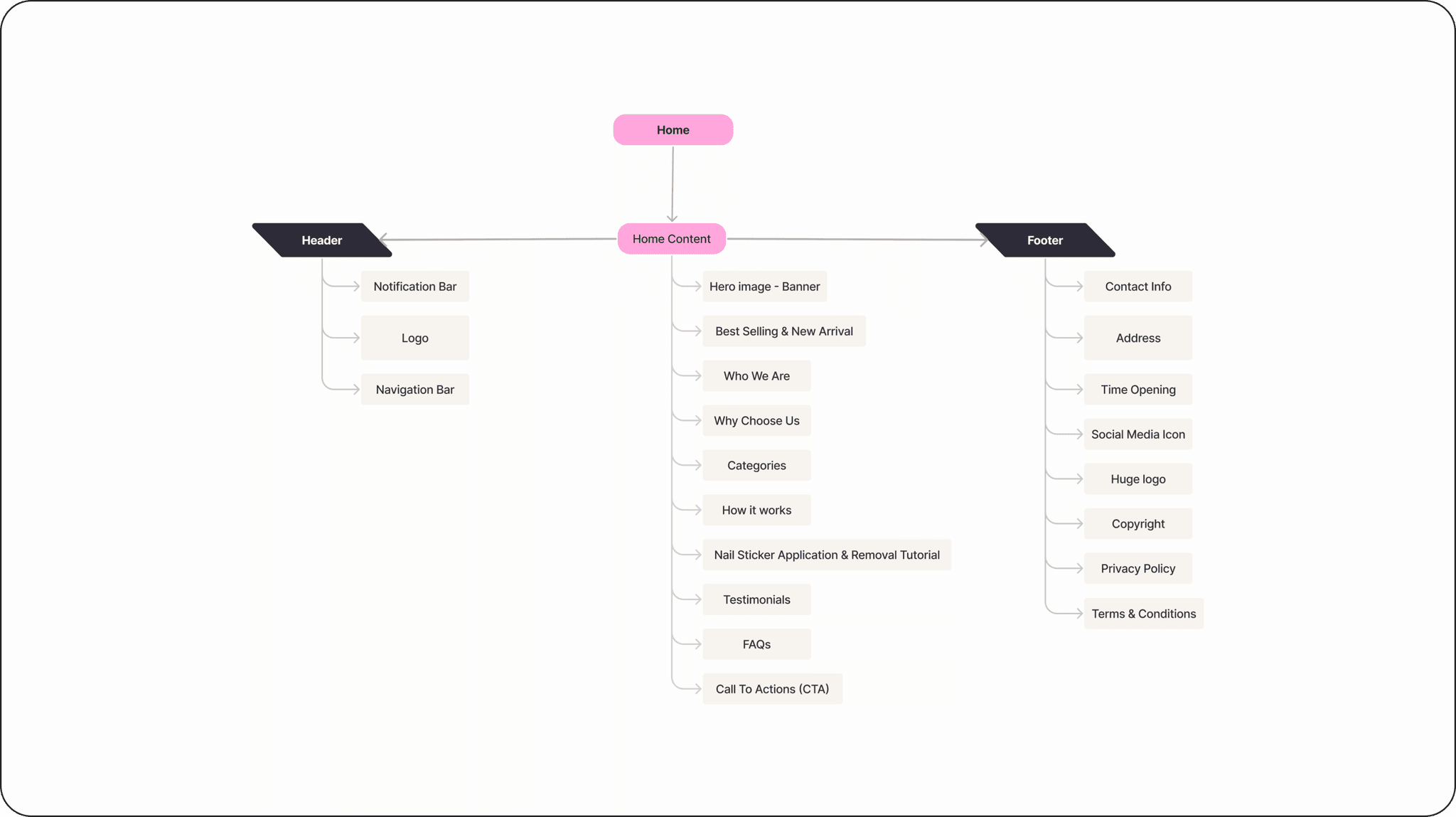
Sitemap
Since I was assigned the sole responsibility of crafting the homepage, the development of the login, registration, and purchase-related pages was entrusted to the developers, who utilized pre-designed templates.
Therefore, the sitemap only outlines the components related to the landing page, navigation and footer (Figure 1.2).
1.2
Sitemap.
IMAGE
{
Branding Choices & Design
}
Creating a distinctive visual identity.
Visual elements
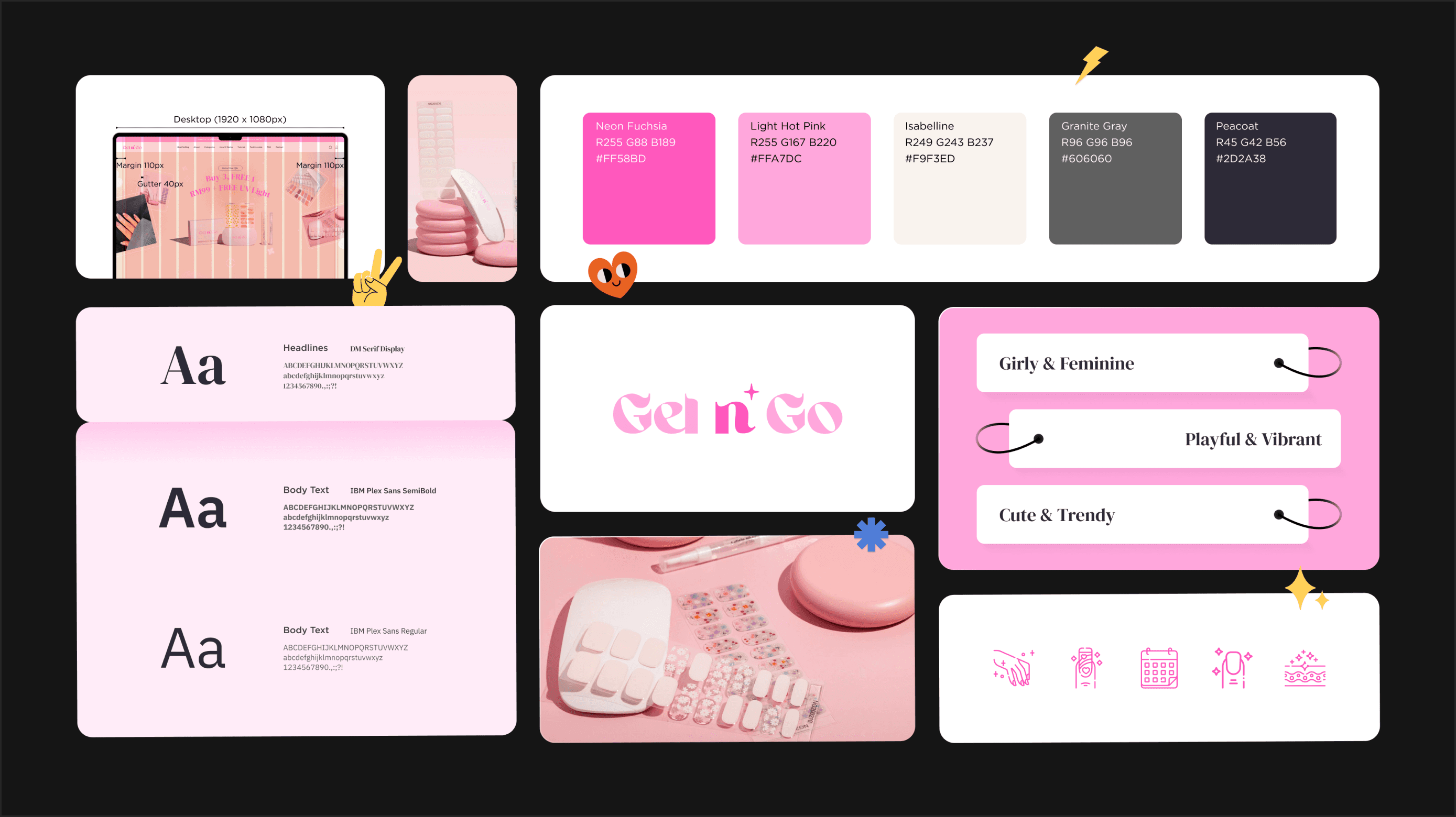
I defined the website's color scheme based on the client's provided logo and their target audience, aiming for a girly, feminine, playful, vibrant, cute, and trendy style (Figure 2.1).
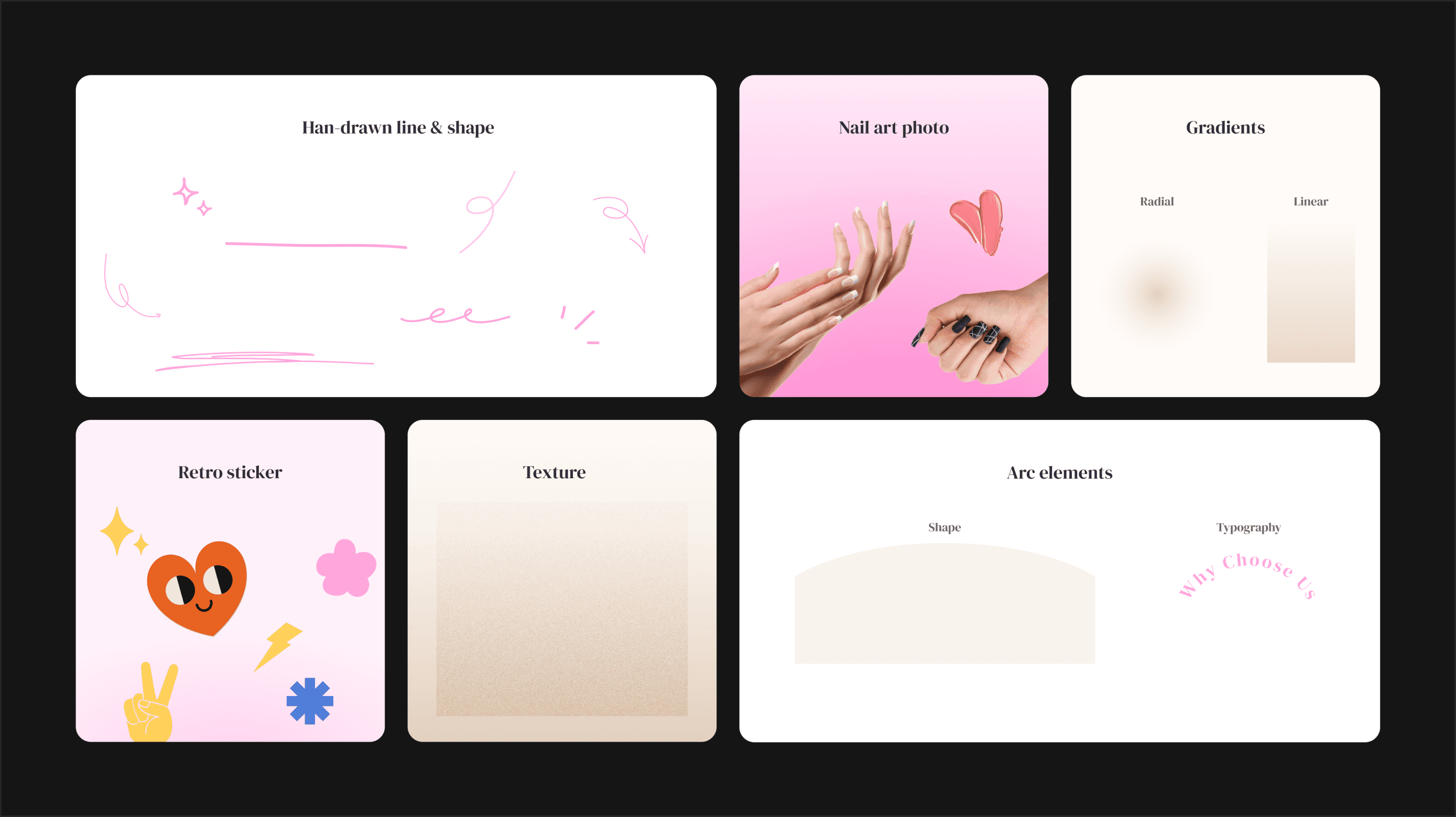
To match the website's style, it incorporates various visual elements, including gradients, hand-drawn lines, retro stickers, textures, and arcs (Figure 2.2).
{
Design exploration
}
Solving through exploration.
Picture limitation
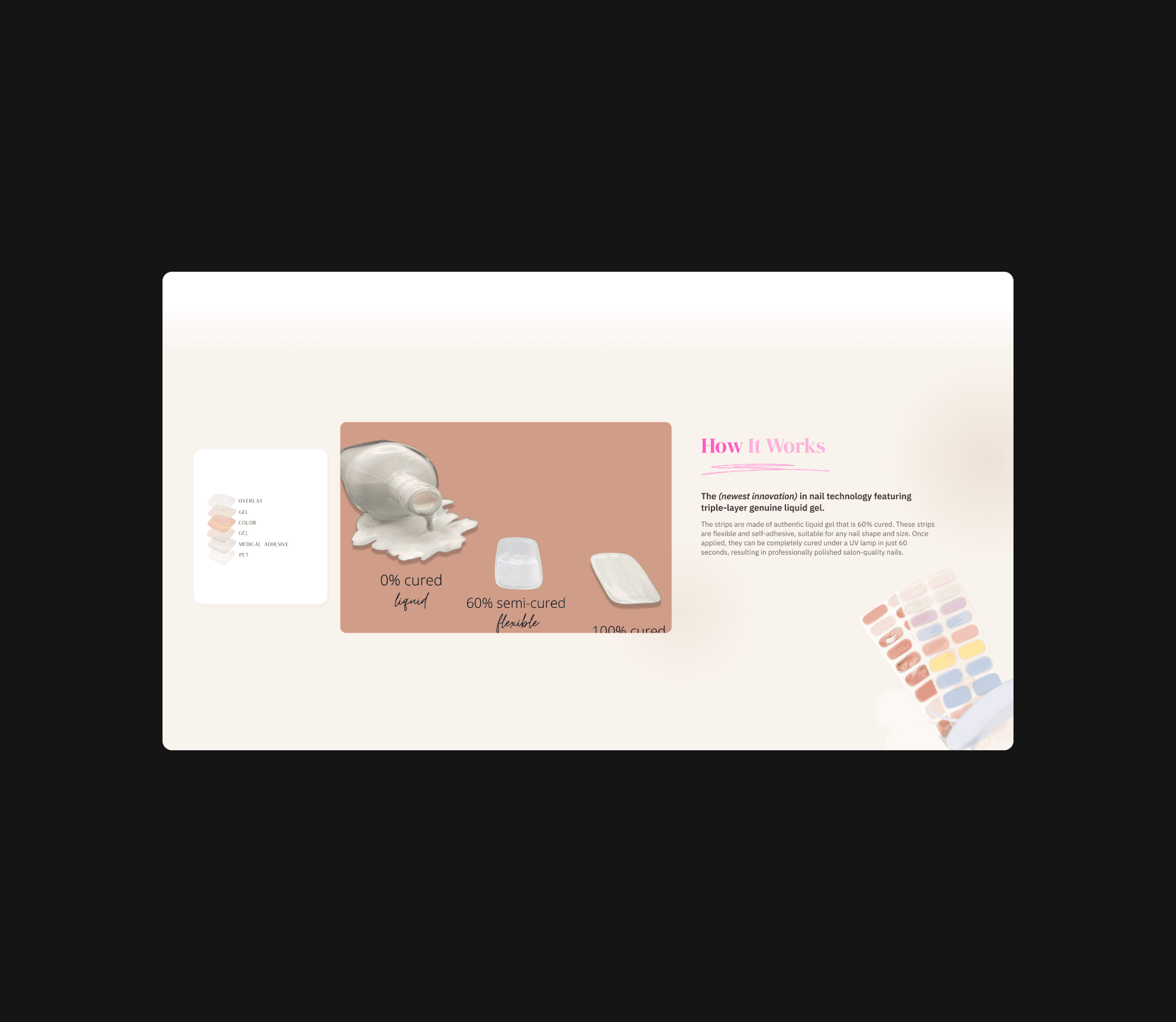
The photos provided by customers were not suitable for direct use and did not match the overall style of the website (Figure 3.1).
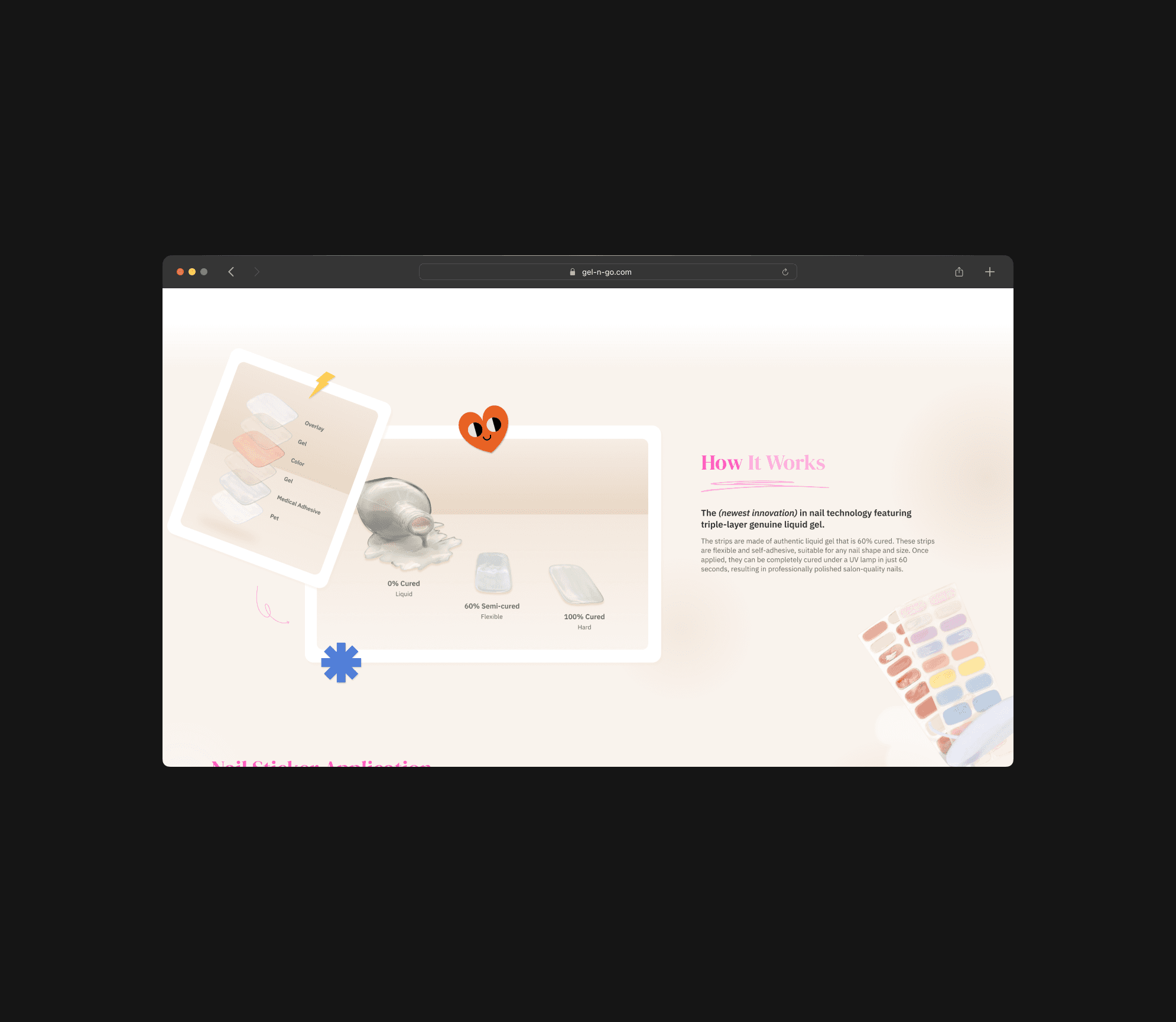
Therefore, I extracted the main subjects from the photos and redesigned them with some visual elements (Figure 3.2).
3.1
Unable view product completely.
IMAGE
Visual inconsistency due to mismatched photo style. The photos provided by customers did not match the overall style of the website, resulting in poor visual effect for this section and causing the two images on the left to look inconsistent.
3.2
Combine 2 image into 1.
IMAGE
Enhance visual consistency by using some visual elements. To ensure a consistent visual style, I extracted the main subject, added a gradient background for depth, and used retro sticker elements to align with the website's aesthetic.
Make it more engaging
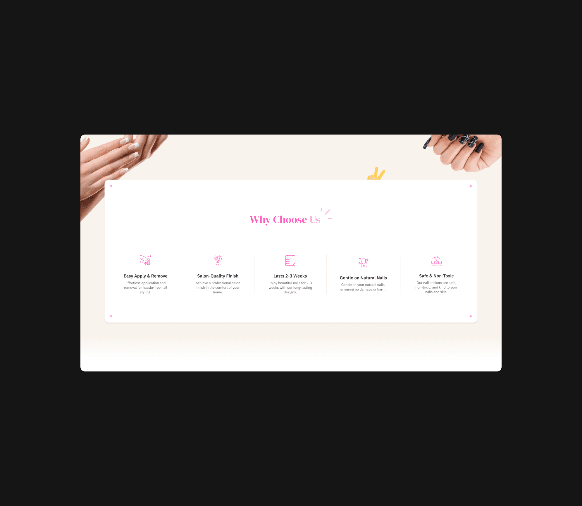
To enhance user engagement and infuse the brand with more personality, I crafted a second version of this section (Figure 3.4).
3.3
Unable view product completely.
IMAGE
Lack of visual appeal. Due to the plain and flat presentation, the absence of graphical elements or decorative icons makes it look less engaging.
The content less prominent due to lack of color contrast. The text and icons blend into the background rather than popping out and it harder for viewers to quickly understand and remember the key points.
3.4
Combine 2 image into 1.
IMAGE
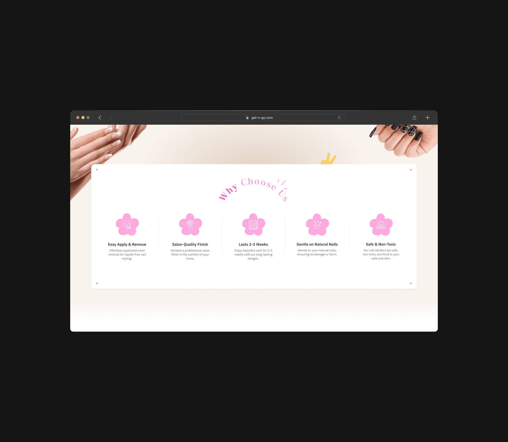
Enhanced visual appeal by applying some vibrant and appealing visual elements. The use of icons with a floral design adds a decorative touch that enhances the overall look.
Enhance readability and visibility by implementing higher contrast colors. To make the text and icons stand out more against the background, the pink floral shape design used as the background for icons.
{
Design rationale
}
Design decision explained.
1. Order strategy
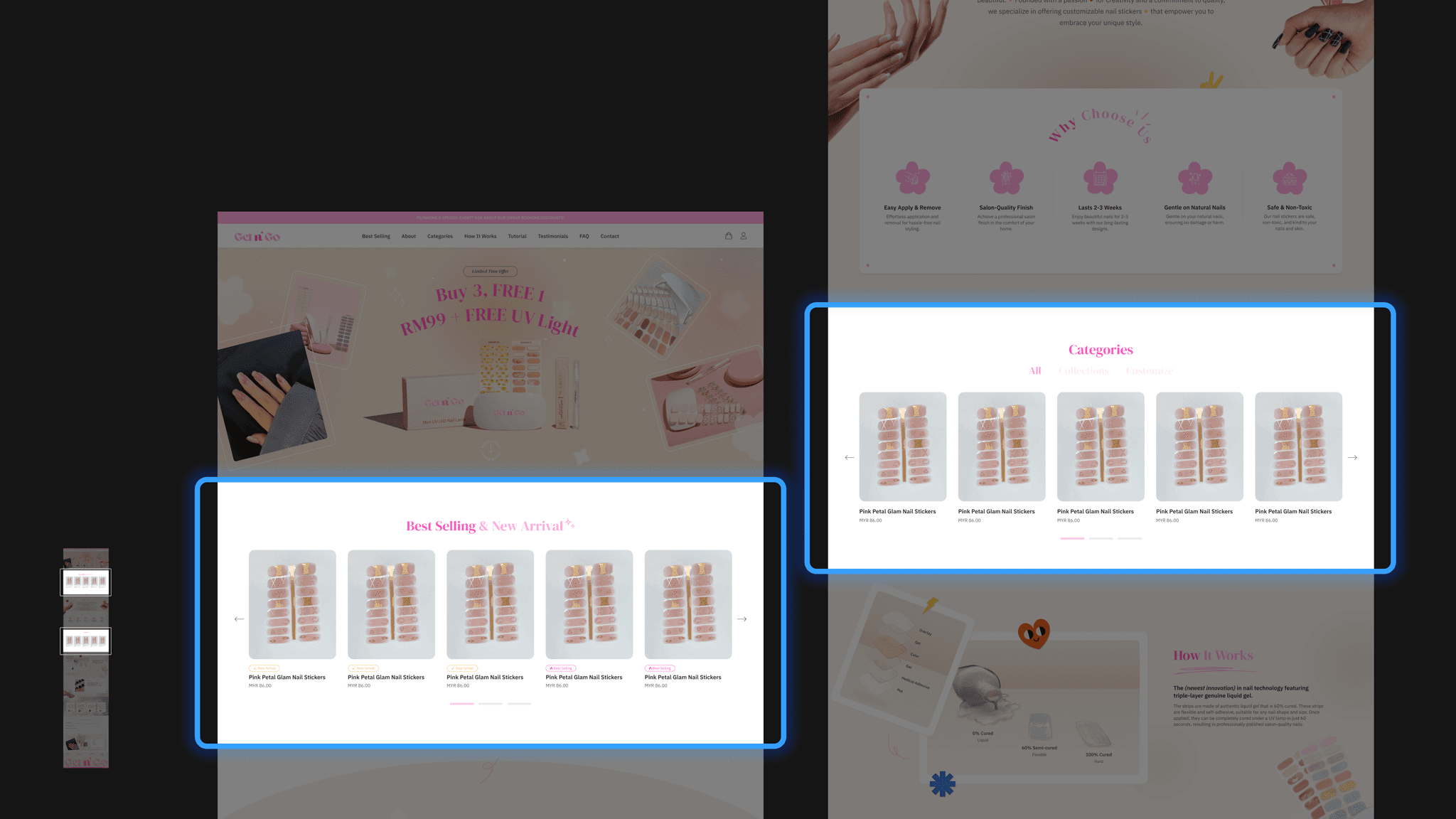
To immediately capture customers' attention and encourage them to continue browsing, I placed the “Best Selling and New Arrival” in the second section and "Categories" in the fifth section of the webpage.
Additionally, I designed a label on the top of product name (Figure 4.1, right) to indicate which products are best sellers or new arrivals.
I also implemented a slider to make the website more interactive and engaging.
4.1
Homepage’s design content.
IMAGE
“Best Selling & New Arrival” in the second section
Capture user attention. Immediately showcase the most attractive products to grab users’ attention and encourage further browsing after they land on the page.
Quick product overview. Help users form a quick impression of the product range and quality, which can enhance conversion rate.
Enhance user experience. Users can quickly find popular and new products, saving them time and effort.
“Categories” section in the fifth section
In-depth browsing stage. Presenting product categories will helps guide users to more detailed browsing and selection, meeting various needs.
Improve navigation efficiency. The use of tabs and sliders allow users to quickly switch between and browse different product categories.
Enhance purchase decisions. Detailed category information helps users make more informed purchase decisions and caters to different user needs.
2. Solve photo limitation
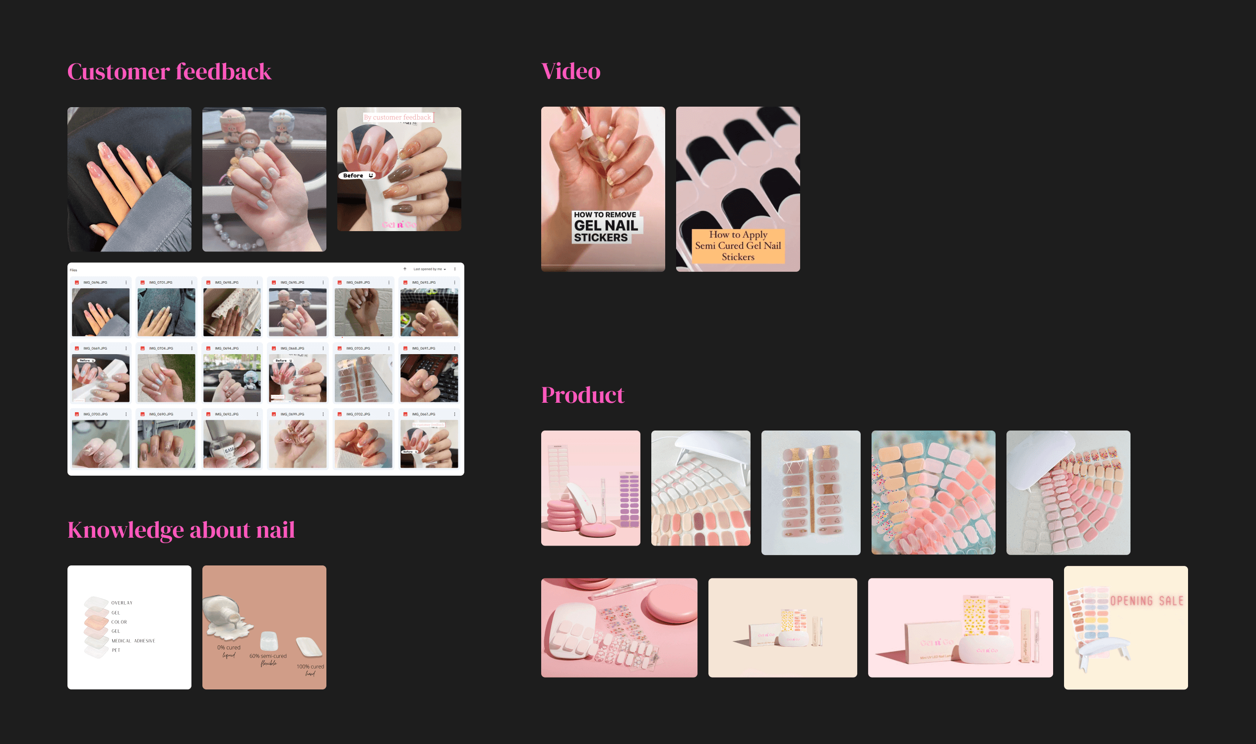
The photos provided by the client (Figure 4.2) were of low quality and inconsistent in style. Using these photos without any processing would result in a disorganized and chaotic appearance for the entire webpage.
Therefore, I processed these photos during the design phase.
4.4
Process redesign hero image.
VIDEO LOOP
Improve visual consistency. To ensure that all images align with the overall aesthetic of the website, creating a cohesive look and feel.
Highlight brand identity. To integrate visual elements that reflect the brand’s personality and style, making the images more representative of the brand.
Create depth and visual interest. To use some elements to add depth and interest to the images, making them stand out more.
Increase engagement. To make the images more attractive and engaging for users, encouraging them to spend more time on the page and explore further.
{
Iteration
}
Refining the design.
1. Banner design
As the visual focal point, it captures user attention and conveys brand image.
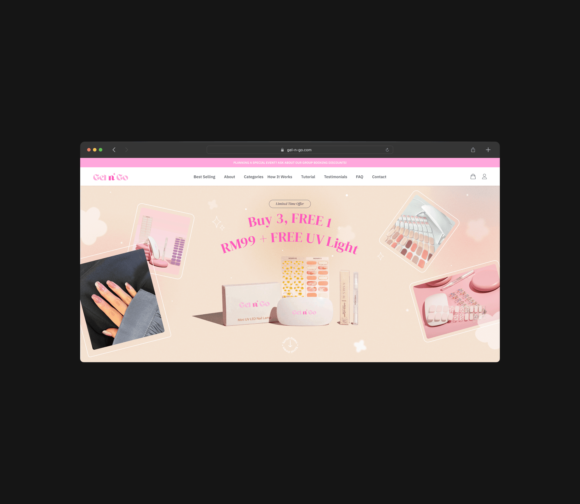
Before iteration, due to the client's lack of a clear concept for the banner and the low quality of the provided images, I had to design the banner using the limited photos available (Figure 5.1).
After the client reviewed and provided feedback, expressing their desire for a banner featuring "Buy 3 Get 1 Free and RM99 Free UV Light," I created the second design (Figure 5.2).
5.1
Banner - before iteration.
IMAGE
Before
This banner design only included a slogan and some product images, without any promotional information.
5.2
After iteration since get new images from client.
IMAGE
After
I requested high-resolution product images from them. Although the new images were slightly better in quality, they were still not ideal.
Since the background color was beige, I was able to expand the photo size without enlarging the original image. I then redesigned the banner and added the promotional information.
Add personality
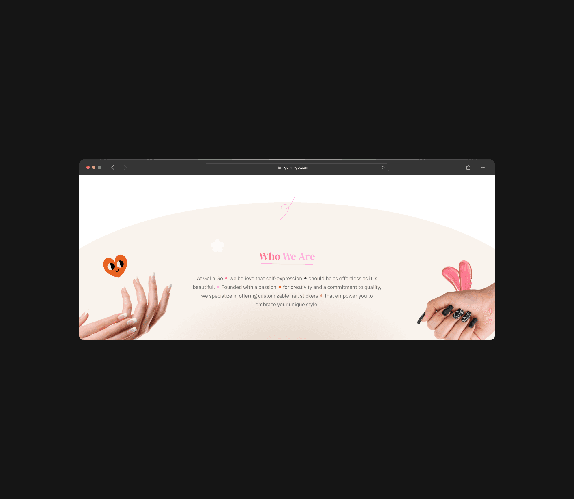
Applied these design elements primarily aims to align the webpage more closely with the brand's style, enhancing its personality and brand identity (Figure 5.4) .
5.3
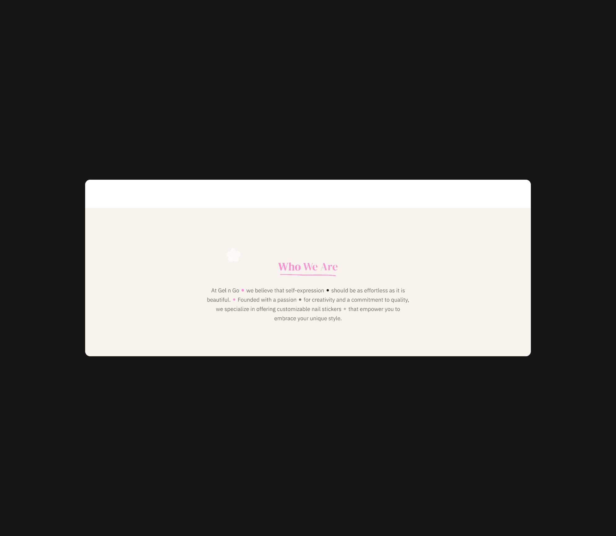
"Who we are" section before iteration.
IMAGE
Before
Prior to the iteration, this section lacked personality and failed to align with the defined style, potentially causing users to overlook it during their browsing experience.
5.4
"Who we are" section after iteration.
IMAGE
After
In order to add personality and make the design feel more complete and engaging, I applied arc background and some extra decorative elements like the stickers and hand graphics around the text in the "Who We Are" section.
Nearly approved in one go.
Elevating sales and brand identity through design
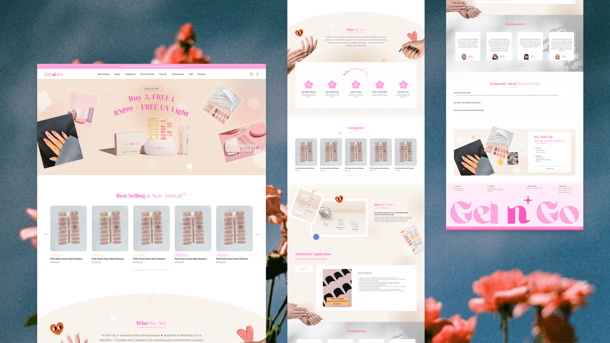
This webpage enables clients to allow their customers to easily browse products and place orders, streamlining order processing.
Additionally, it helps build brand identity, attract potential customers, and expand the customer base.
6.1
Final outcome.
IMAGE
{
Retrospective
}
A fulfilling ending.
{
Achievement
}
Delivered successfully, with stakeholders expressing their utmost satisfaction.
Lessons learned
Balancing aesthetics and functionality
Striking the right balance between visual appeal and functionality ensures that the design is not only attractive but also practical and user-friendly.
Effective communication is crucial
Clear communication with stakeholder, especially when encountering design issues such as limited client-provided photos, aids in aligning expectations and ensures smooth project execution.
Responsive for desktop & mobile
Responsive design ensure that users can easily navigate and interact with the website, and improves satisfaction and engagement.
Utilizing feedback for improvement
Constructive feedback from clients is invaluable for refining and improving the design process and final output.
