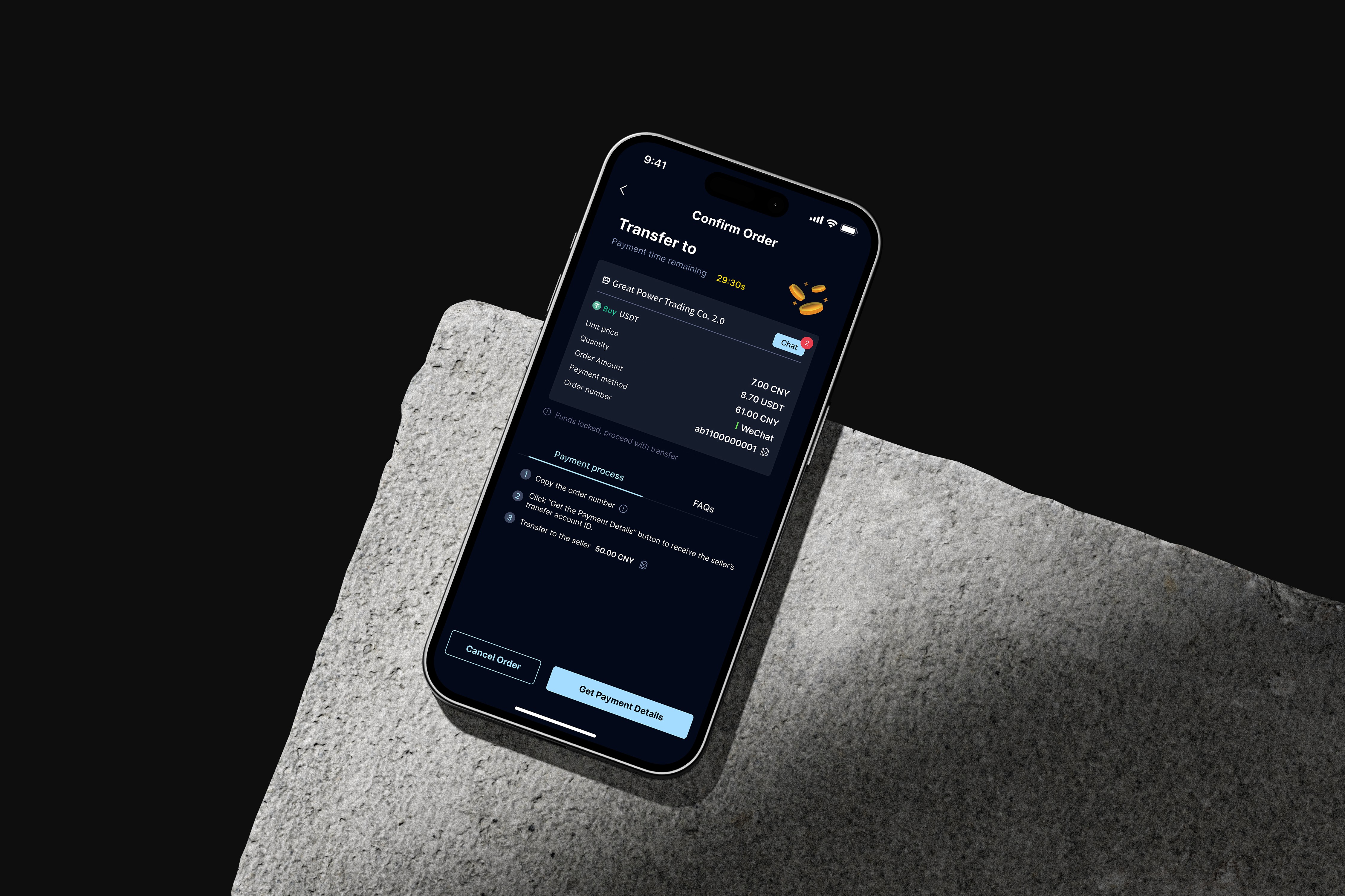
App UI/UX (B2C), Case Study - Jan 2024
Timeline
2024.01 - 2024.03 (3 month)
Industry
Taxi-hailing service provider
Role
UI/UX designer (0 - 1)
Tools
Figma, Adobe Illustration, Adobe After Effect & LottieFiles
Responsibilities
Competitive analysis, Wireframe & prototyping, UI design, UX design, Usability testing, Illustration, Motion graphic
Overview
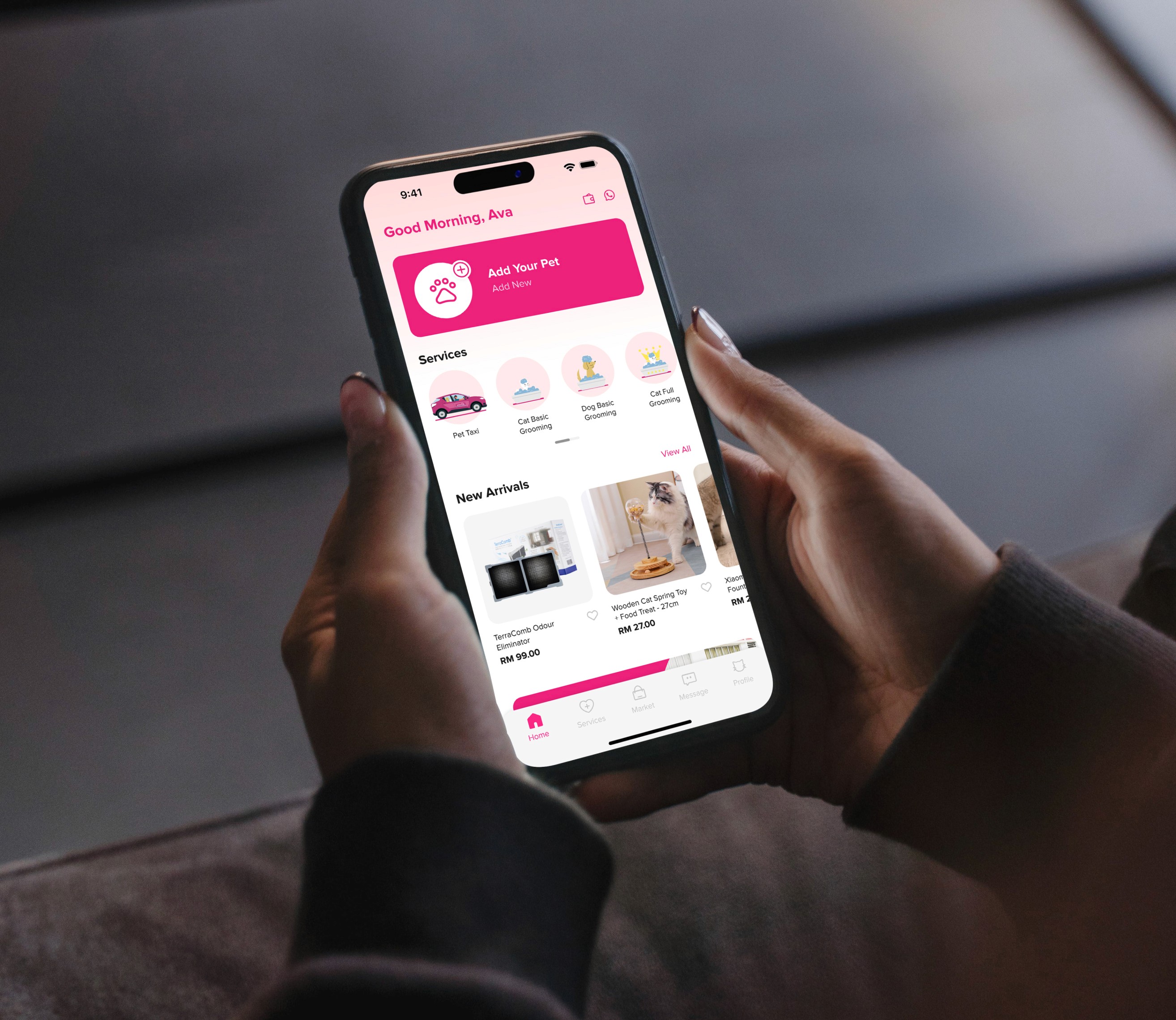
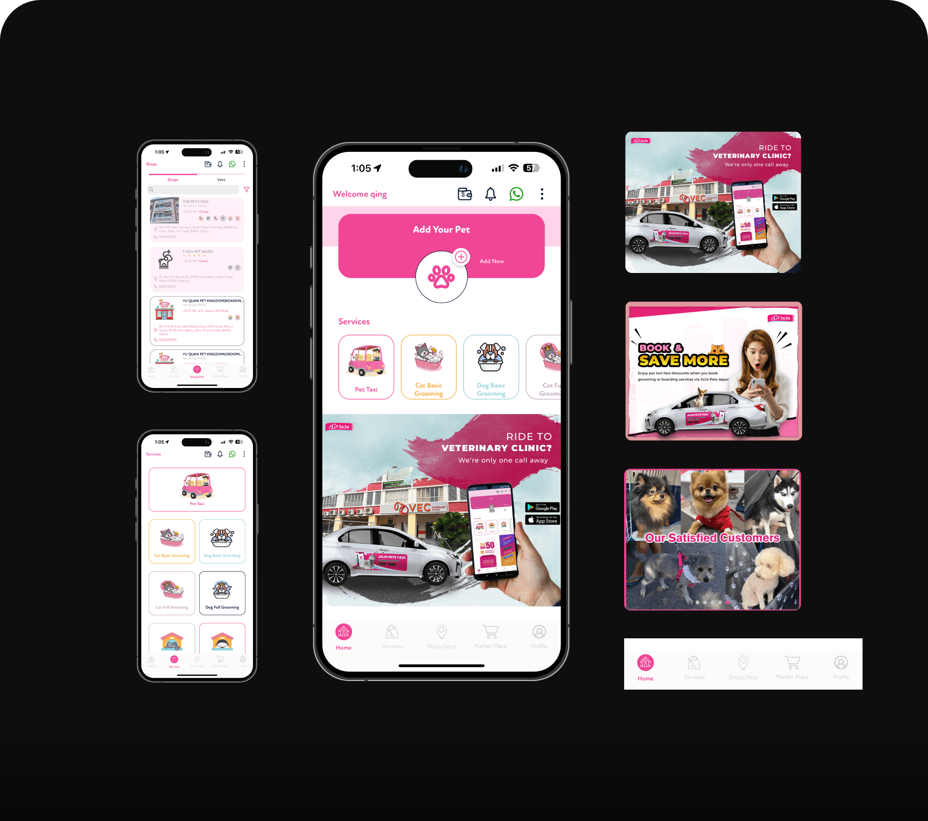
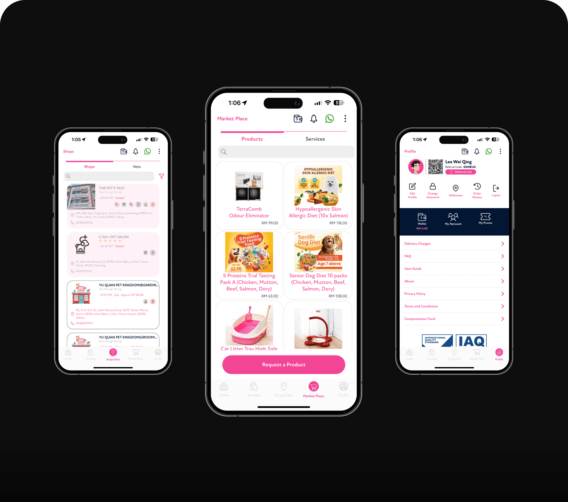
JoJo Pets app is an all-in-one pet app that offers high-quality pet care services in Malaysia such as pet transportation taxis, pet grooming, pet boarding, pet hotels, pet supplies, vet clinics and so on.
Alert!
This project is not related to the JoJo Pet Taxi. It's just for practice.
{
Highlights
}
A pet friendly taxi-hailing app designed to let users take their pet to where anytime
Step-by-step design journey.
Transforming user experience.
Refining UX and UI for a seamless experience
Inefficient navigation
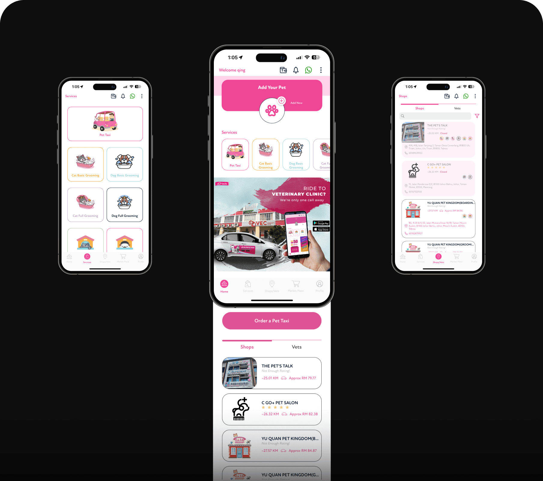
Service and shops/vets screen functions appear on home screen and “order a pet taxi” button result in an inefficient navigation experience, causing user frustration and give up.
Unfriendly user interface
The user interface is visually unappealing, cluttered due to inconsistent visual elements (icons and illustrations), lacks clear visual hierarchy, and appears outdated.
Poor communication management
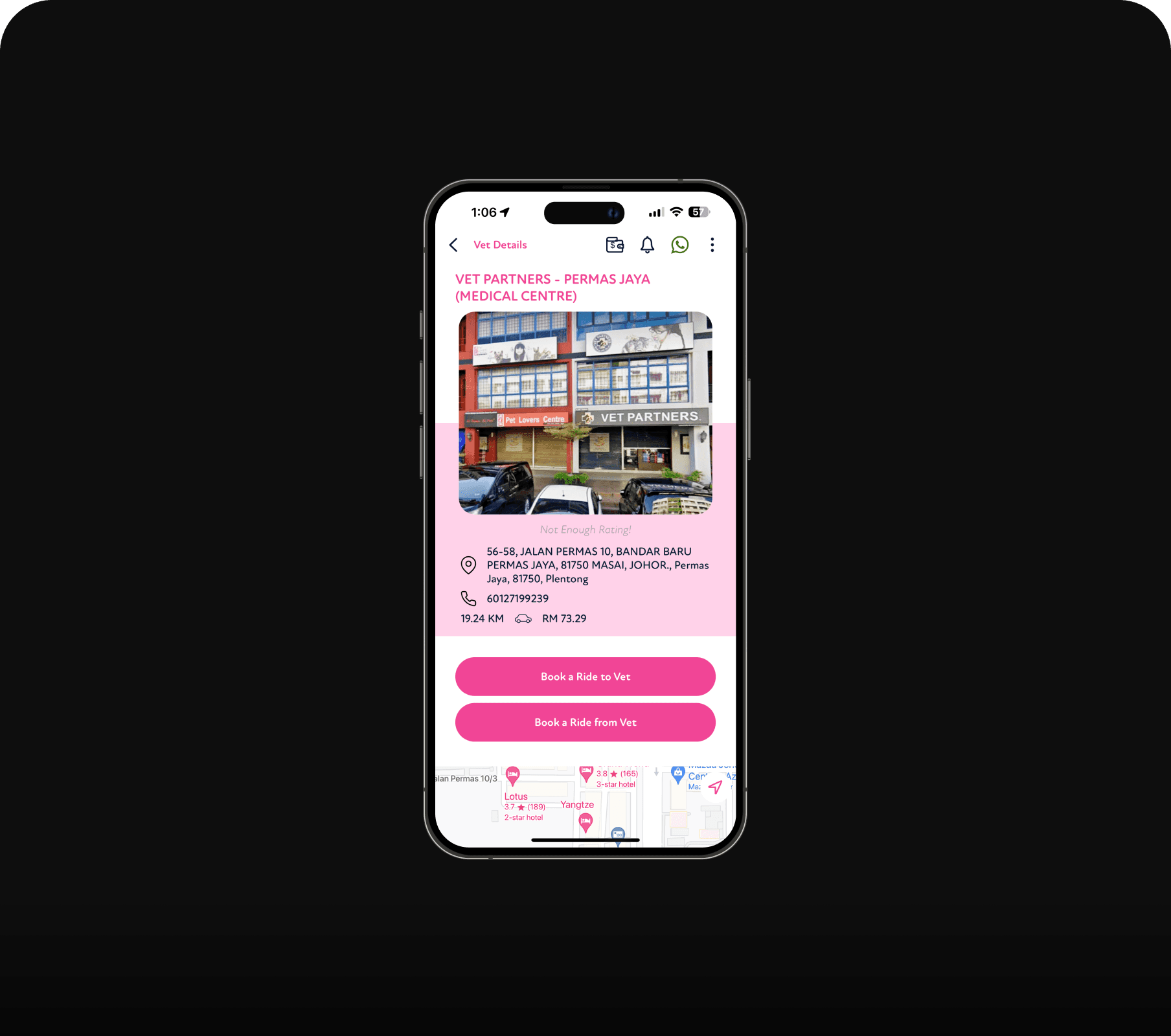
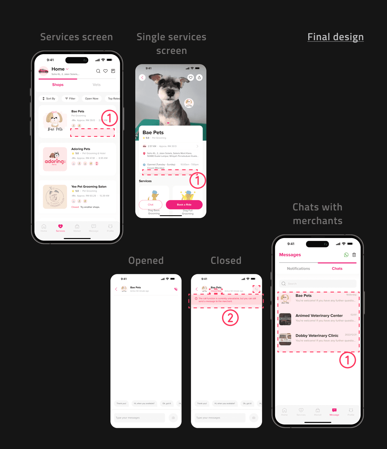
Merchant phone numbers on individual merchant screens may led to potential late-night calls, so they were replaced with a messaging feature that disables calling and indicates store closure during off hours.
Missing features
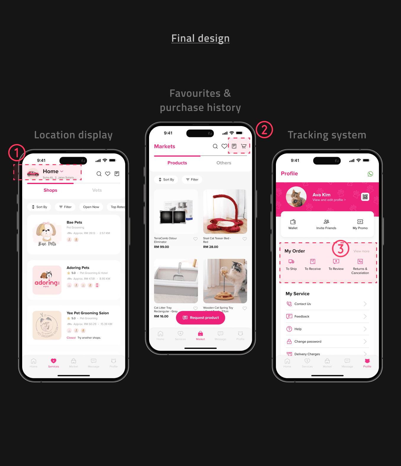
The service screen does not display the customer's location and lacks essential features such as favorites, purchase history, and a tracking system for shipping, receiving, reviewing, returns, and cancellations.
{
The Challenge
}
Balance simplicity with feature richness while create consistent and modern design elements through cohesive icons and illustrations.
Laying the groundwork.
Understanding the landscape
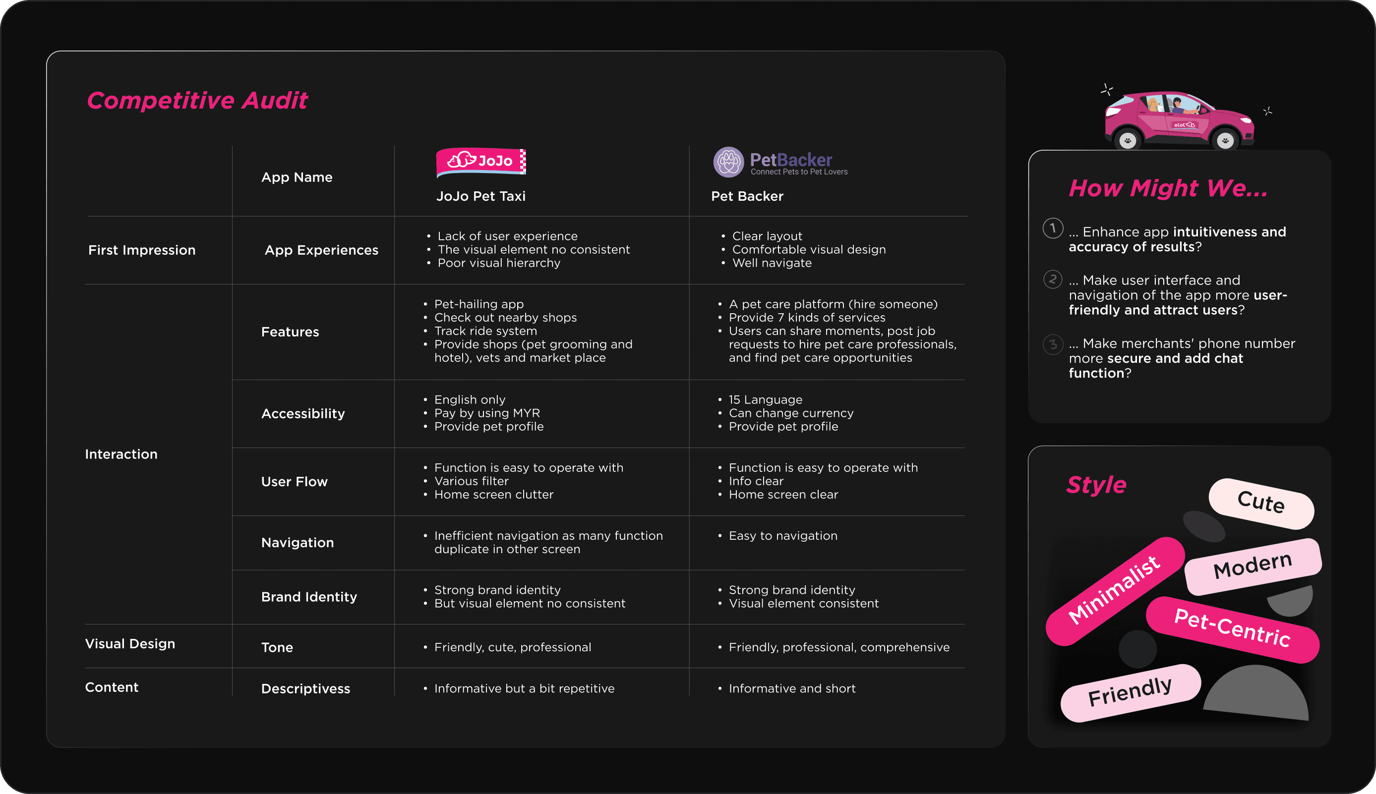
In the initial phase, I conducted a competitive audit, formulated "How Might We" (HMW) questions, and defined the app's style (Figure 3.1).
The reason for conducting the competitive audit was to gain a deeper understanding of the strengths and weaknesses of similar apps in this category. The "How Might We" (HMW) questions helped me frame the challenges and develop effective solutions more efficiently.
Structuring the experience
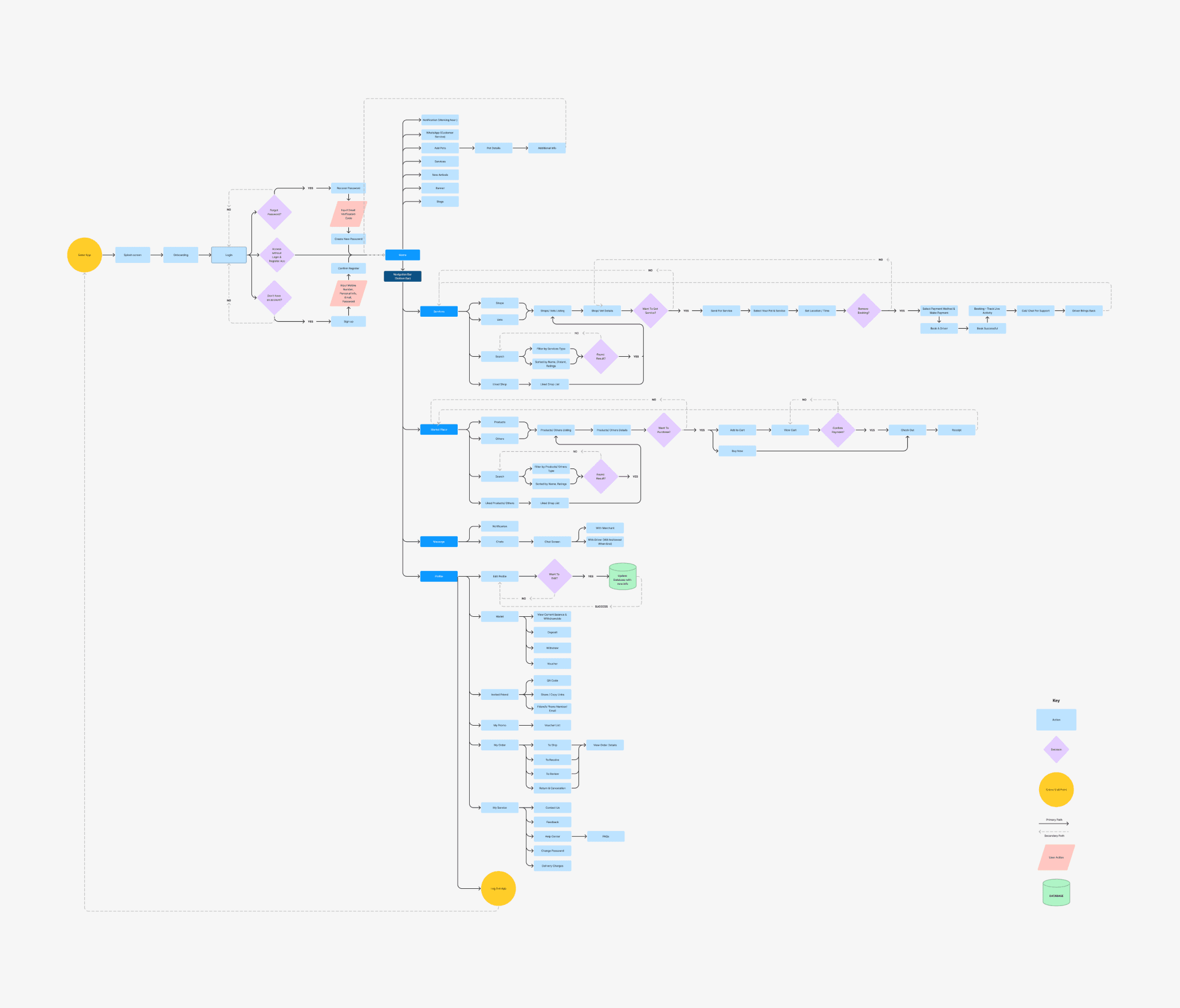
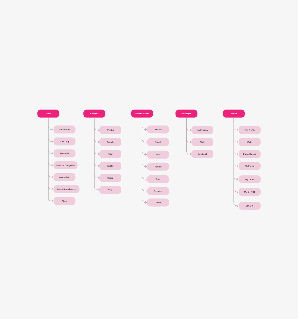
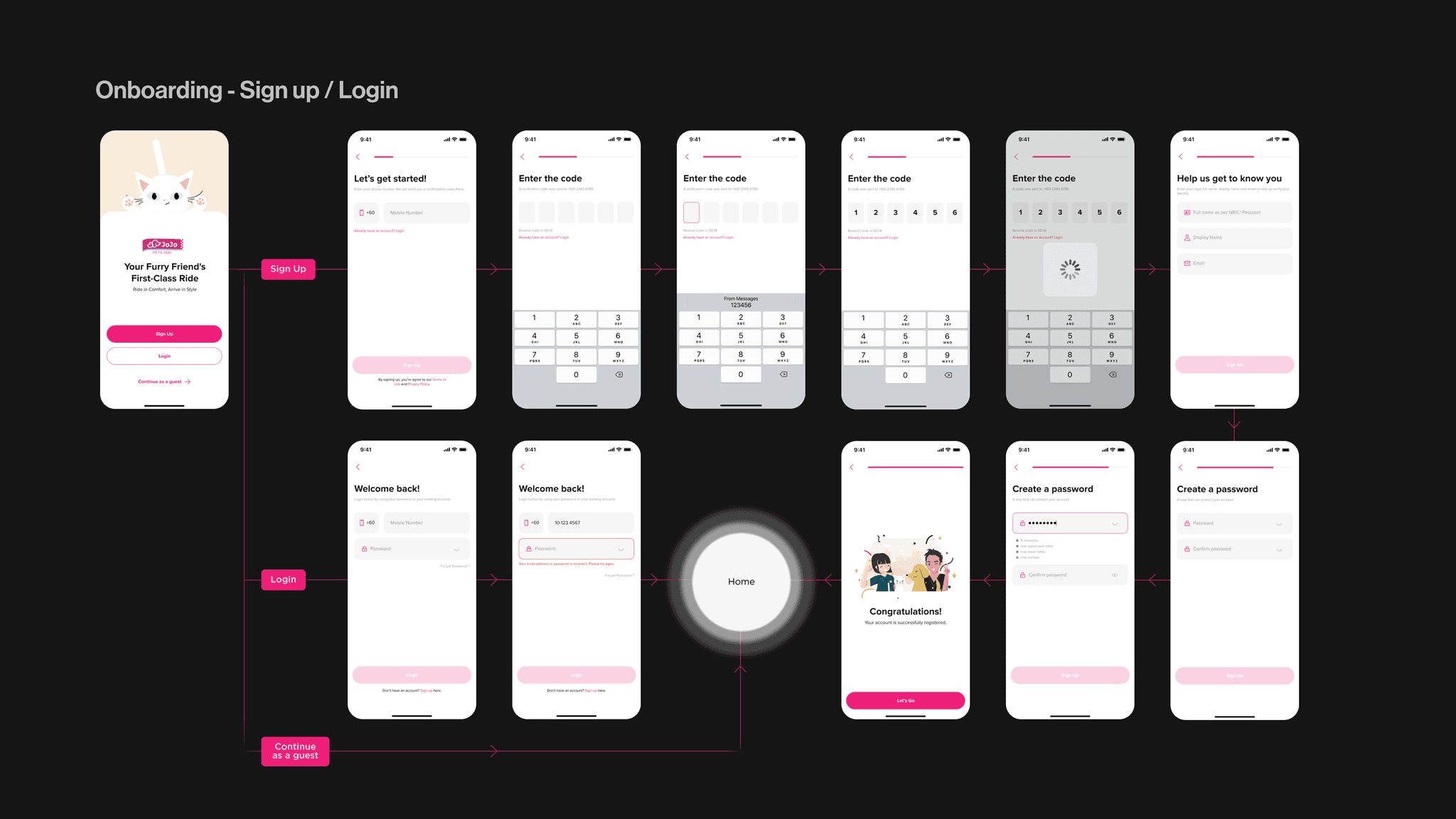
After analyzing the original user flow and identifying key issues, I redesigned the user flow and information architecture for the app (Figure 3.2 & 3.3).
This process helped me identify potential problems early and ensured a smoother transition when creating the wireframes. By refining these foundational elements, I aimed to enhance the overall user experience and address the previously identified pain points more effectively.
Visualizing ideas & prototyping the vision
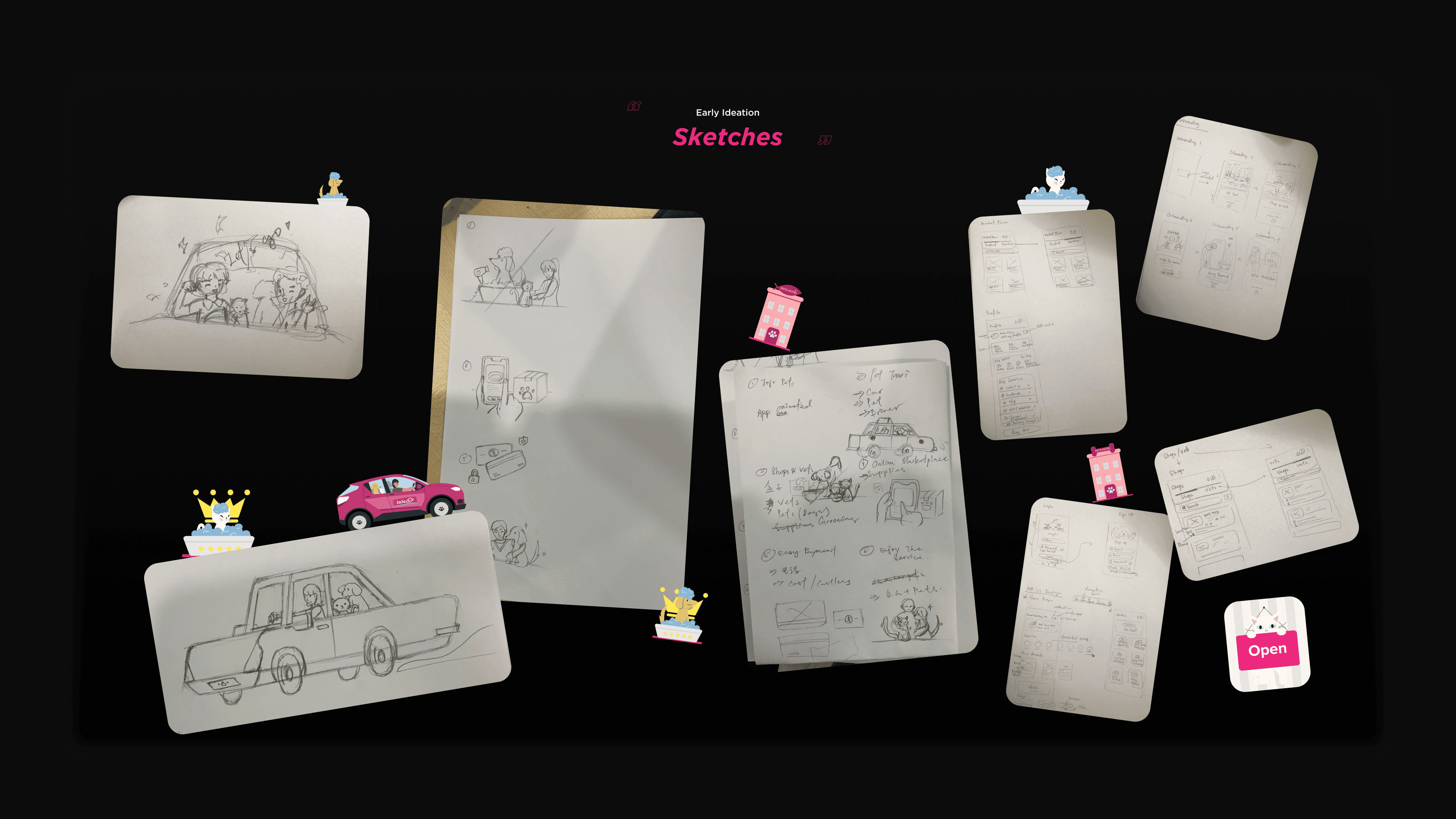
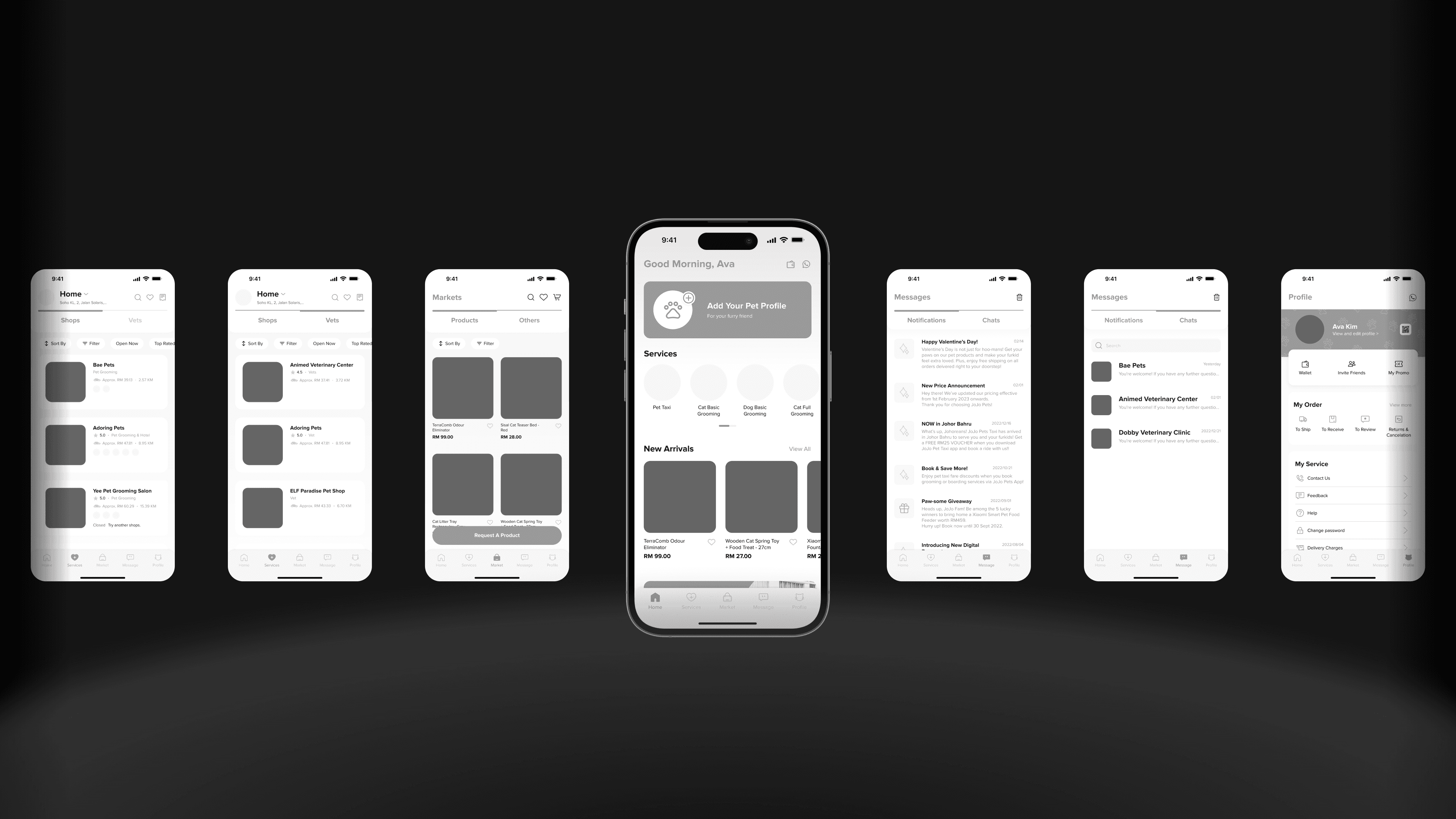
After refining the user flow and information architecture, I created sketches and wireframes (Figures 0.2 & 0.3).
The purpose of creating sketches was to quickly capture and explore initial ideas and concepts. Wireframes were then used to define the structure and layout of information, followed by user testing to ensure the design's usability and effectiveness.
Shaping the identity.
Visual design
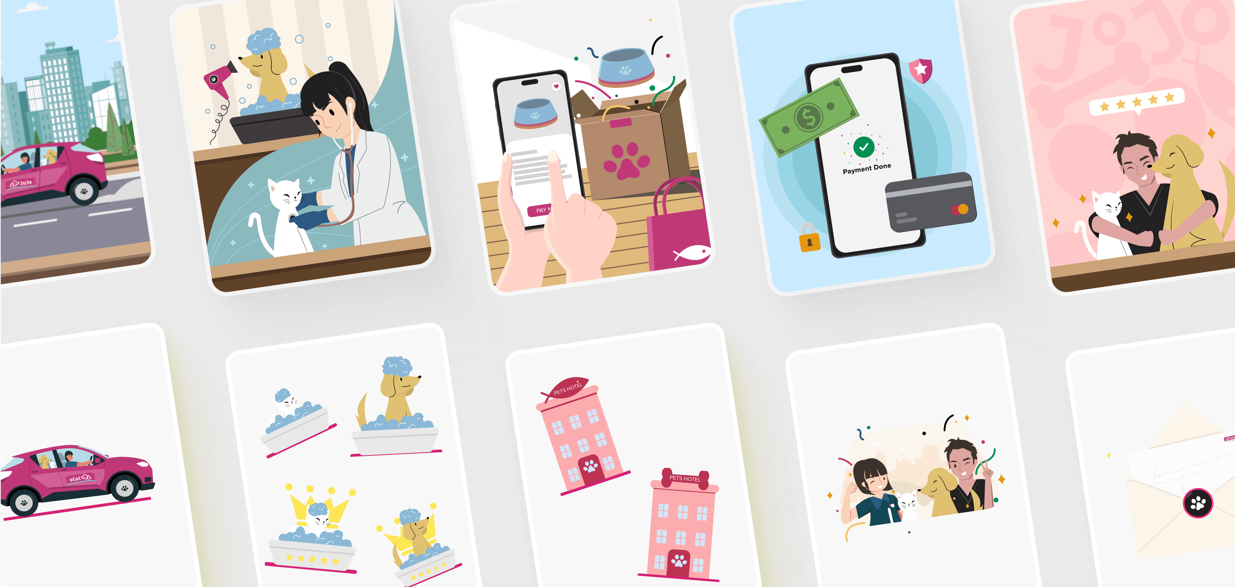
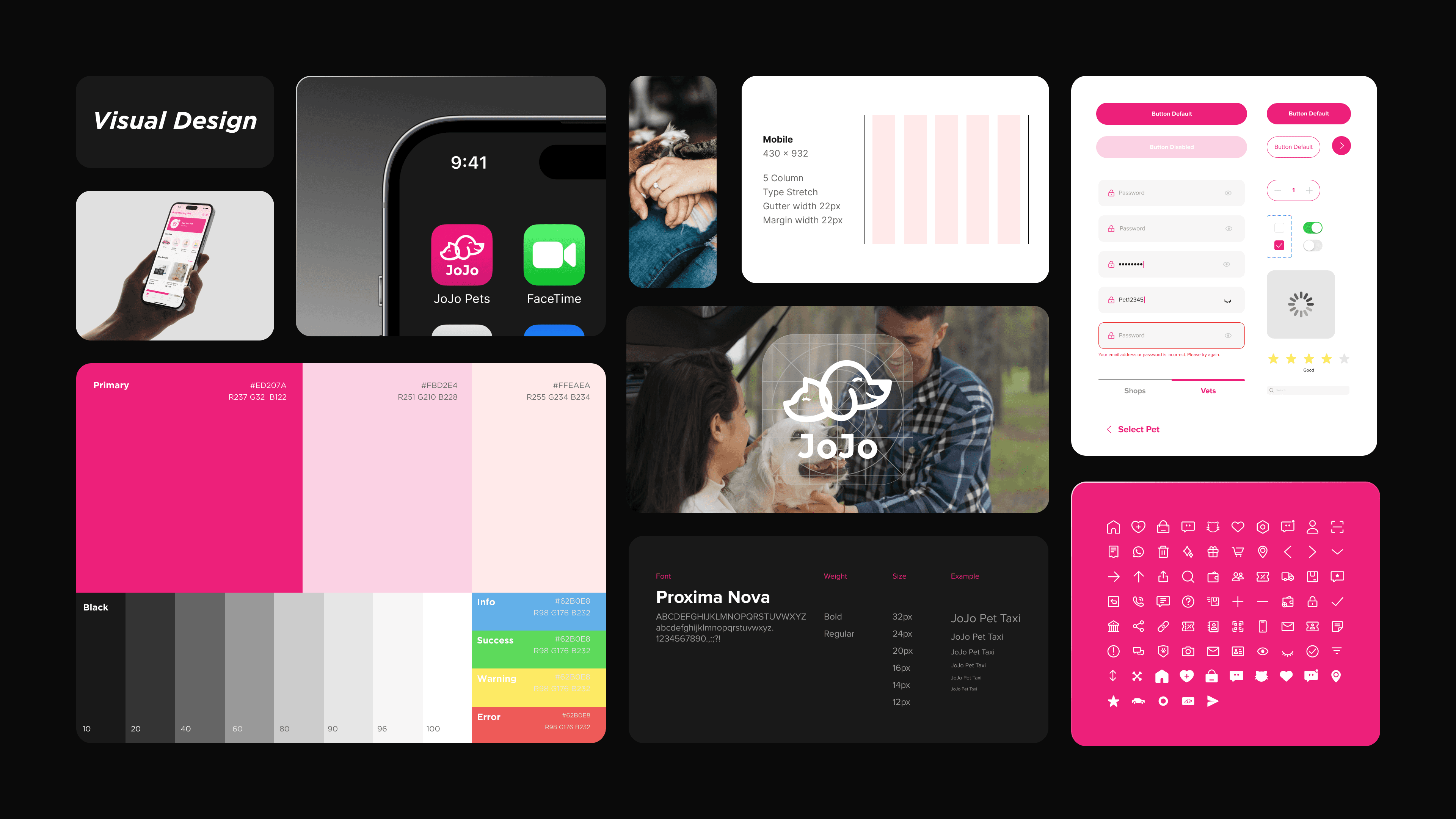
I defined the app's color scheme based on the logo, aiming for a sense of cute, modern, minimalist, friendly, and pet-centric (Figure 4.1).
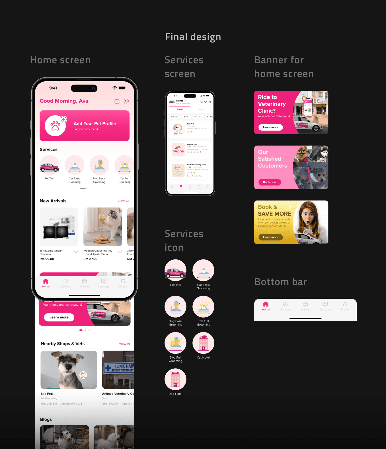
To ensure visual consistency, I created all the illustrations and icons myself. Besides, I make some visual animated to attract users.
Turning probelms into highlights.
1. Inefficient navigation
After reviewing the entire app, I identified issues with inefficient navigation.
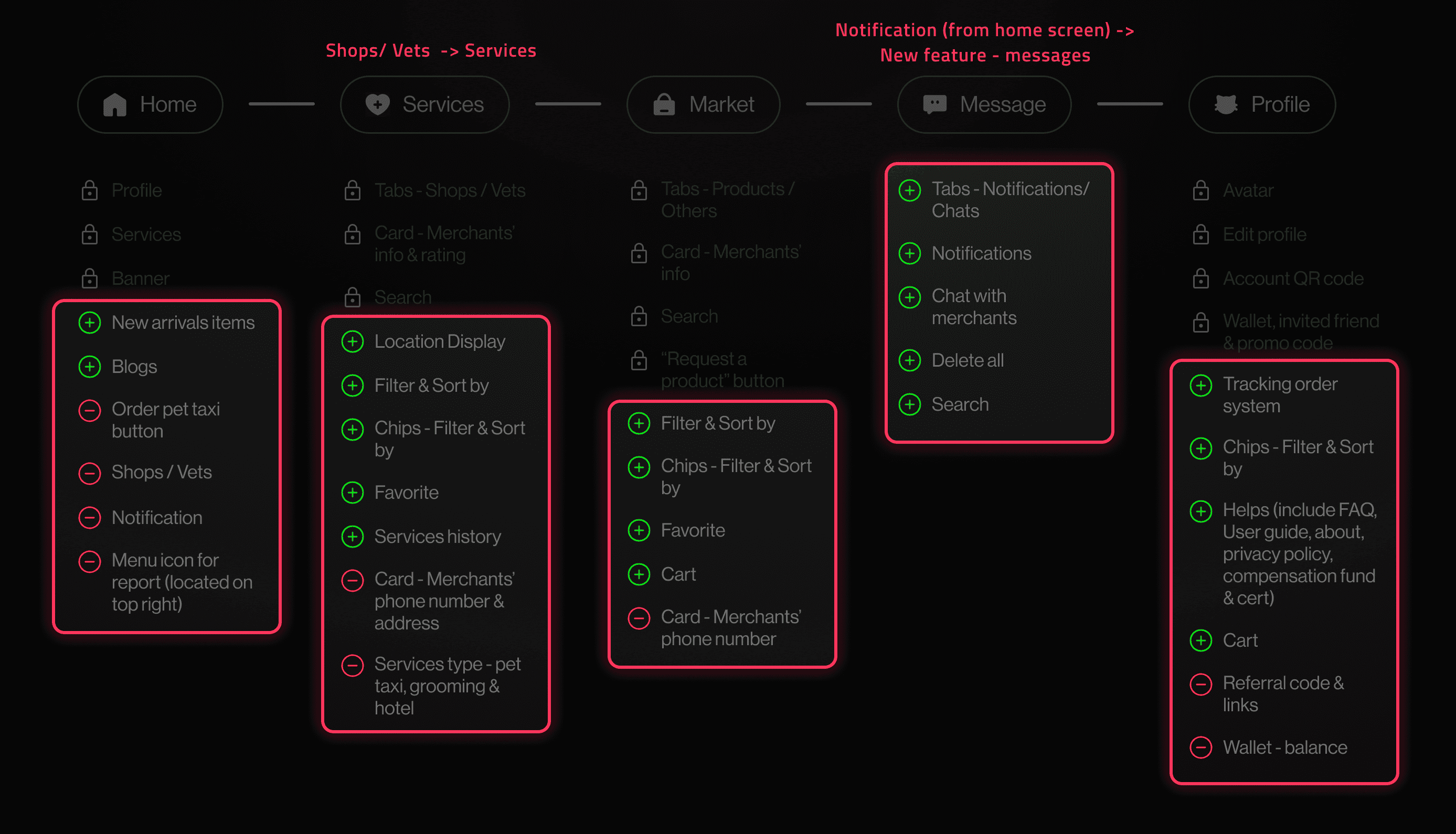
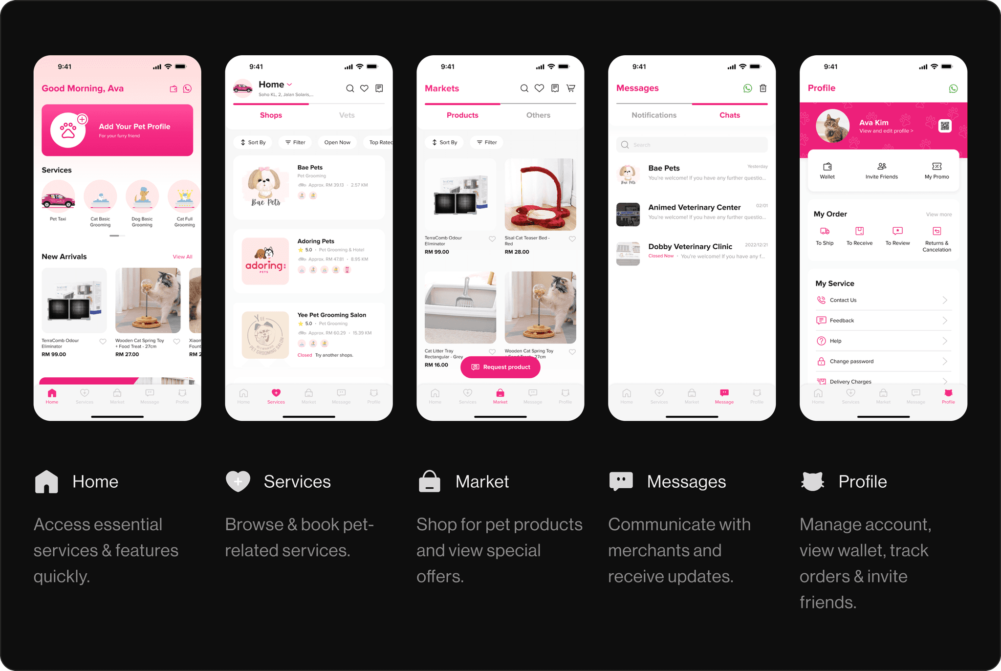
I then organized the core functionalities and information of the five main screens, making adjustments by adding and removing certain features (Figure 5.1).
2. Unfriendly user interface
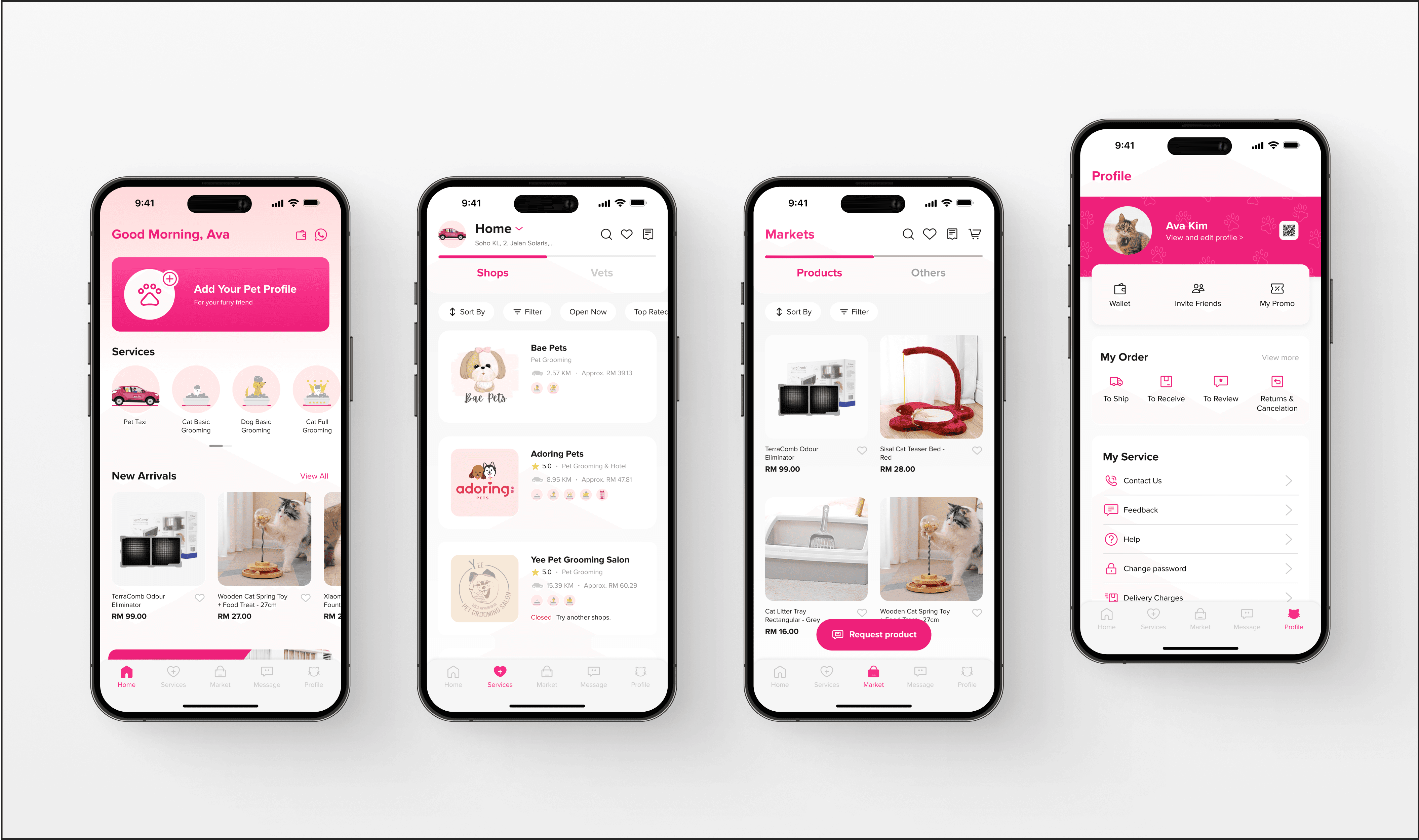
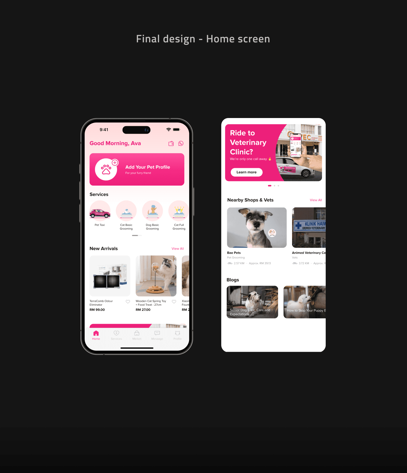
A consistent and modern UI enhances usability and user engagement by making the app more visually appealing and easier to navigate. This is why I decided to redesign the app's UI.
3. Missing features
While reviewing the app, I noticed it lacked several important features, such as location display on the services screen, favourites and purchase history, and a tracking system.
These features are essential for helping users see their current location, save items they want to purchase, and view past purchase records and information (Figures 5.4.1).
4. Enhanced communication management
The decision to remove the merchants' phone numbers was made considering that some customers might call or message late at night or after store hours to book appointments.
So I designed a messaging feature that displays 'Closed Now' during off hours, disabling the call function but still allowing users to message the merchants for booking.
To determine which option is best.
Optimized layout for diverse interactions
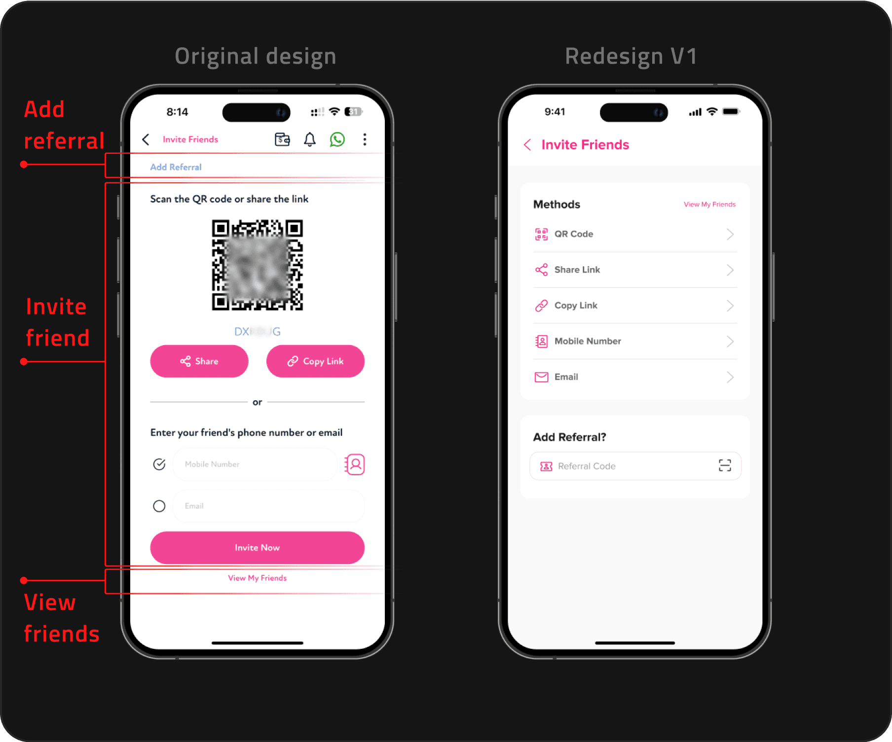
Before redesigning the original screen (Figure 5.6, left), I first organized the existing functionalities and information. Then, I created two designs: Version 1 and Version 2.
After considering user interactions, Version 2 (Figure 5.7) was selected for implementation as the layout is optimized to support diverse user interactions to ensures a seamless and intuitive user experience..
Original design - Poor visual hierarchy. Users will overlook the top-left "Add Referral" feature as their attention is drawn to the QR code and three primary buttons.
Redesign V1 - Misleading right arrow navigation. The 5 ways of “invite friend” interaction behave differently, meanwhile the right arrow in V1 will implied that clicking on a feature will navigate to the next page.
Clear visual distinction. Using white rounded-corner shapes as backgrounds clearly separates between the "Invite Friend" and "Add Referral" sections to help users quickly understand and locate their desired actions.
Intuitive icon and list display. Envelopes and icons with circular strokes visually represent various ways to invite friends, with detailed descriptions below for easy selection.
Diverse interactions enabled by circular icons. It allow that QR codes, share links, and emails use a bottom sheet; copying a link displays a "copied" message; and selecting a mobile number directs to a contact list on the next screen.
Evolution of design.
Repetitive information display
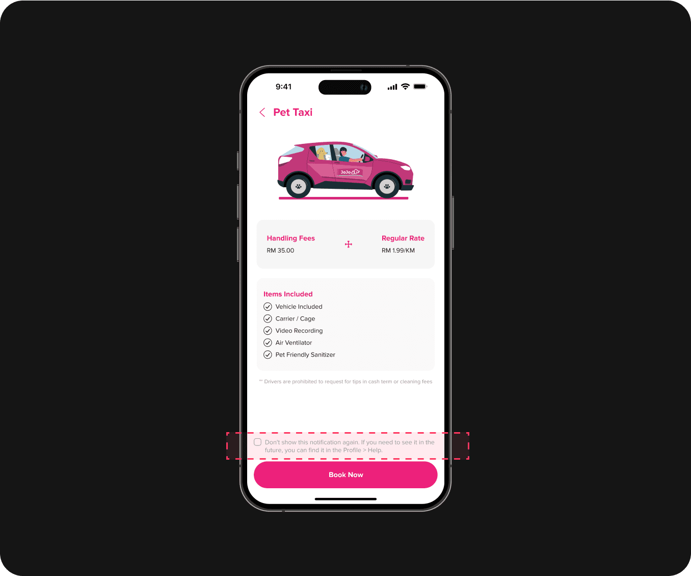
After user testing, users reported that the reminder screen appearing every time they clicked on a service was a bit annoying (Figure 5.8).
Before
Users find it frustrating that the screen displaying pet taxi fees and pet size standards appears every time they click on a service.
After
Adding checkbox to allow users to choose whether it appears for each service, and provide an option to dismiss it permanently.
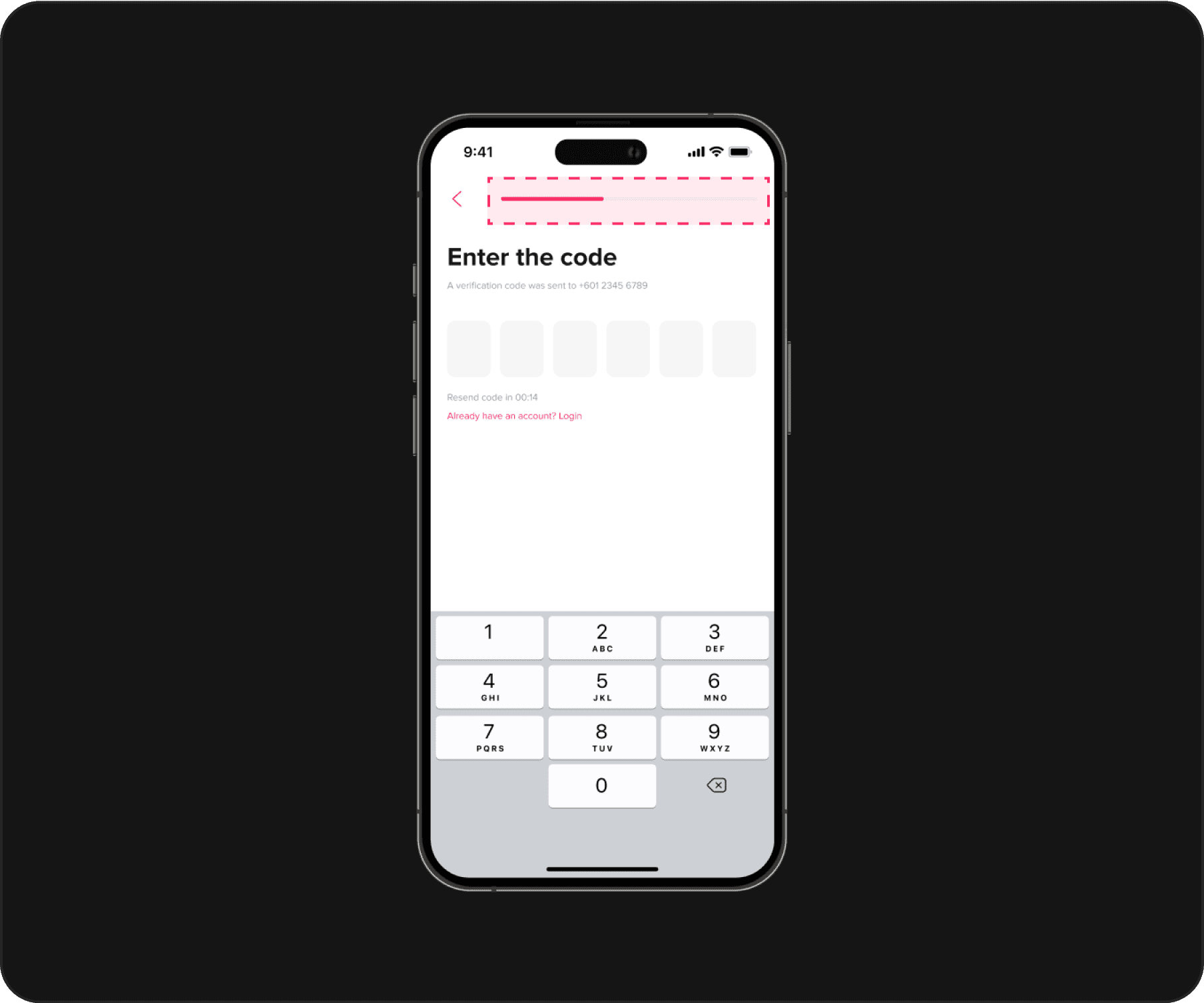
Linear progress indicator without any numerical context
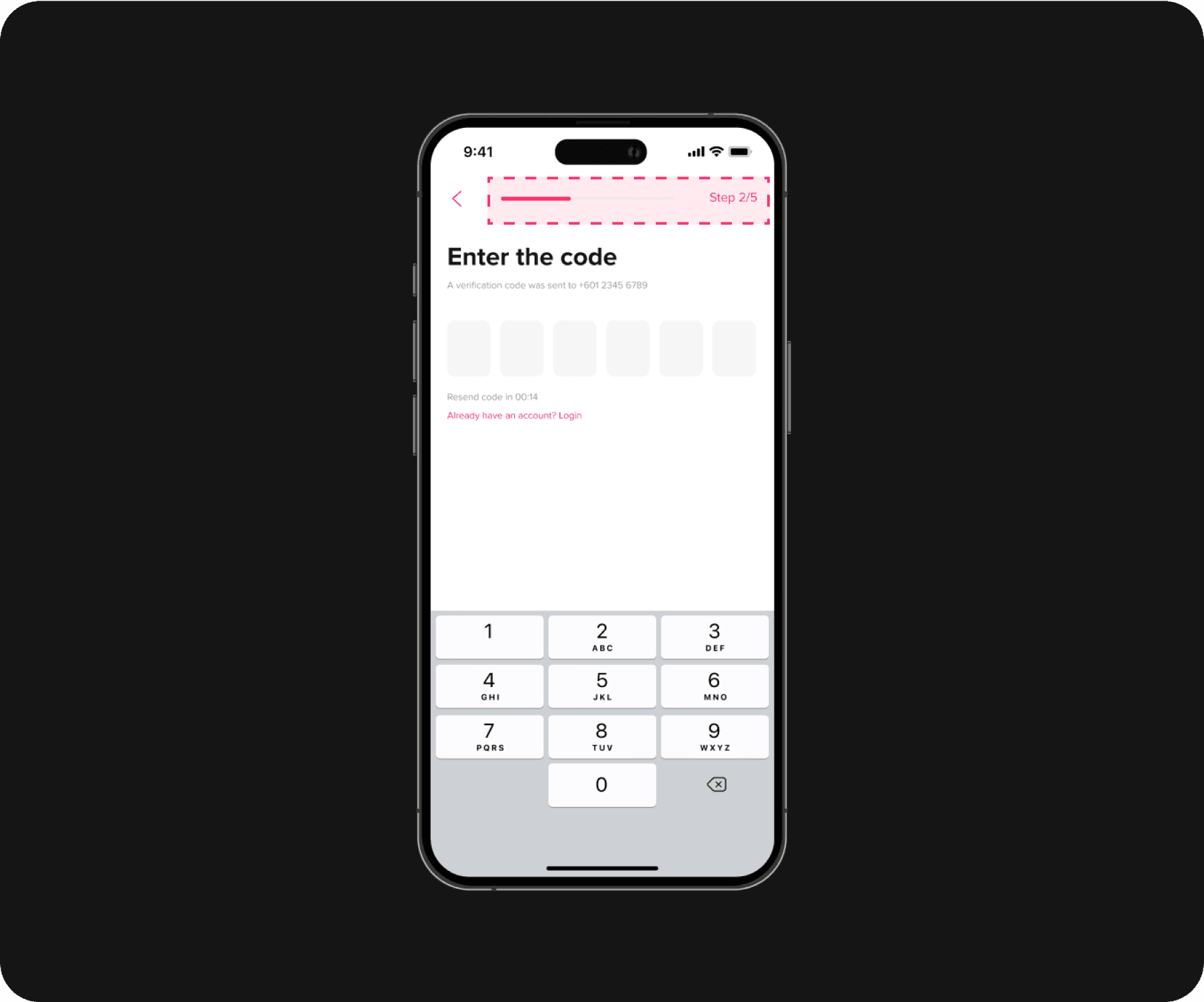
The iteration on the progress indicator, especially the addition of numerical steps, significantly improved user experience and led to higher completion rates by providing clear visual cues and reducing frustration (Figure 5.11).
Before
Users found this design to be frustrating and unclear, as they had no idea how many steps were left.
After
I redesigned the progress indicator to include numerical steps such as "Step 2/5" to provided users with a clear sense of progression and how much of the process remained.
A pleasurable learning process.
More engaging & seamless
When redesigning this app, I learned a lot, such as how to make the app more user-centered and improve my UI and icon design skills.
Figma prototype link
Please refresh the screen to ensure the splash screen displays correctly :D
Reflecting on the journey.
{
Achievement
}
Gained a lot from this case study, which showcases my ability to apply design principles effectively.
Hypothetical results and impacts
While not implemented, the conceptual redesign of the JoJo Pet Taxi app is expected to:
Increase user engagement and retention. By providing a more intuitive interface, the redesign aims to keep users engaged and encourage them to return to the app regularly.
Improve user satisfaction. Addressing usability issues and enhancing visual appeal should lead to higher user satisfaction, making the app more enjoyable and efficient to use.
Lessons learned
Animated illustration is awesome
Animated illustration really visual appealing and I learn how to use Lottie plugin in Adobe After Effect and export it.
User-centered design principles
When redesigning this app, I first put myself in the users' shoes to identify issues and then focused on redesigning to ensure the new app delivers a seamless and intuitive user experience.
Paying attention to the smallest details
It help ensure that all components and interfaces adhere to consistent design principles and fosters better collaboration between designers and developers.
Guidelines for icon design
To ensure visual consistency, I learned and applied specific guidelines for icon design, maintaining a uniform style and size throughout.
