Skylive Ventures
App UI/UX (B2B & B2C), Real-World Project - July 2023
Timeline
2023.07 - 2023.09 (2 months)
Industry
Financial technology (fintech)
Role
UI/UX designer (Project lead post handover)
Tools
Figma
Responsibilities
High-fidelity wireframe, Prototyping, UI design, UX design, Usability testing
Team
1 Product manager
2 UI/UX designers
2 Developers
Overview
Skylive Venture, a loan management company, sought to develop apps to streamline processes for customers, agents, managers, and debt collectors. The app includes KYC and registration features requiring an agent's referral code.
The UI/UX designer initially worked on the customer interface. I then took over, made modifications to the customer interface based on stakeholder feedback, and designed the remaining aspects of the app, including the agent, manager, and debt collector interfaces.
Notice:
This project includes a future expansion plan if given the opportunity, located at the end of the 'retrospective' section.
{
Highlights
}
A suite of seamless loan management and collection apps.
A briefly for you.
Handled my first app project.
Overcome these problems
Complex workflow design. Due to loan management processes quite complex, so I need to ensure smooth navigation and user experience across different interfaces.
Shifting requirements and expectations. Stakeholders frequently changed their minds during the project, even though the requirements and goals were clearly documented beforehand.
Balancing features and usability. Need to ensure that the app remains easy to use while providing comprehensive functionality.
Maintaining consistency. Need to balancing the unique needs of each user role while maintaining a unified interface.
{
The Challenge
}
Ensure design consistency and intuitive navigation across multiple user roles while integrating complex financial functionalities and client-specific requirements.
Understanding the foundation.
Initial observations
I first reviewed the overall user flow and design style, seeking clarification from the senior designer when I had questions about the user flow. I then started revising the design based on the stakeholders' feedback.
During this process, I discovered 2 issues:
Each flow is not intuitive. It cause me spend some time to check each screen individually and use the preview function to understand the flow.
Lack of a design system. When designing for end-user, agent, manager, and debt collector interfaces, the absence of a design system led to inconsistent components.
Even I had discovered these issues and I would like to solve the lack of a design system problem, but
{
Under limitations
}
Limited time for design system due to multi-tasking.
Almost gave up on creating the design system
The reasons I felt want to give up on creating the design system:
Being new to the field. At that time, I was relatively new to this field and had never worked on a design system before. I was more familiar with web design.
Lack of experience. The company had no prior experience with design systems, which added to the complexity of the task.
Time constraints. Creating a design system required significant research and development time, which was challenging given the tight deadlines and my need to multitask with other responsibilities.
Overcoming initial hesitations under time constraints
Reasons I lastly decided to create the design system:
Interface consistency. As this project required designing for 4 different interfaces.
Handling frequent changes. Helps manage evolving stakeholder requirements by maintaining design consistency and efficiency.
Improving design efficiency. The initial design lacked auto layout features, which slowed down the design process and affected consistency in spacing and padding, especially during modifications.
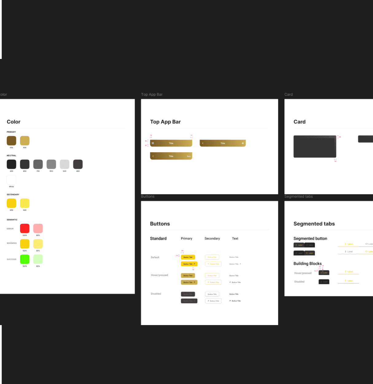
Mini design system
Since there was no established design system, it led to inconsistencies in components and styles.
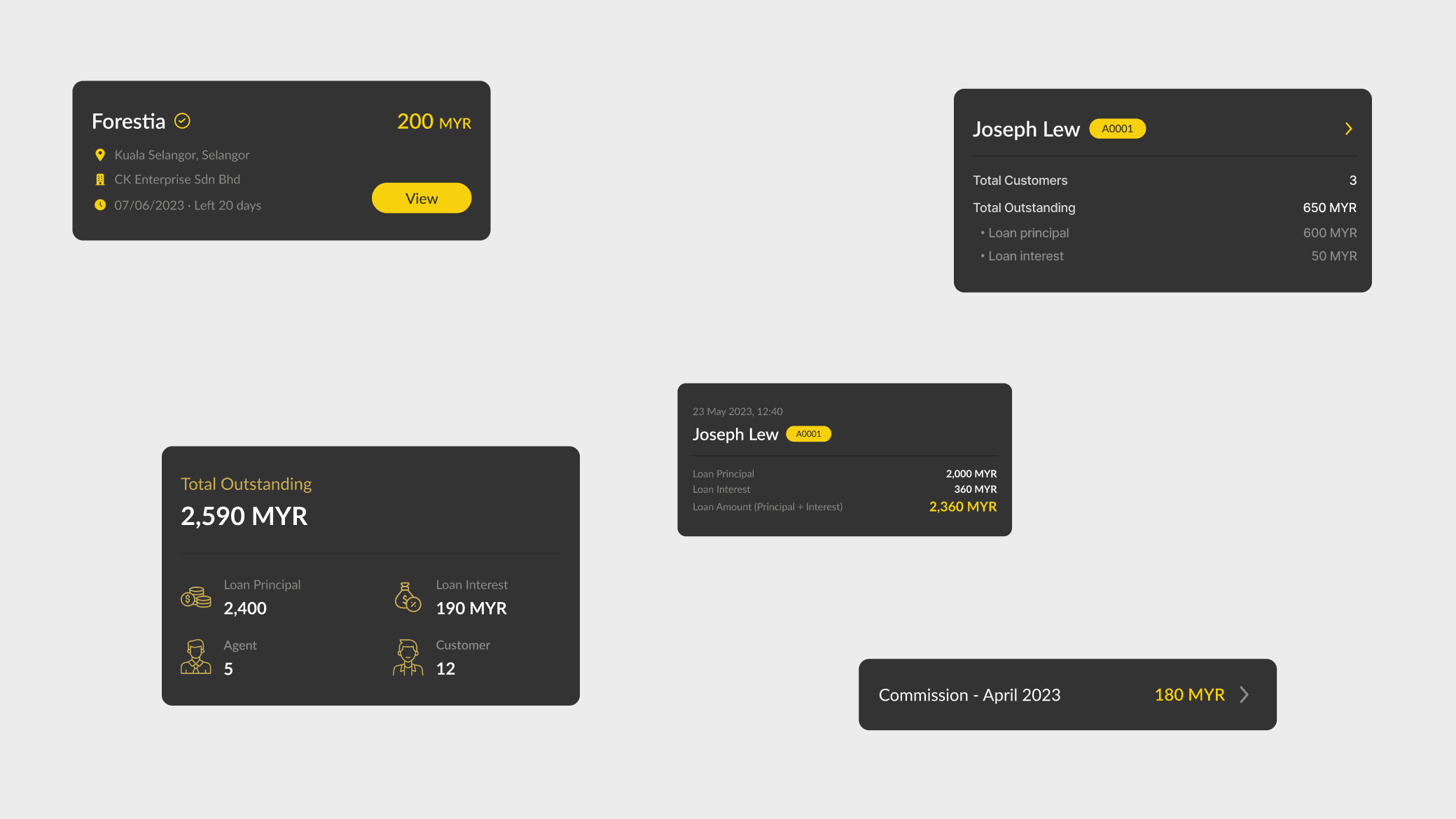
To address this, I built a mini design system that included only the components used in this app.
Annotations and connections
Flow connections were not labeled, making it difficult to understand the user flow at a glance.
To make it easier for developers and anyone taking over the project, I added clear labels to the flow connections, ensuring a smoother handover.
Where ideas take shape.
Workflow with Skylive Venture
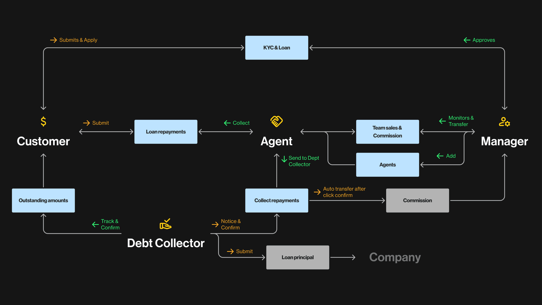
After I revised the customer interface, the product manager explained how the entire system operates and how the various components interact with each other and let me know what features should included in these apps.
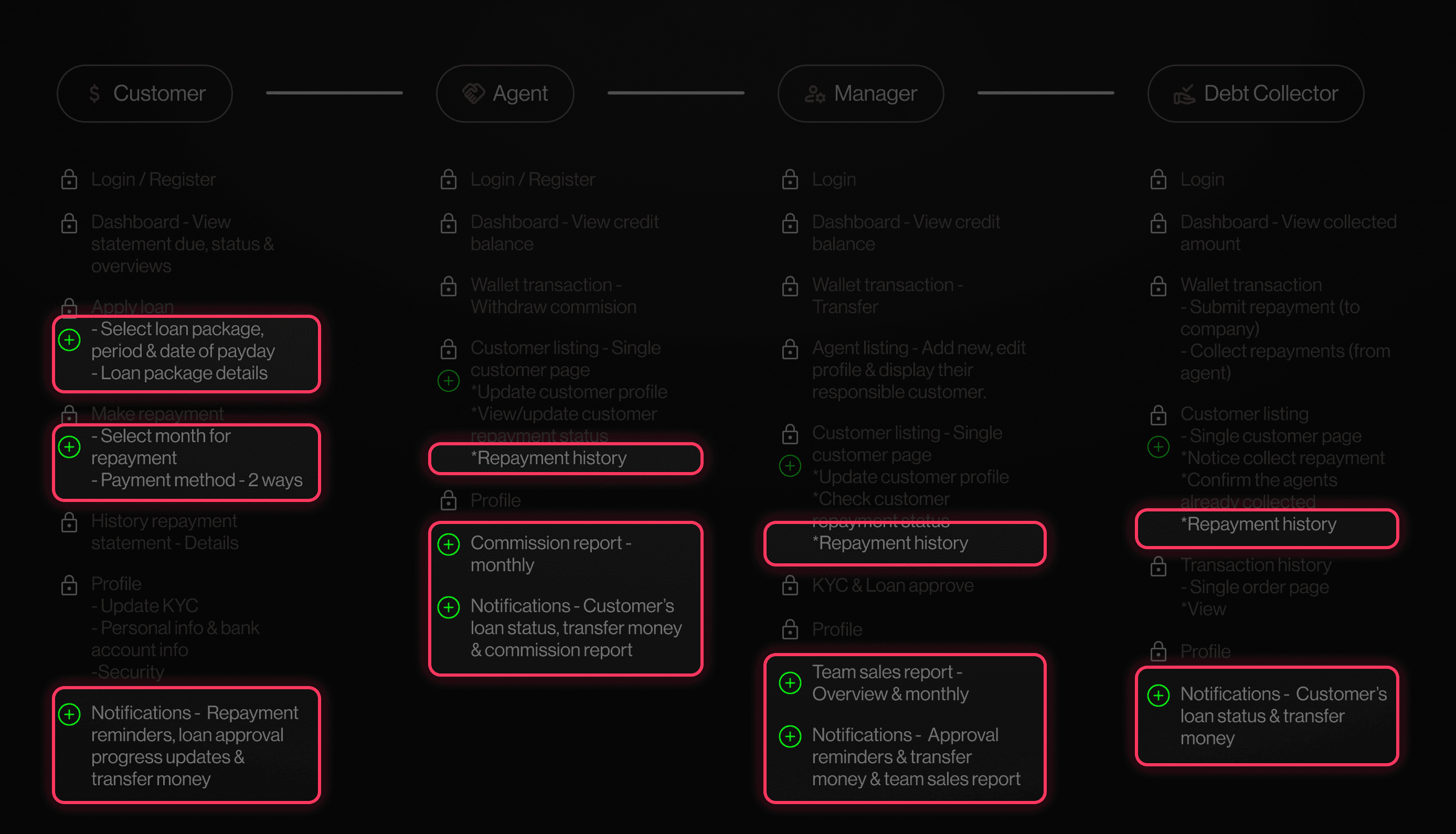
The purpose I create Figure 2.1 & 2.2 is to outlined the necessary features for the agent, manager, and debt collector interfaces as well as help me better understand the logic behind the user needs and the functionality design.
During this time, I researched loan app features on Dribbble and the App Store, analyzing user experiences through reviews and app screenshots that highlight key features and user flow.
The sentences outlined in red rectangles (Figure 2.2) represent features added after discussions with the product manager, stakeholders and development team.
Creating a system that enhances the efficiency of loan-related operations
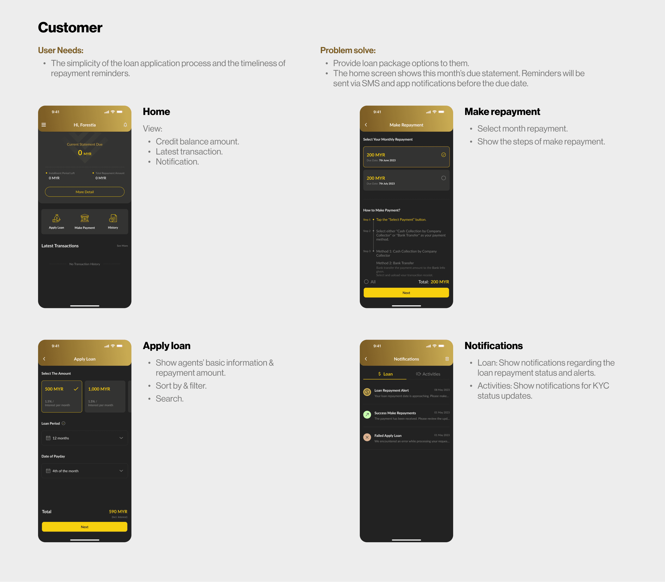
Each user testing session with colleagues and meetings with stakeholders have deepened my understanding of the user needs for these four apps.
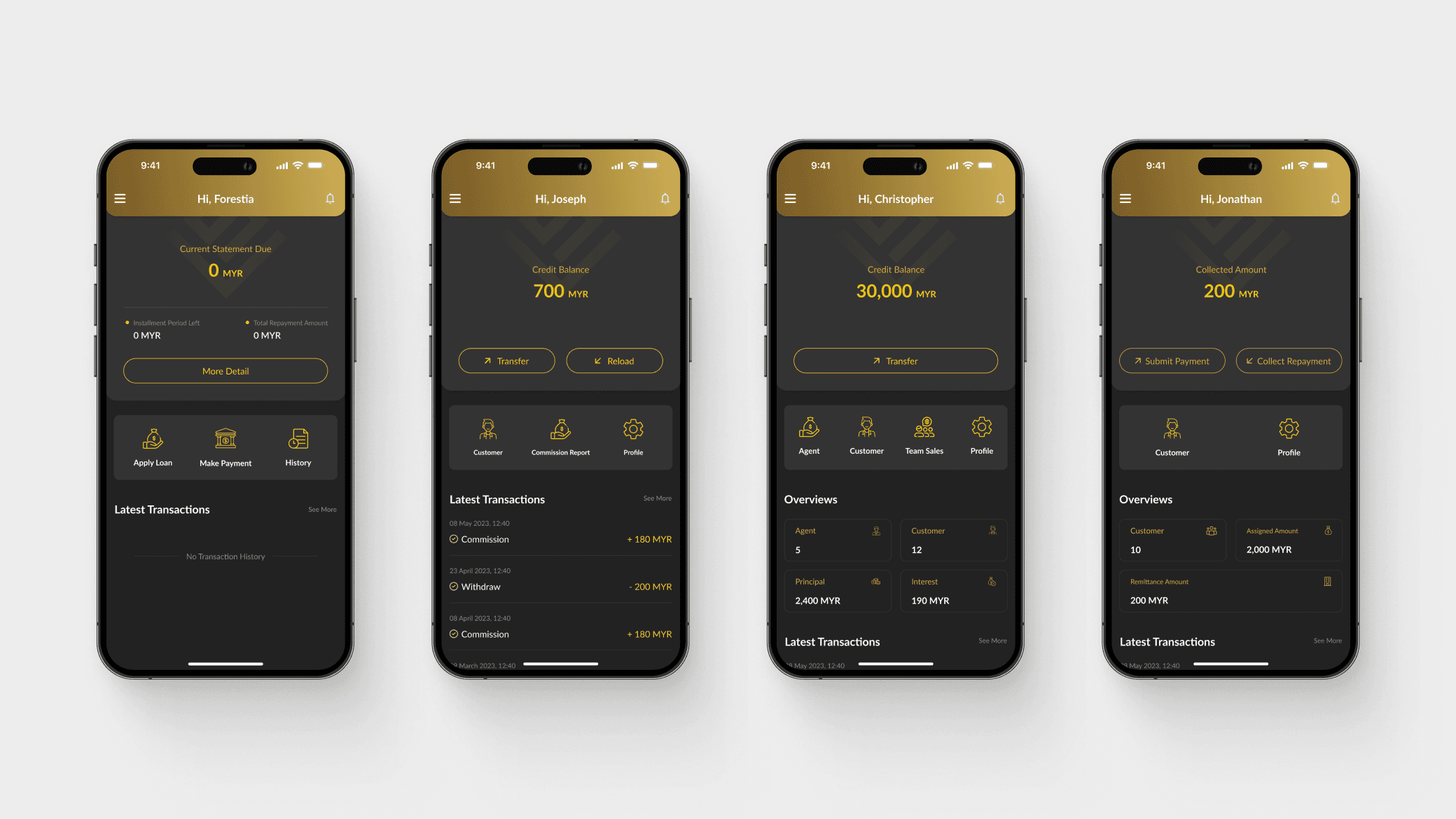
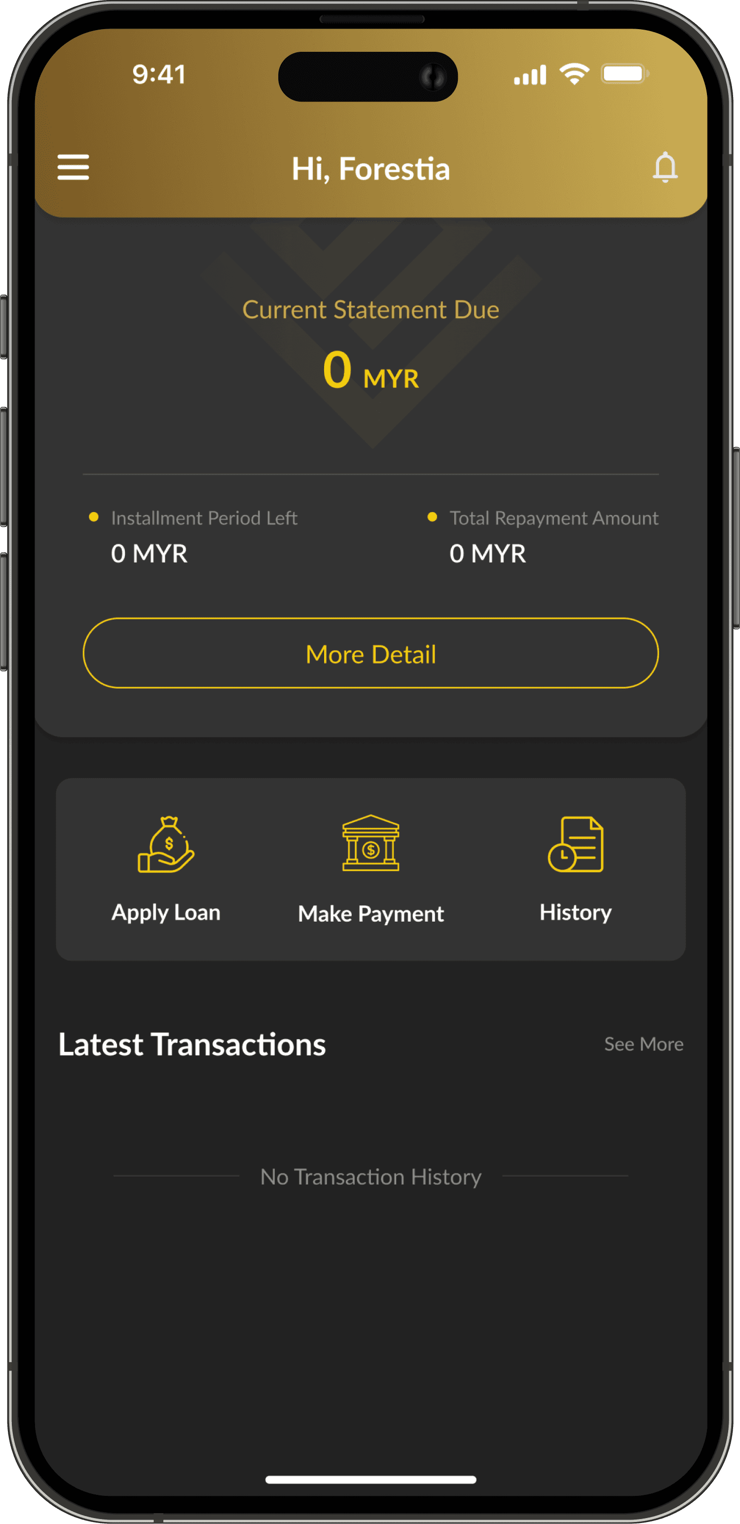
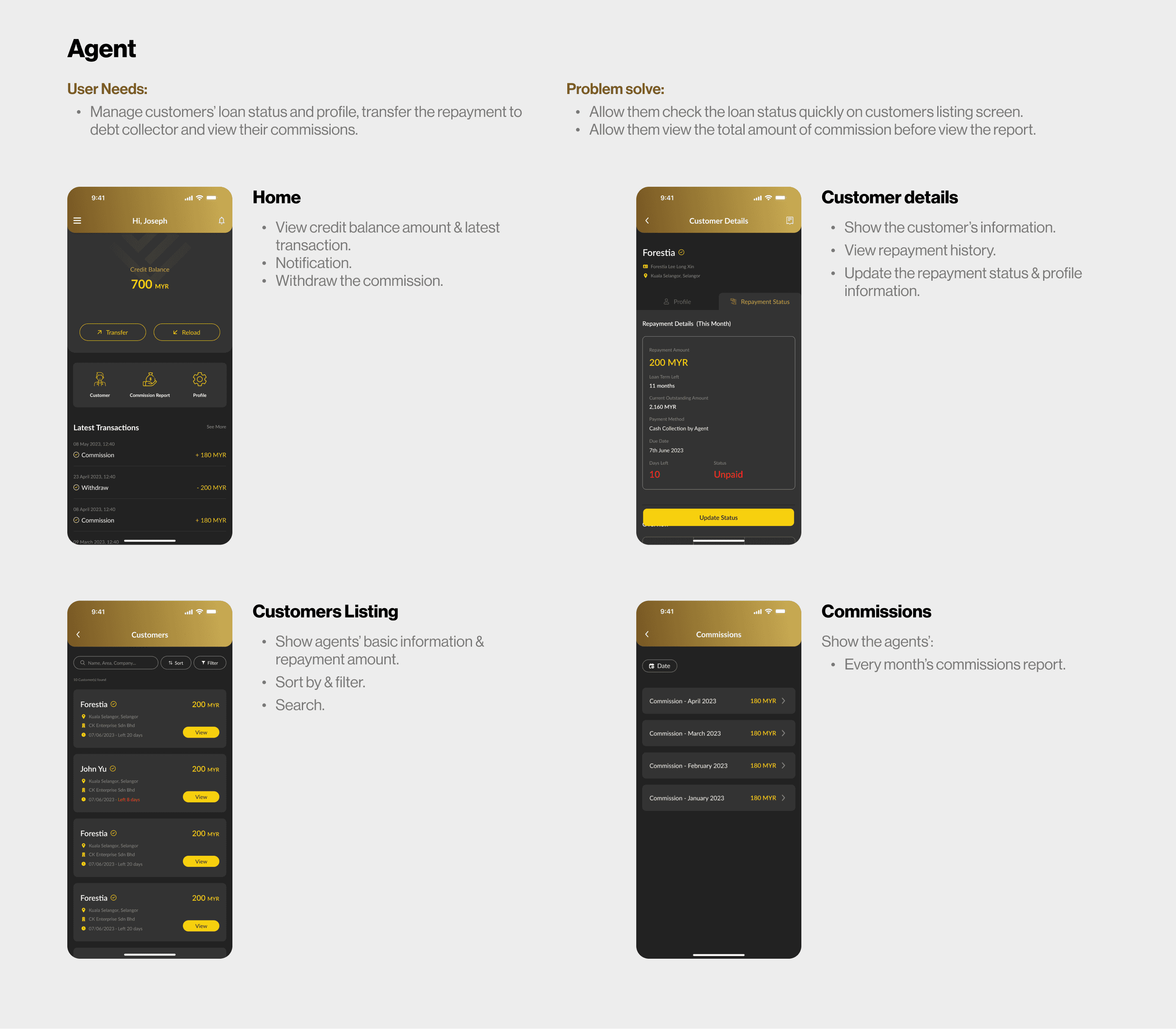
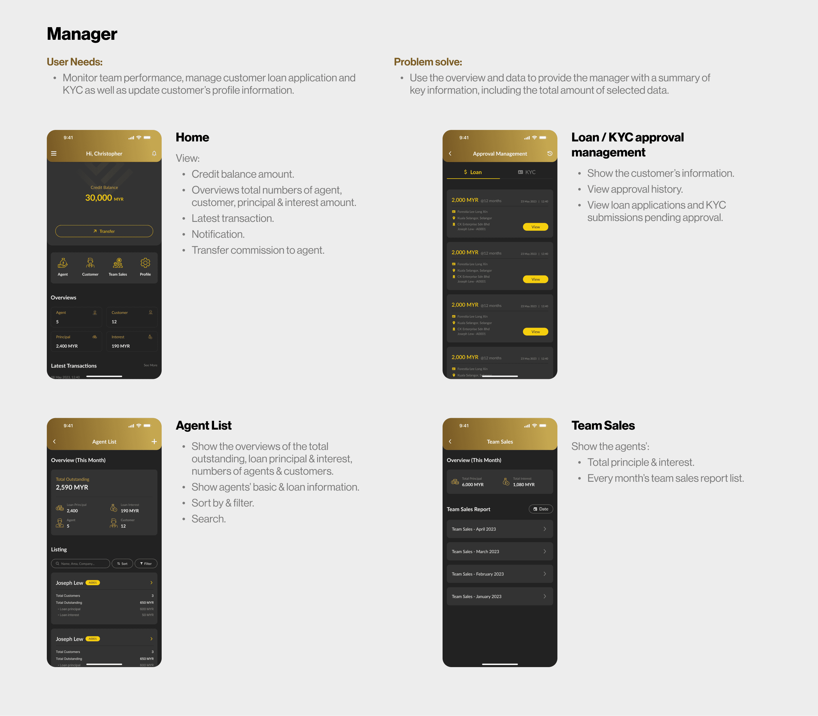
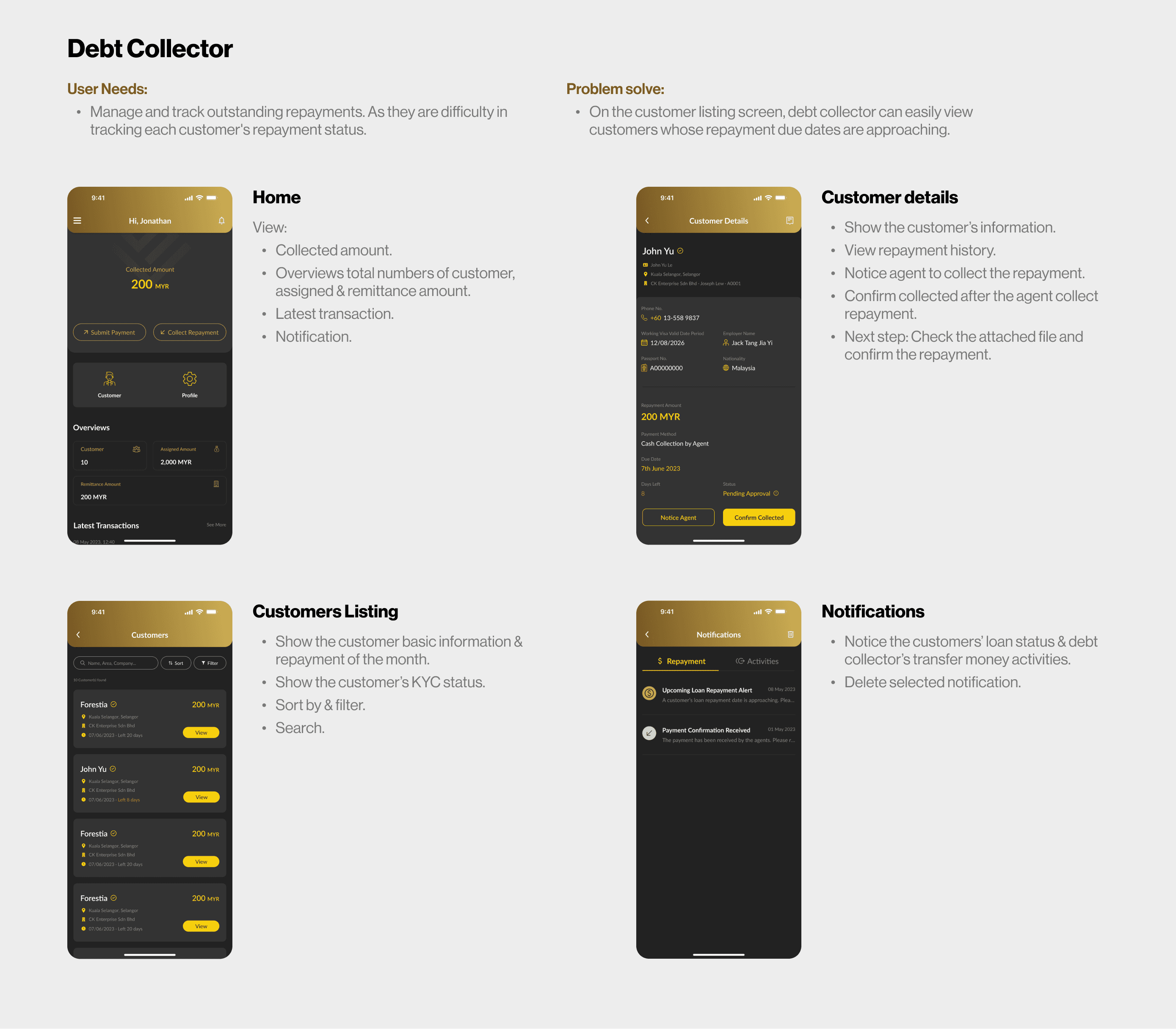
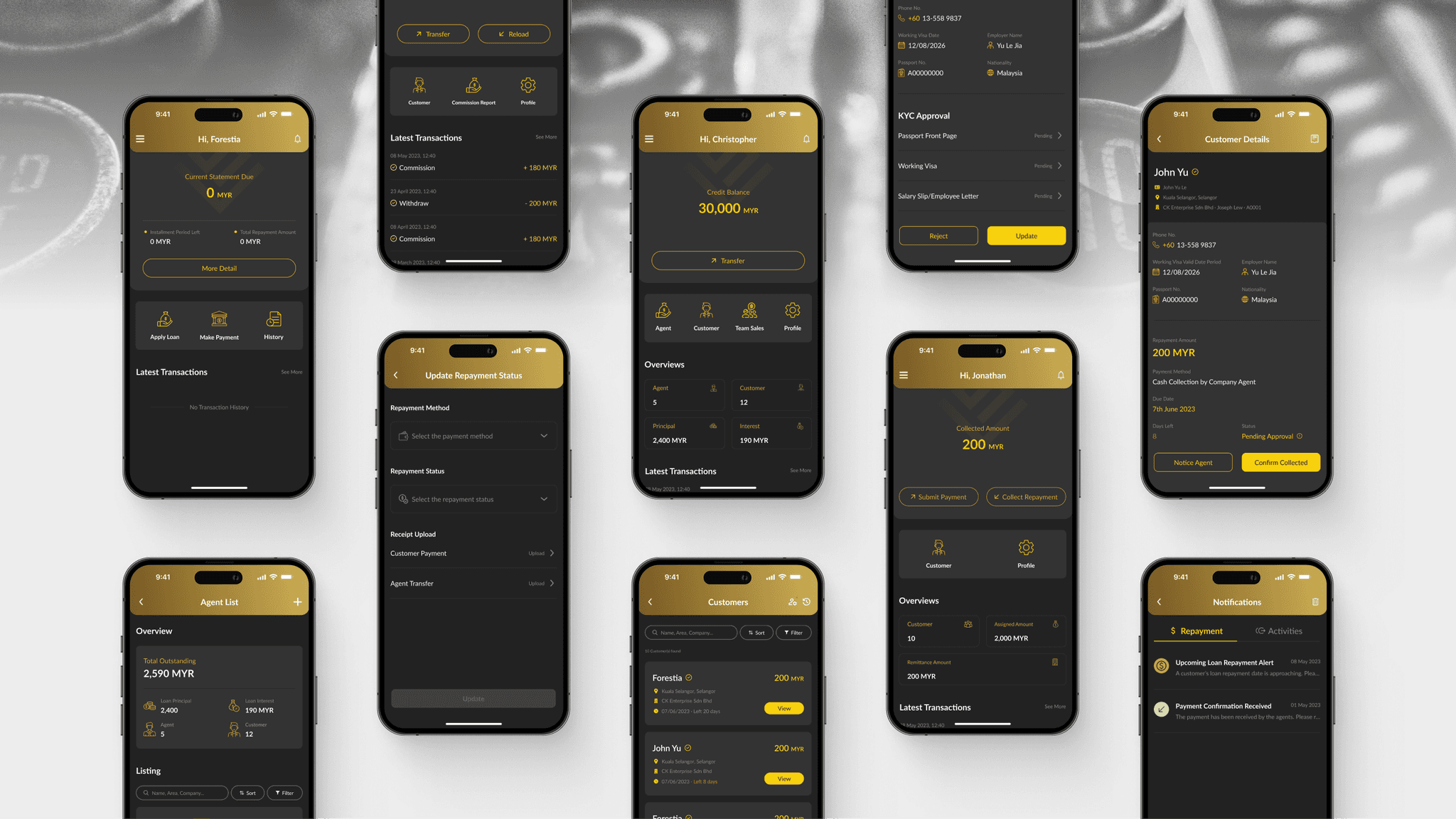
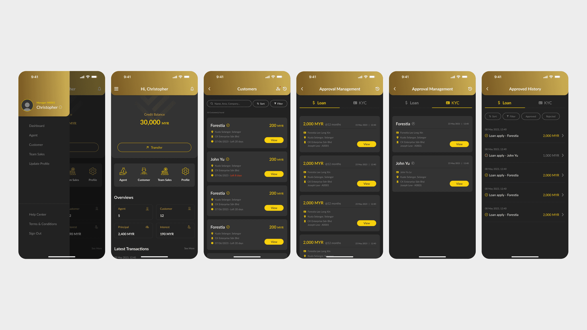
Figure 2.4, 2.5, 2.6 & 2.7 shows the app screens that address these needs and solve the problems users face.
Scenario presentation
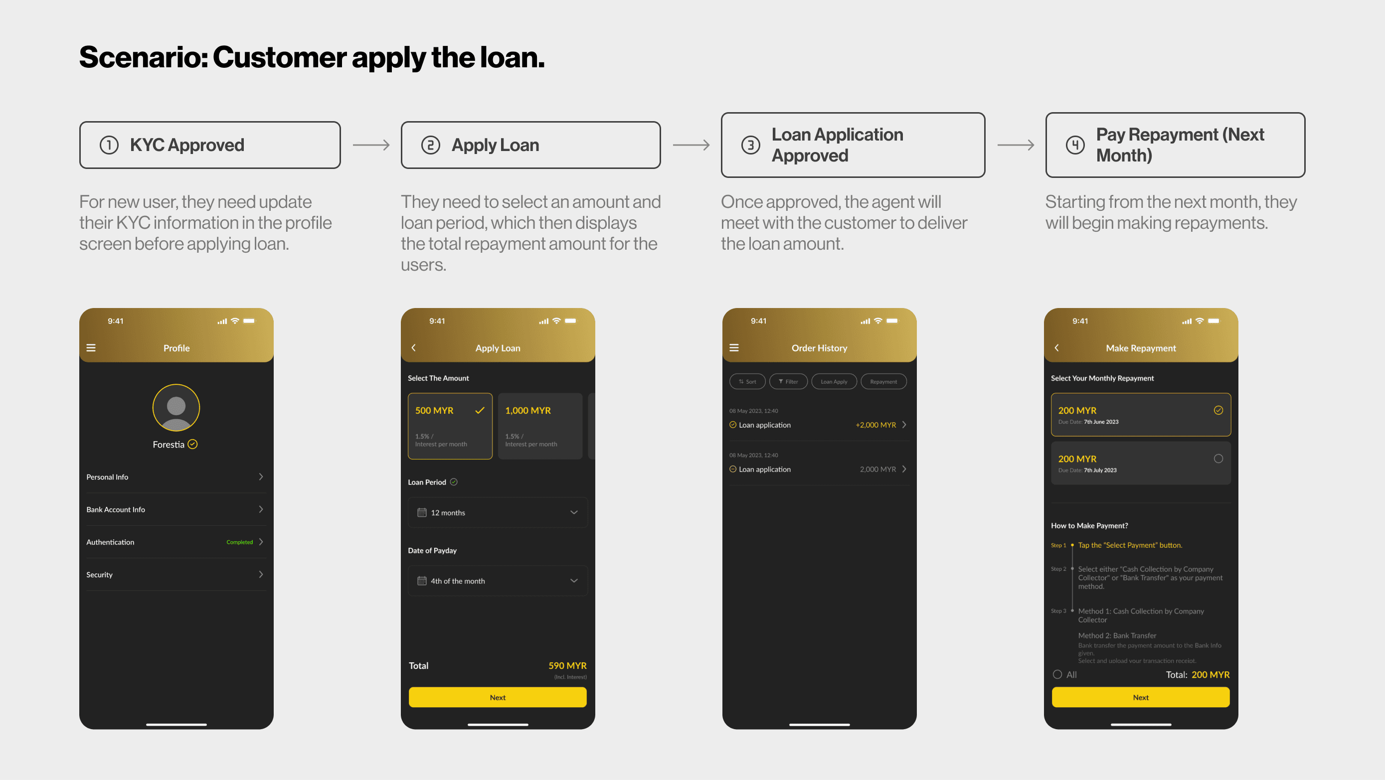
Figures 2.8, 2.9, 2.10, and 2.11 demonstrate how the system operates in real-world scenarios.
Finding the best solution.
Exploration for commission report on agent interface
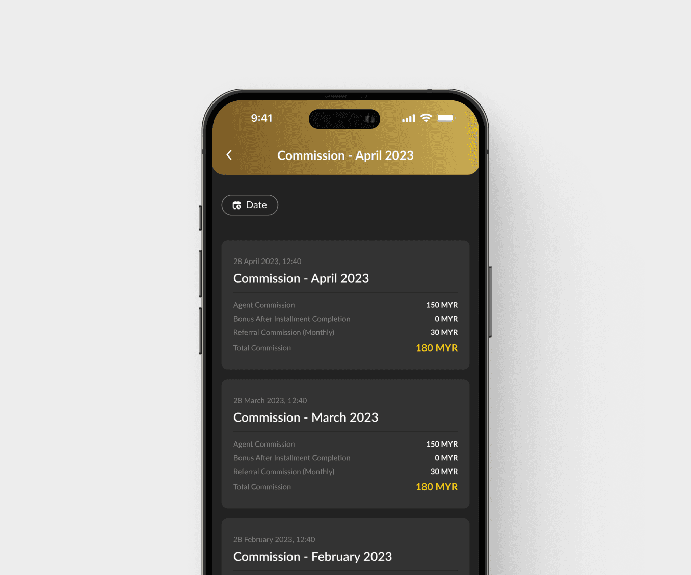
I first designed version 1 (Figure 3.1), which allowed users to quickly search for the reports they wanted without needing to click to view the report content.
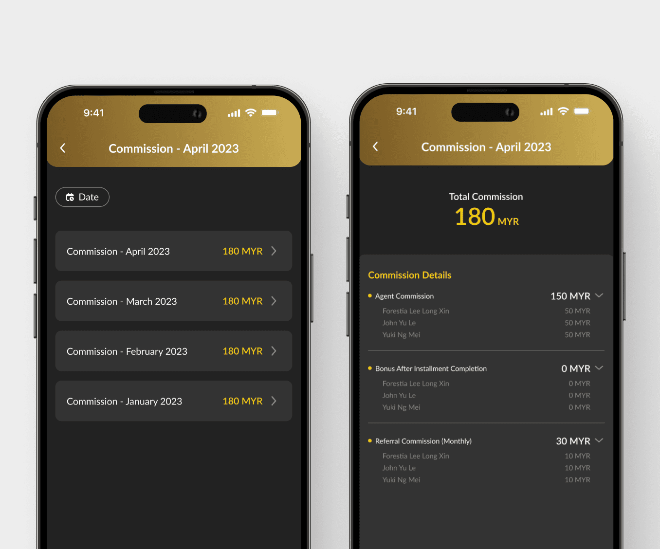
However, I felt the report content could be more detailed. Therefore, I created version 2 (Figure 3.2), which provides a more thorough view of the report content.
More intuitively. Agents can instantly view commission details, saving them time.
Lack of detailed information. It was not possible to display more detailed information, leaving agents unable to determine from whom their commission originated.
May take longer to find previous months' reports. As the card design used to display commission details can result in overly lengthy content.
Detailed commission breakdown. The commission details in the report allow agents to know which customer each commission came from.
Time-saving report searching. Agents can quickly find the reports they need without using filters, saving valuable time.
Cannot view the commission report's details directly. They need to click on a report and navigate to another page to read the detailed information.
Choosing between amount entry and option selection
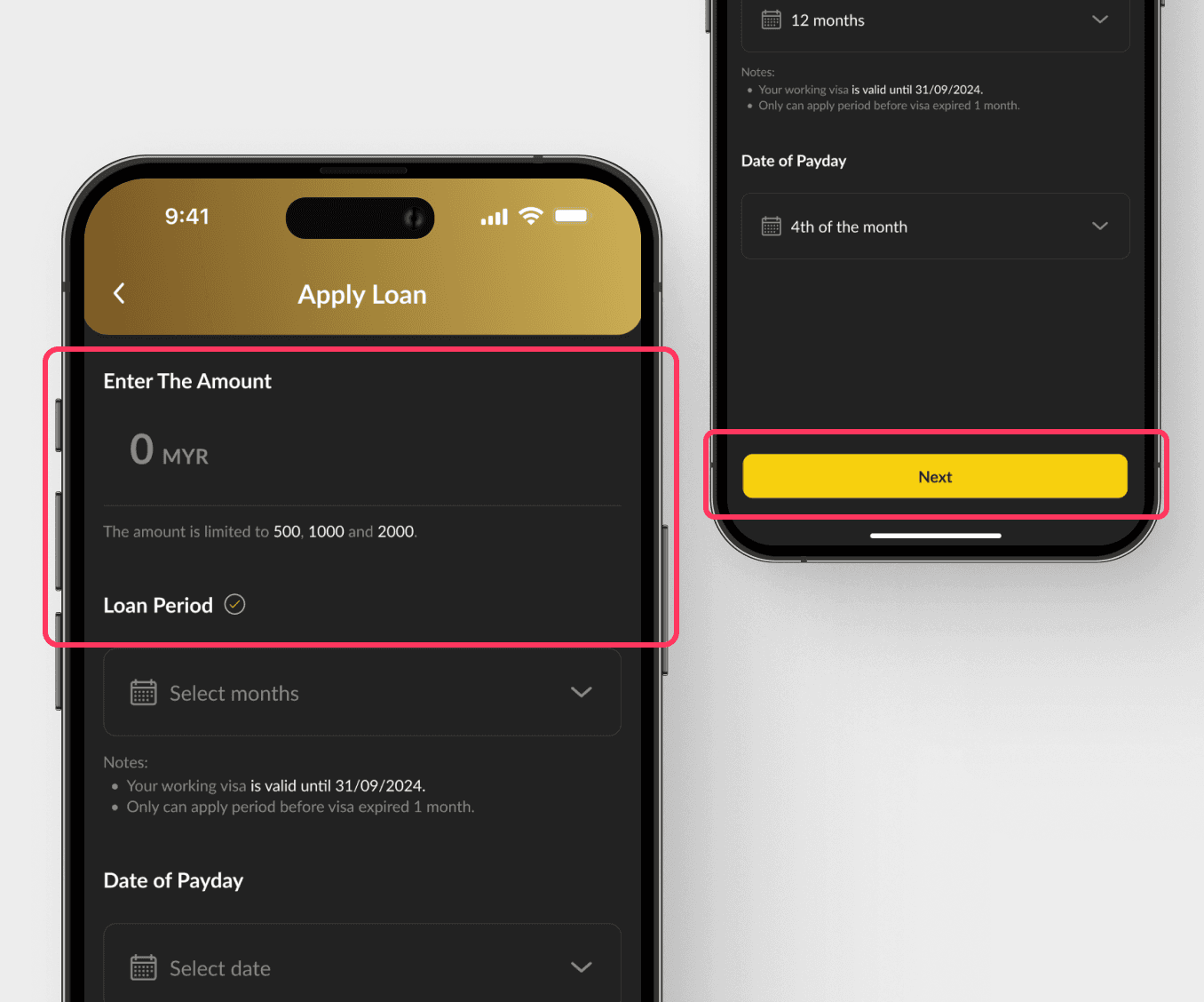
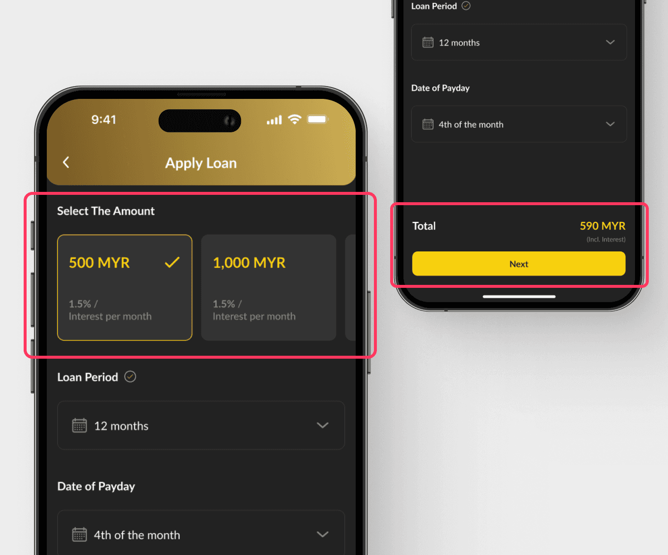
After redesigning Version 1 (Figure 3.3), I attempted a second approach by changing the entry amount to an option selection (Figure 3.4).
Both Version 1 and Version 2 include a subsequent screen that provides details on the selected loan. After careful consideration, we chose Version 2 (Figure 3.4).
Lack of detailed information and make users confusion. As the design does not display the loan options directly on the screen and it will make users might be unsure of what options are available to them.
Increased likelihood of navigation back. When users see the loan package details on the next screen, they might realize they selected the wrong package.
More clarity and intuitively. The use of distinct blocks for each package option with the associated interest rates helps users quickly scan and compare the options.
Reduces potential confusion. As the selectable loan packages are presented as clickable options and the total amount of the loan is displayed before the user proceeds to the next step.
May cause users hesitate. As seeing the total amount in advance may make users hesitate or doubt their decision.
Make it more user-friendly.
Data overview
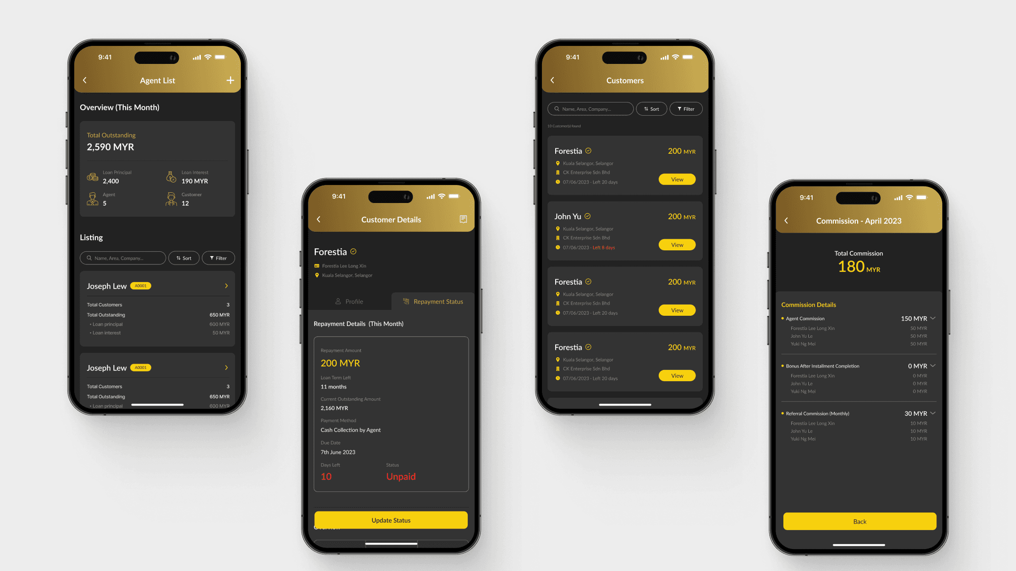
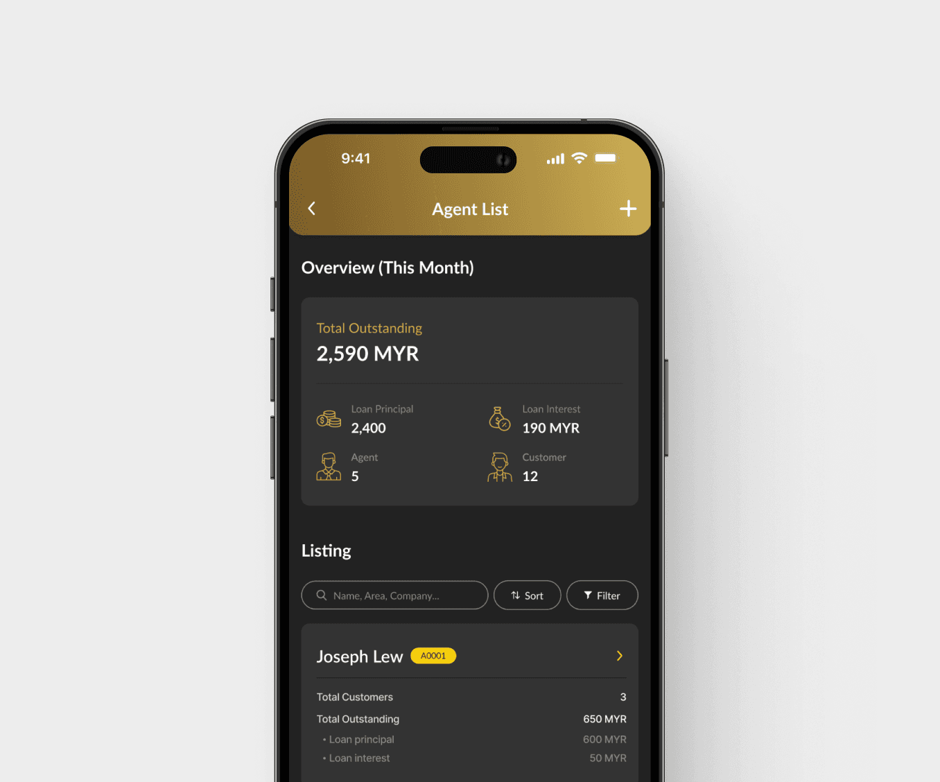
After meeting with stakeholders, we identified that the manager interface needed a data overview for the agent list screen to monitor key metrics.
This overview would display the outstanding principal, outstanding interest, total outstanding amounts, and the number of agents and customers (Figure 4.2).
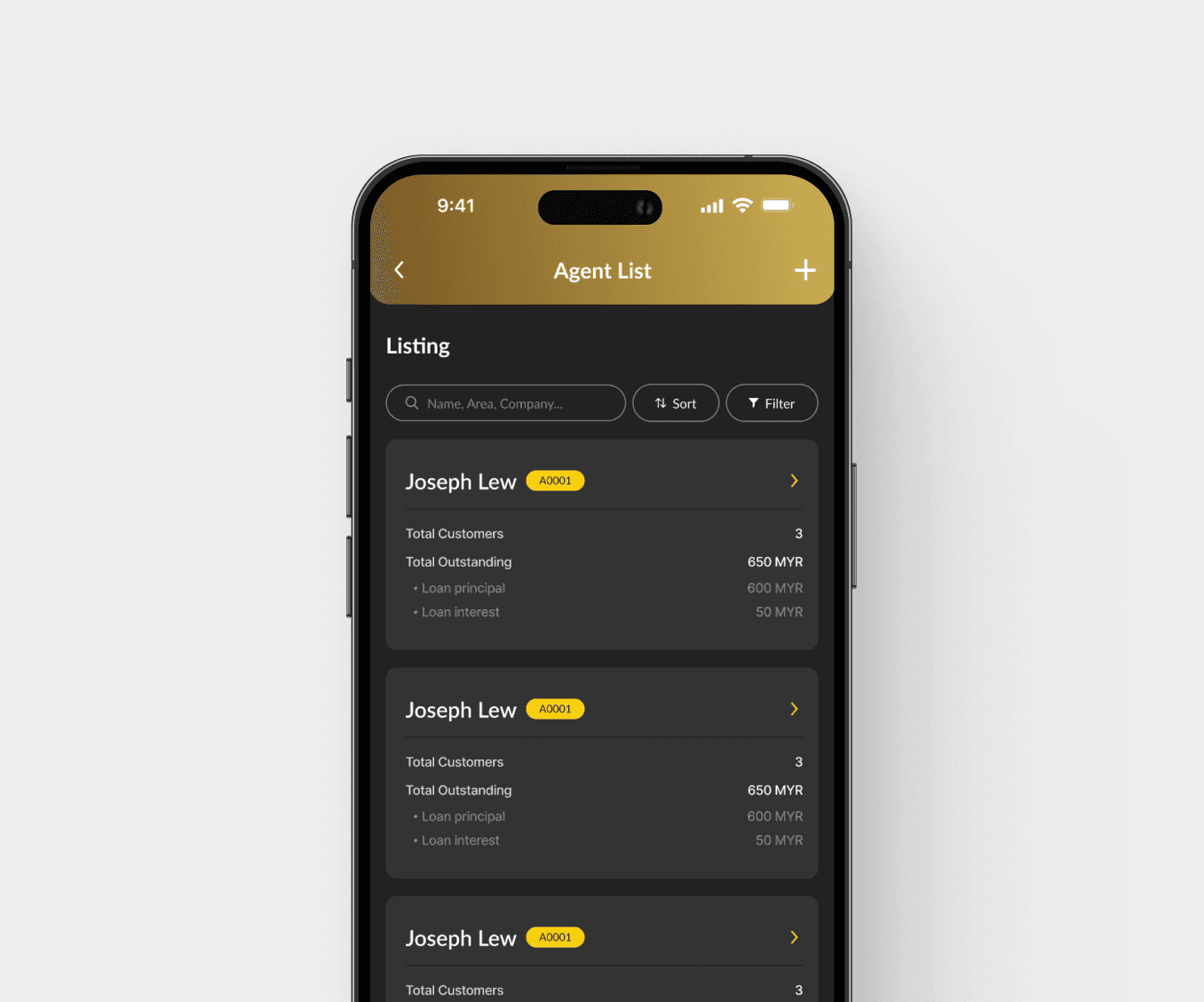
Before
Simply design the agent list, with each agent list card displaying the agent's current total outstanding (loan principal and interest) and the total number of customers they have.
After
Design a card that provides an overview of the data and place it at the top to make it easier for them to access key information at a glance.
Agent interface - update repayments status
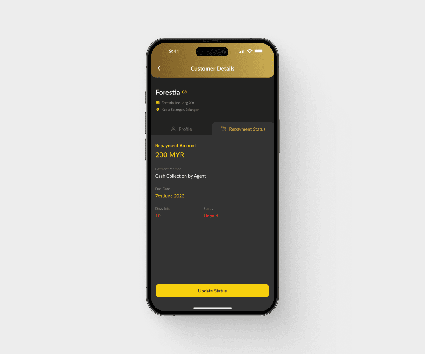
After meeting with stakeholders, stakeholders provided feedback that agents could not view more detailed information about their customers' loans(Figure 4.3).
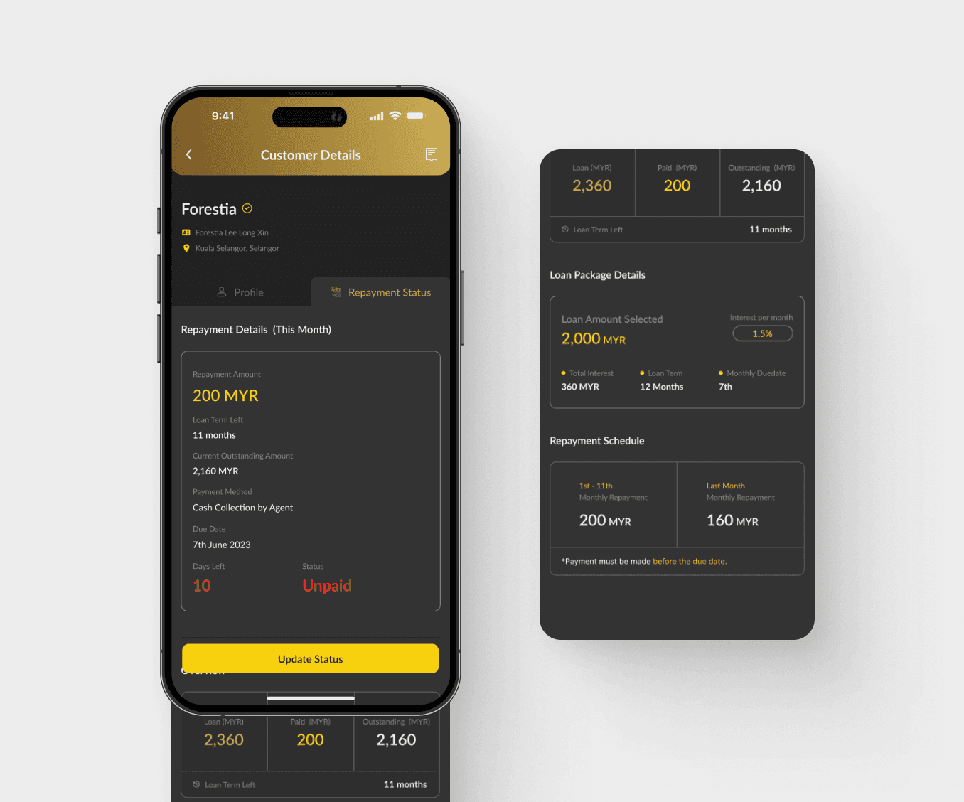
So, design Version 2 (Figure 4.4) was designed to allow agents to view loan details and make loan management easier.
Before
Version 1 only displays repayment amount, method, date, days remaining until due date, and repayment status.
After
Agents can provide better customer support and manage loans more efficiently.
As this design provides more detailed customer information, including monthly repayment details, an overview of the loan, loan package details, the repayment schedule, and repayment history.
The seamless platforms that simplifies loan management for all stakeholders involved.
Improve customer experience and operational efficiency
Figure 5.1 & 5.2 showcase the final design of this app. It helps to enhances the efficiency of loan-related operations.
Last, this projects showcases my ability to handle complex design challenges, integrate user feedback, and deliver high-quality, functional design solutions.
Growth through challenges.
{
Achievement
}
Stakeholders are highly satisfied, and successful delivery was achieved.
Lessons learned
Stakeholder communication is crucial
Communicate clearly and regularly with stakeholders to ensure alignment of project goals, functionality, and workflow.
Clear documentation
Maintaining clear and detailed documentation of the design system, workflows, and updates ensures that the project remains organized and enables team members to quickly understand and take over the project when necessary, especially during iterations.
Design flexibility
Adaptability is crucial, as it enables timely adjustments based on feedback or evolving project requirements, enhancing functionality and aligning with stakeholder expectations.
Usability is important
Every feature should be user-centric, addressing specific needs and incorporating feedback to improve usability and overall design effectiveness.
Future expansion plan if given the opportunity
If I have access to the data, I would iterate on the product to improve usability and empower users to have a more seamless and impactful experience.

